work /
Yuki Accounting
Redesigning Yuki: A Modular Design System to Make Accounting Easy, Intuitive, and Enjoyable
Yuki | Software
Business challenge
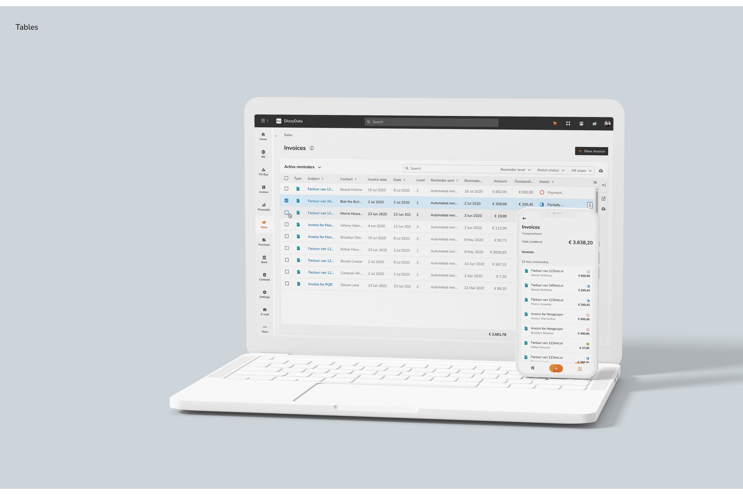
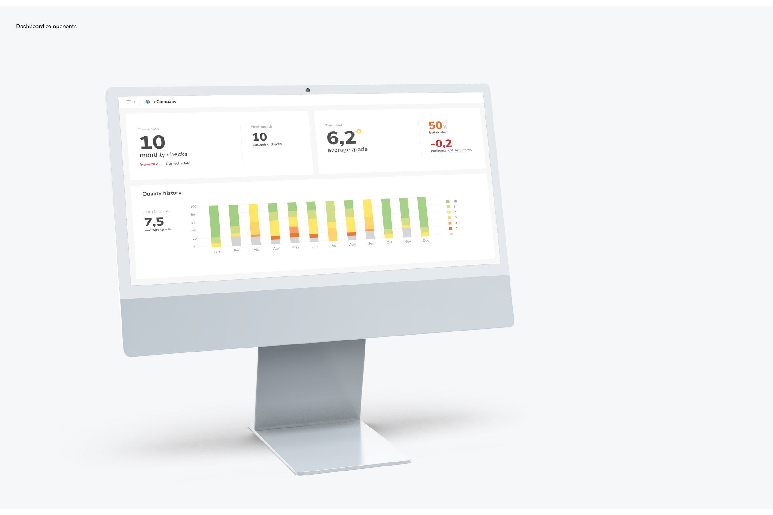
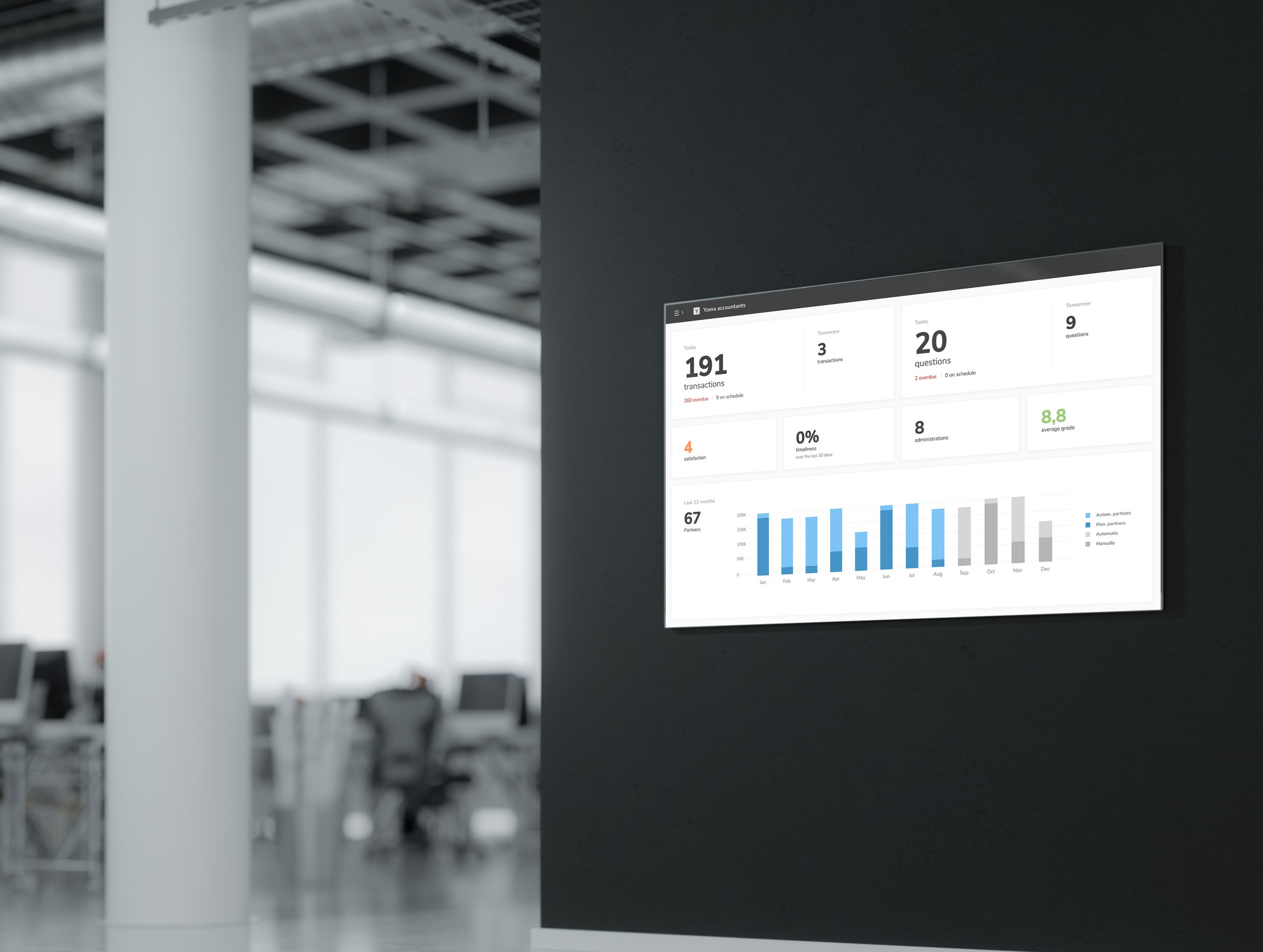
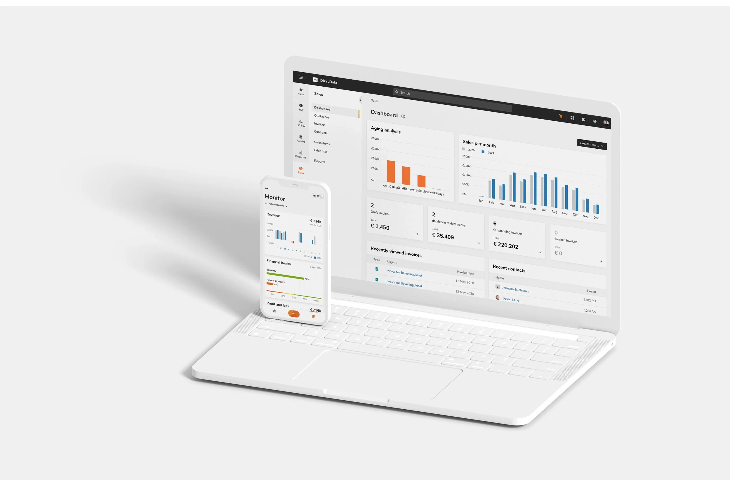
Yuki, a self-learning accounting software company operating in the Netherlands, Belgium, and Spain, faced a significant challenge during a major code migration project. The goal was to enhance their accounting platform’s UI and UX while developing a unified design system to support both desktop and mobile applications. With outdated designs and inconsistent component libraries, Yuki needed a more modern, accessible, and cohesive interface to better serve users and support future growth.
Company: Visma | Yuki, Rotterdam Netherlands
My role: UI designer
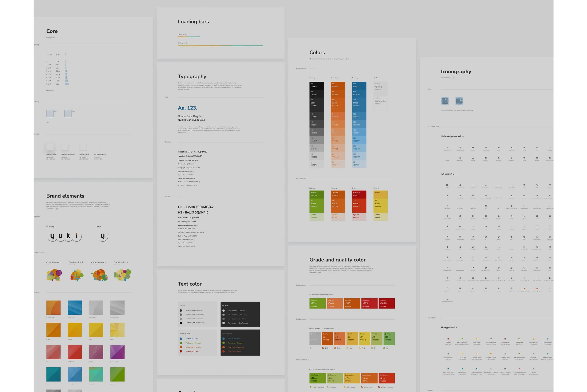
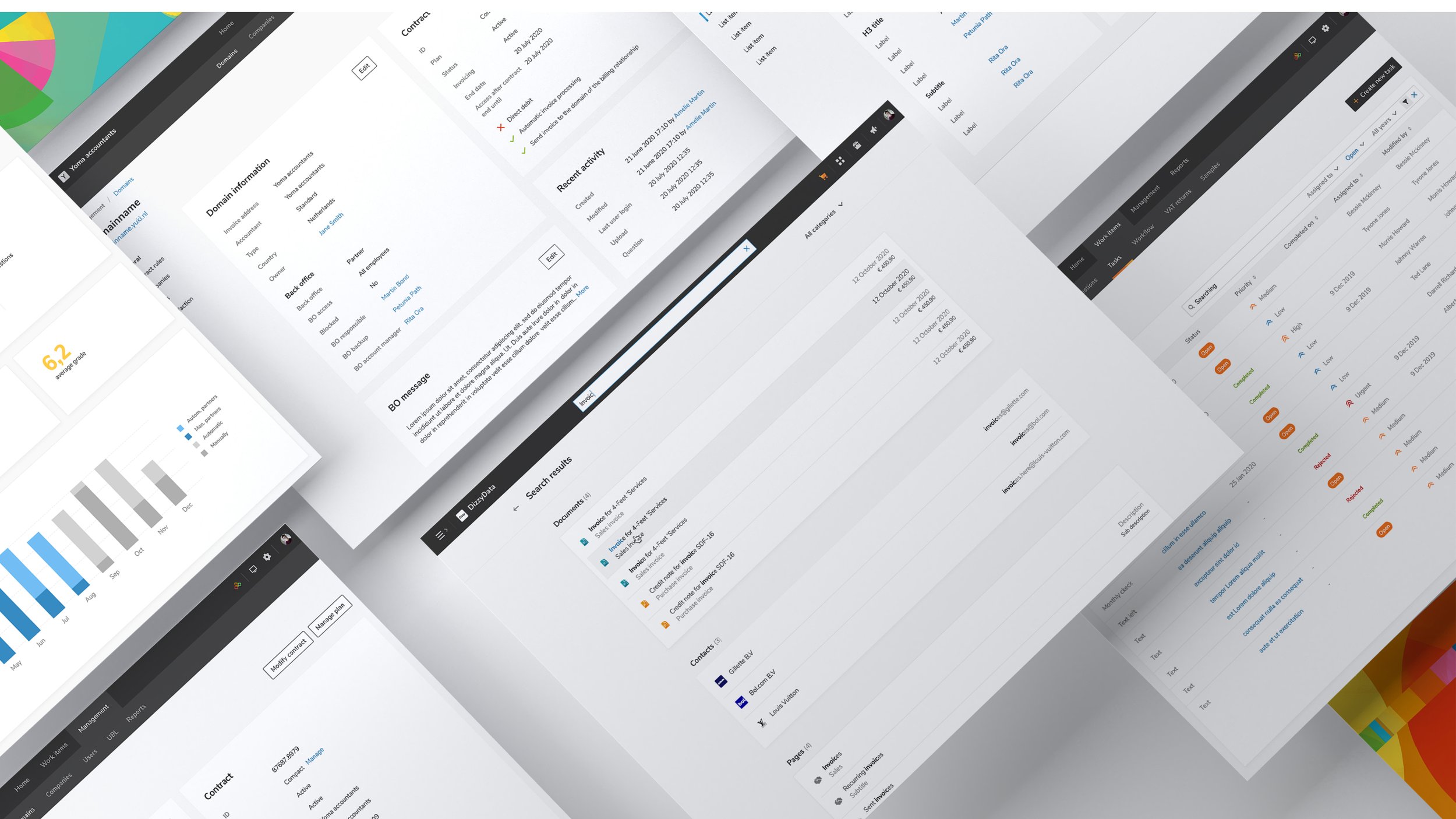
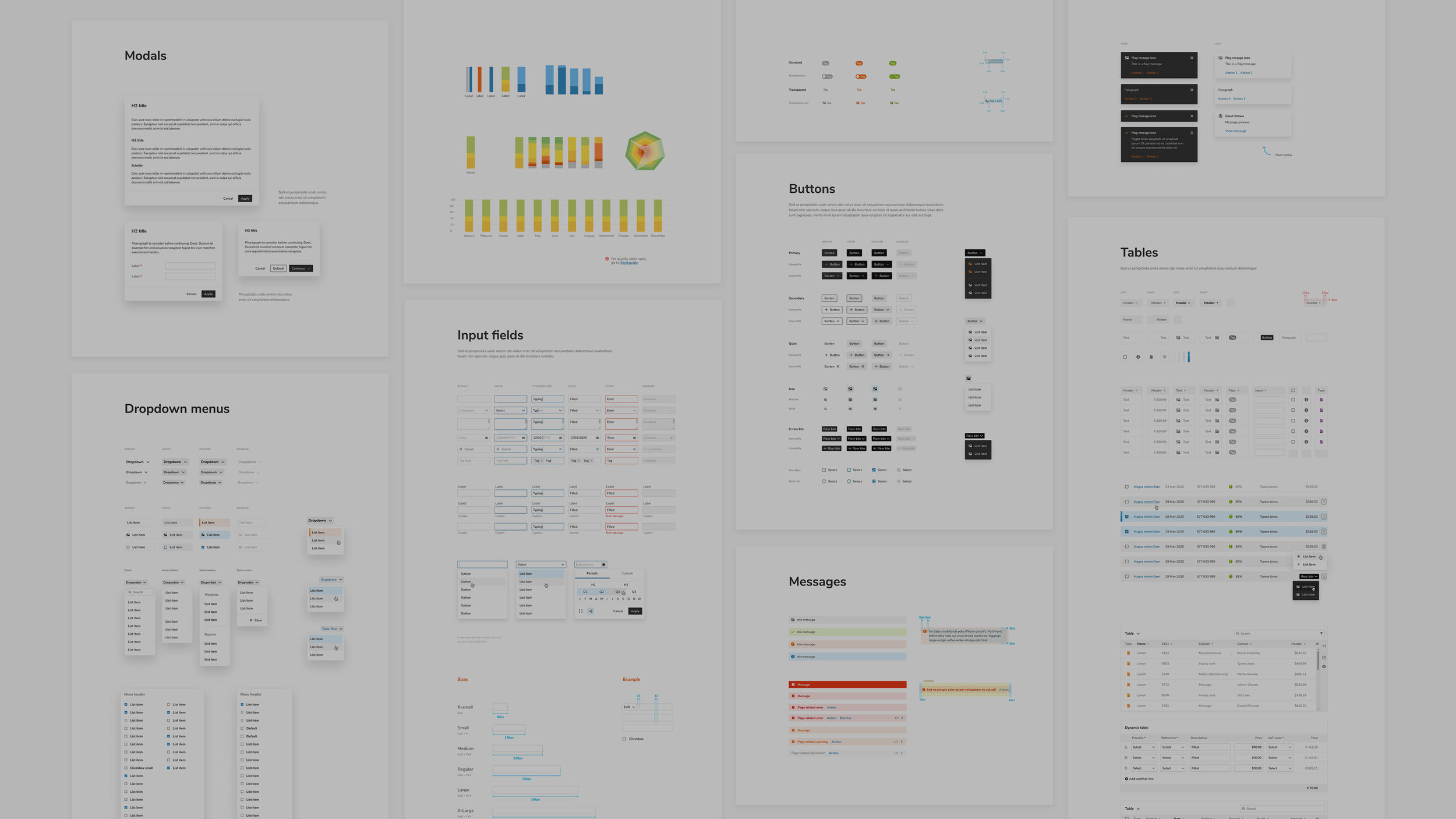
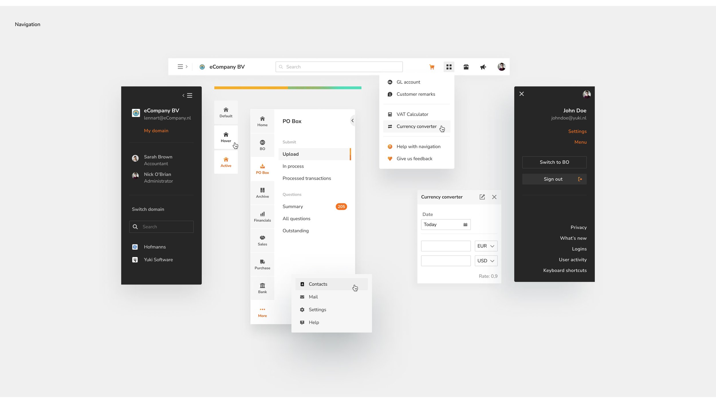
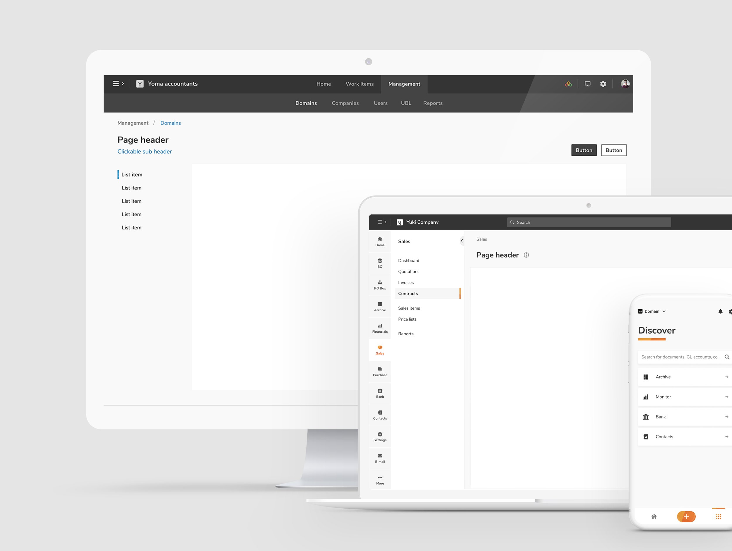
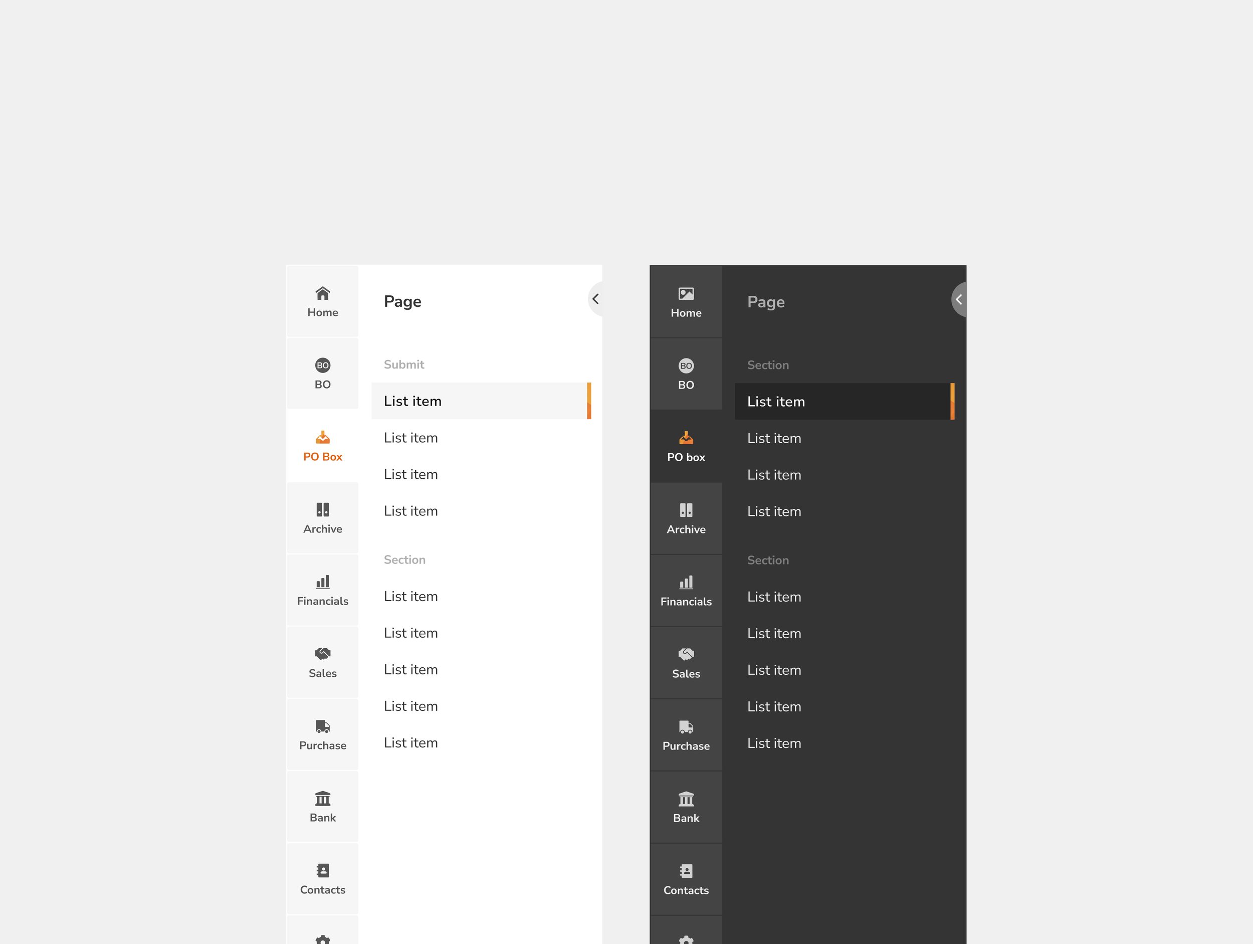
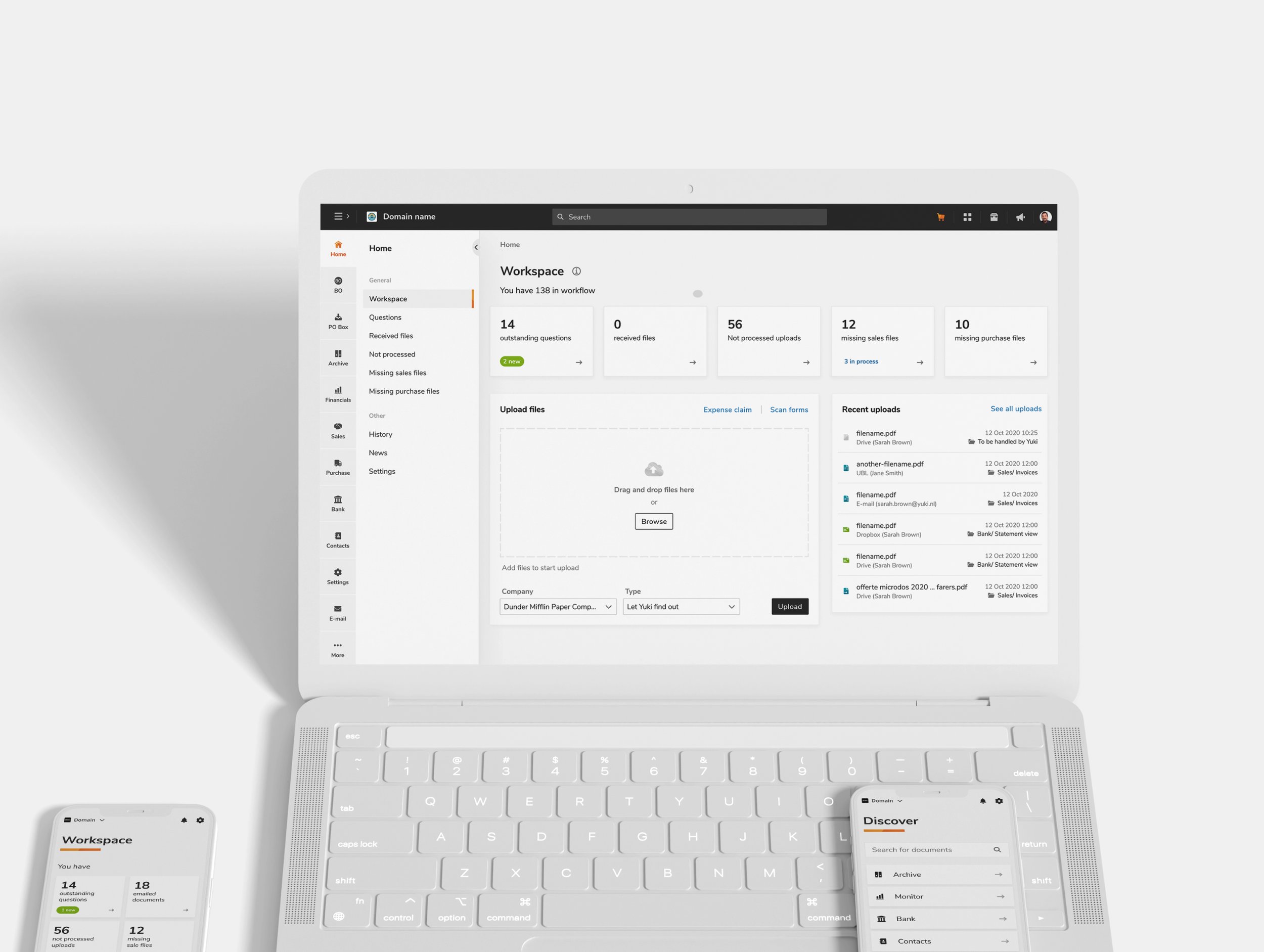
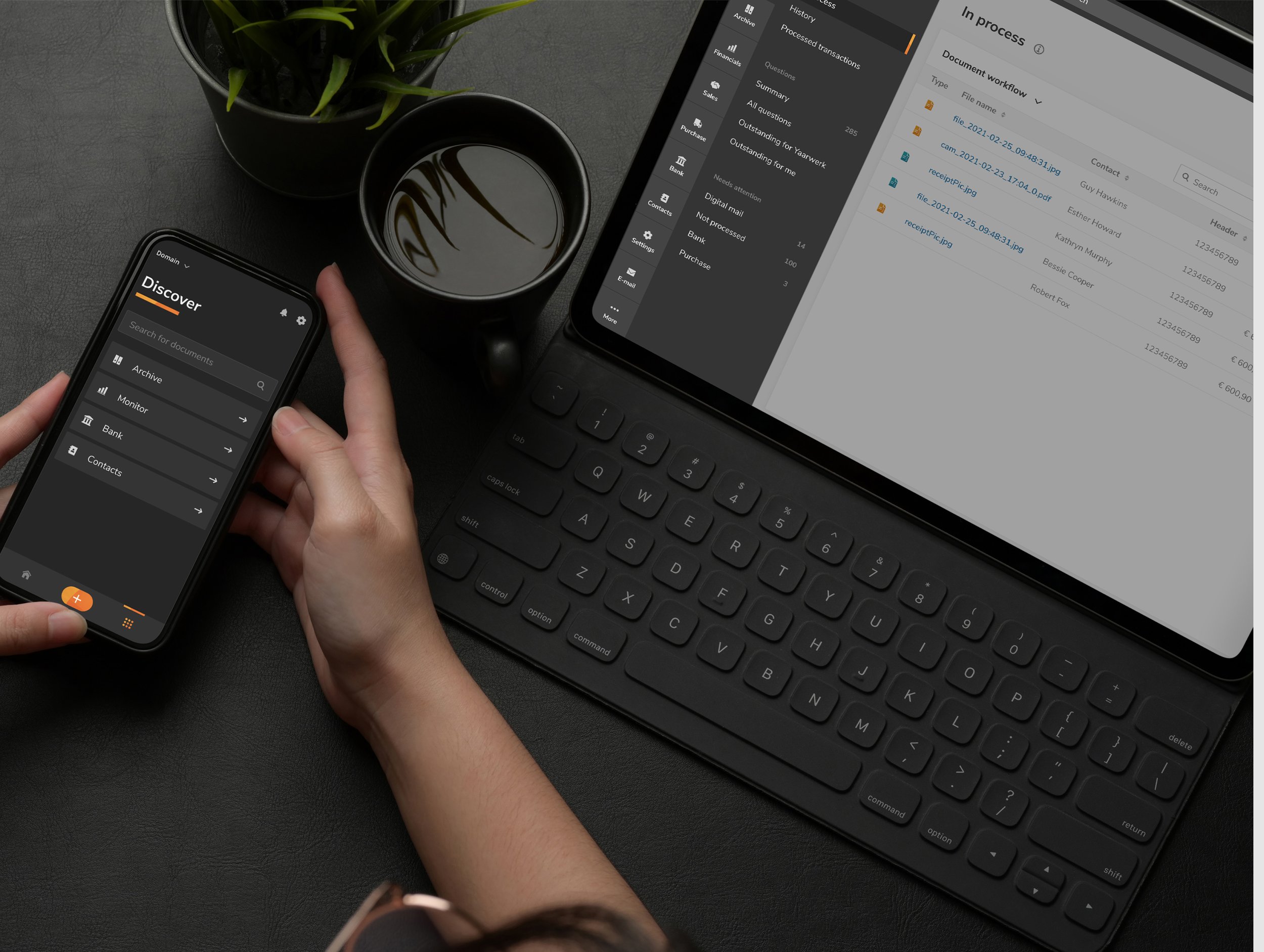
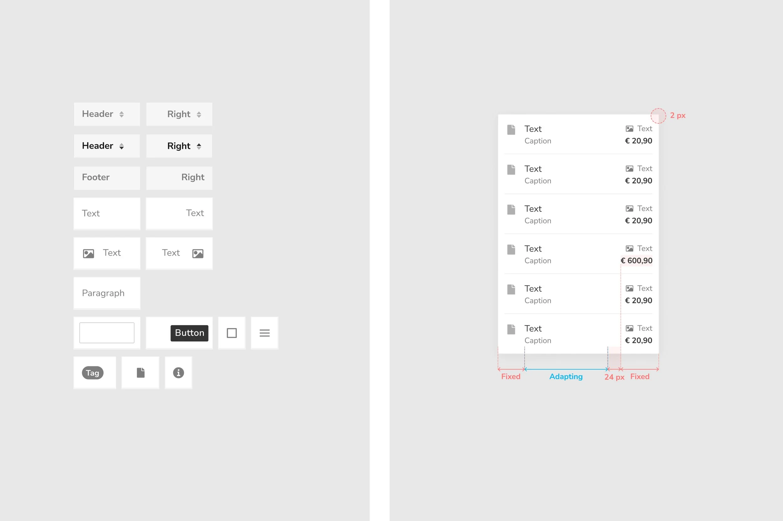
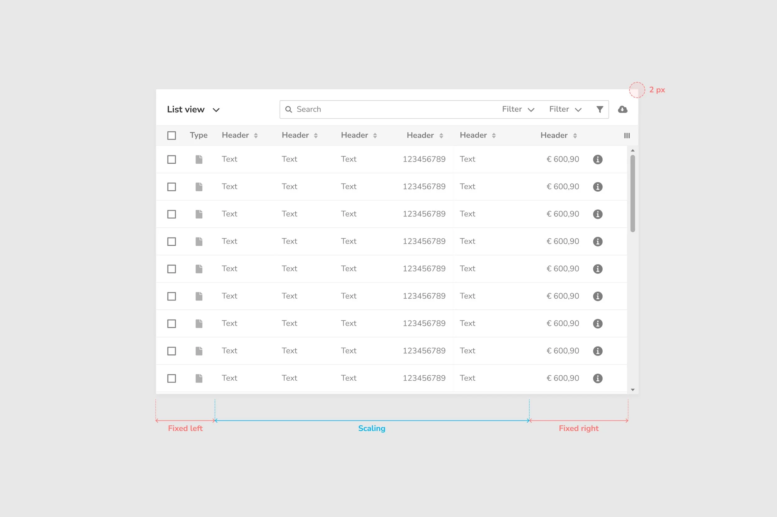
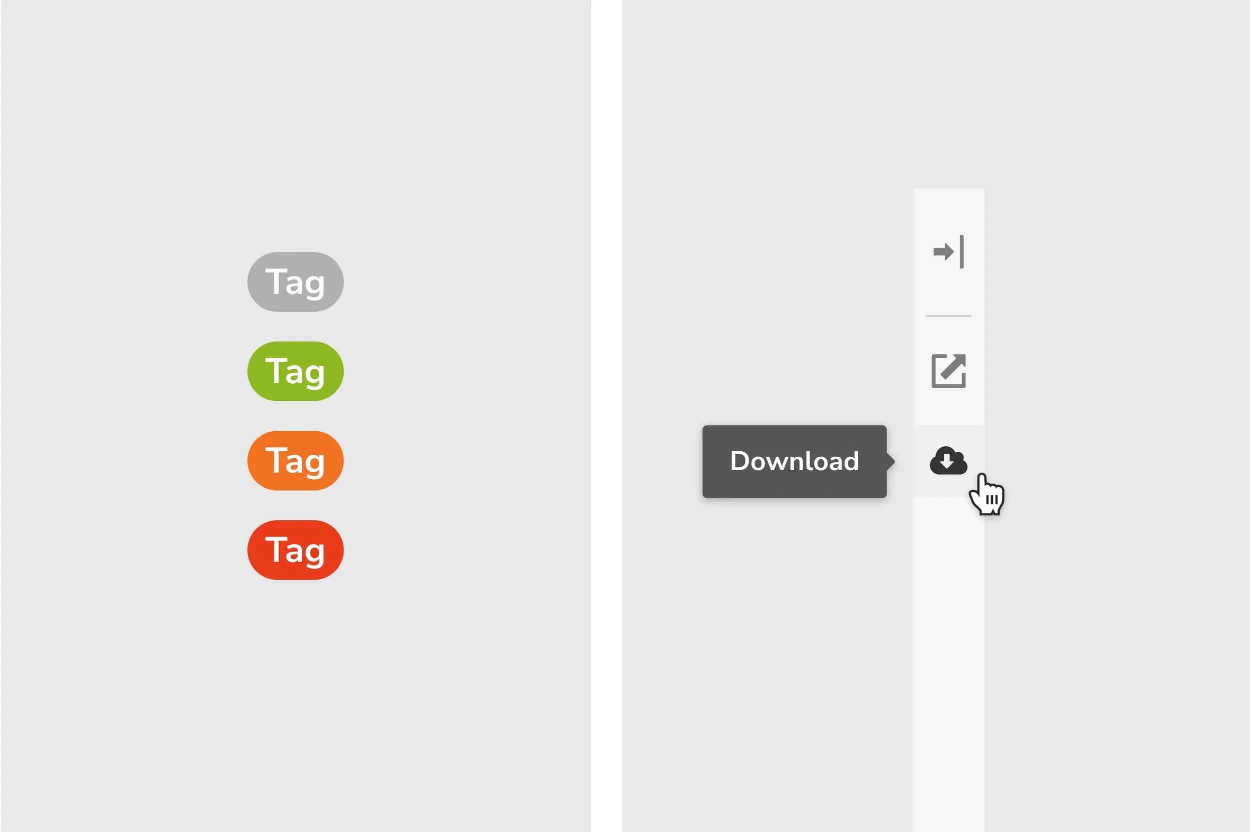
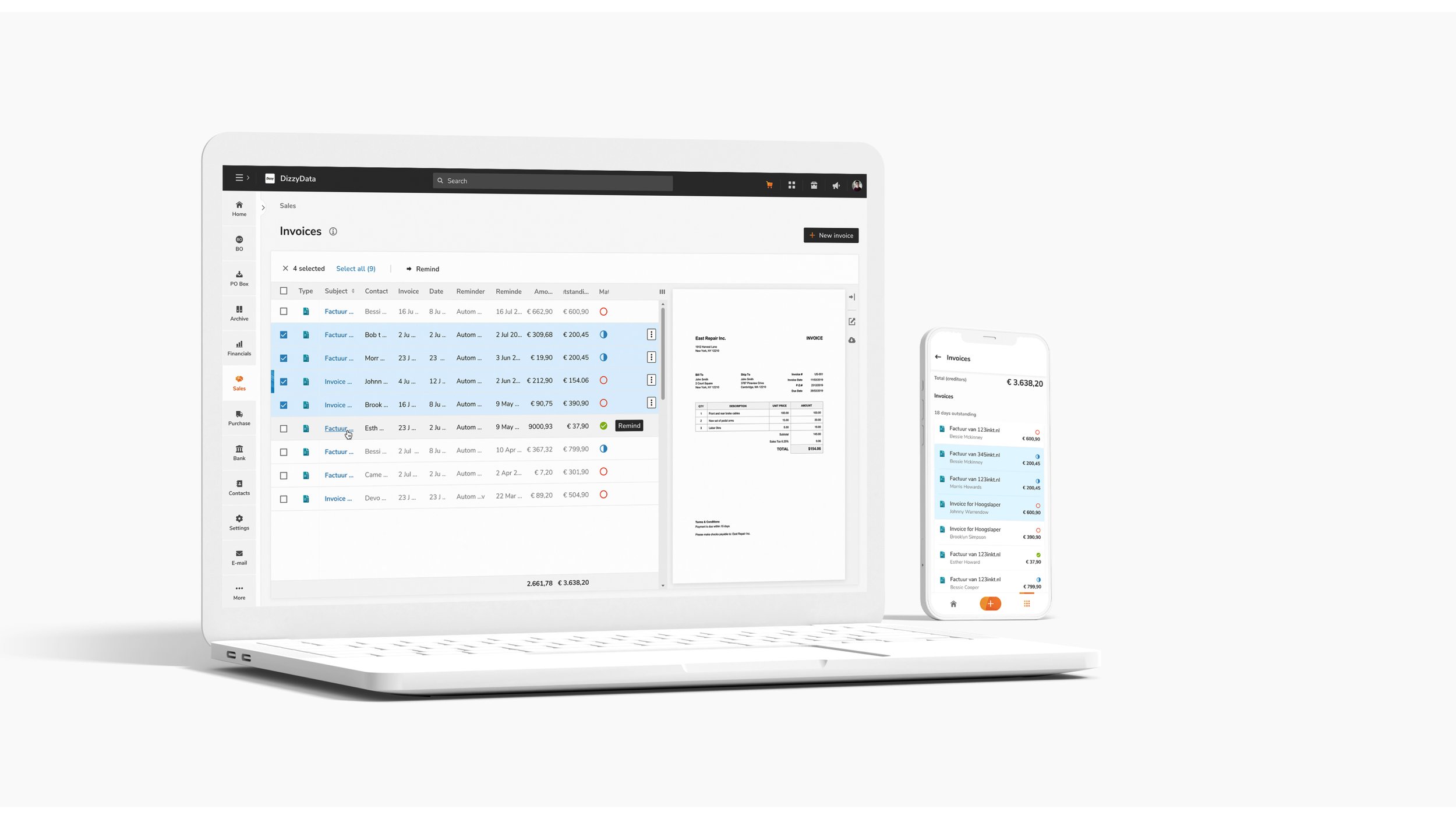
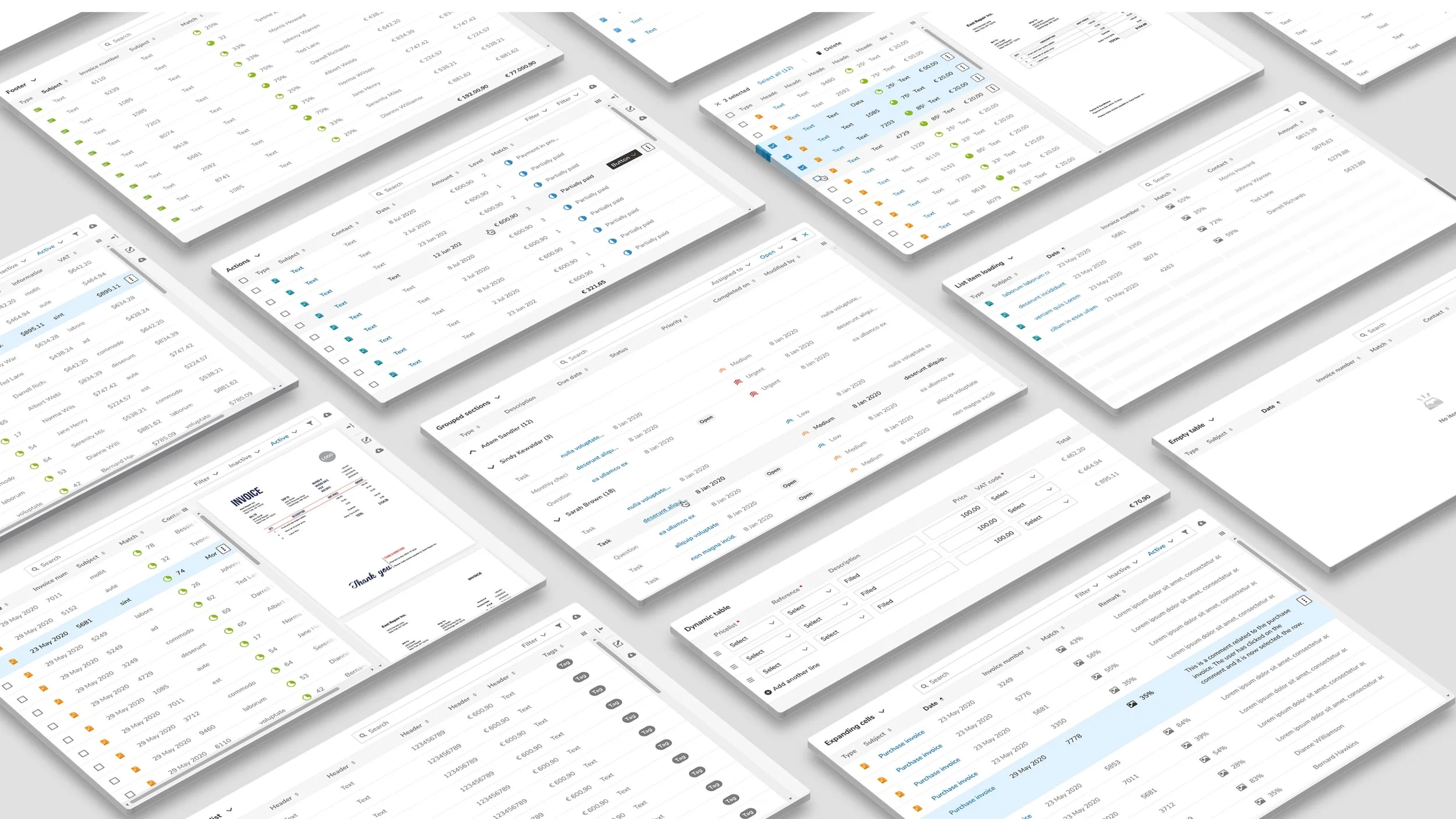
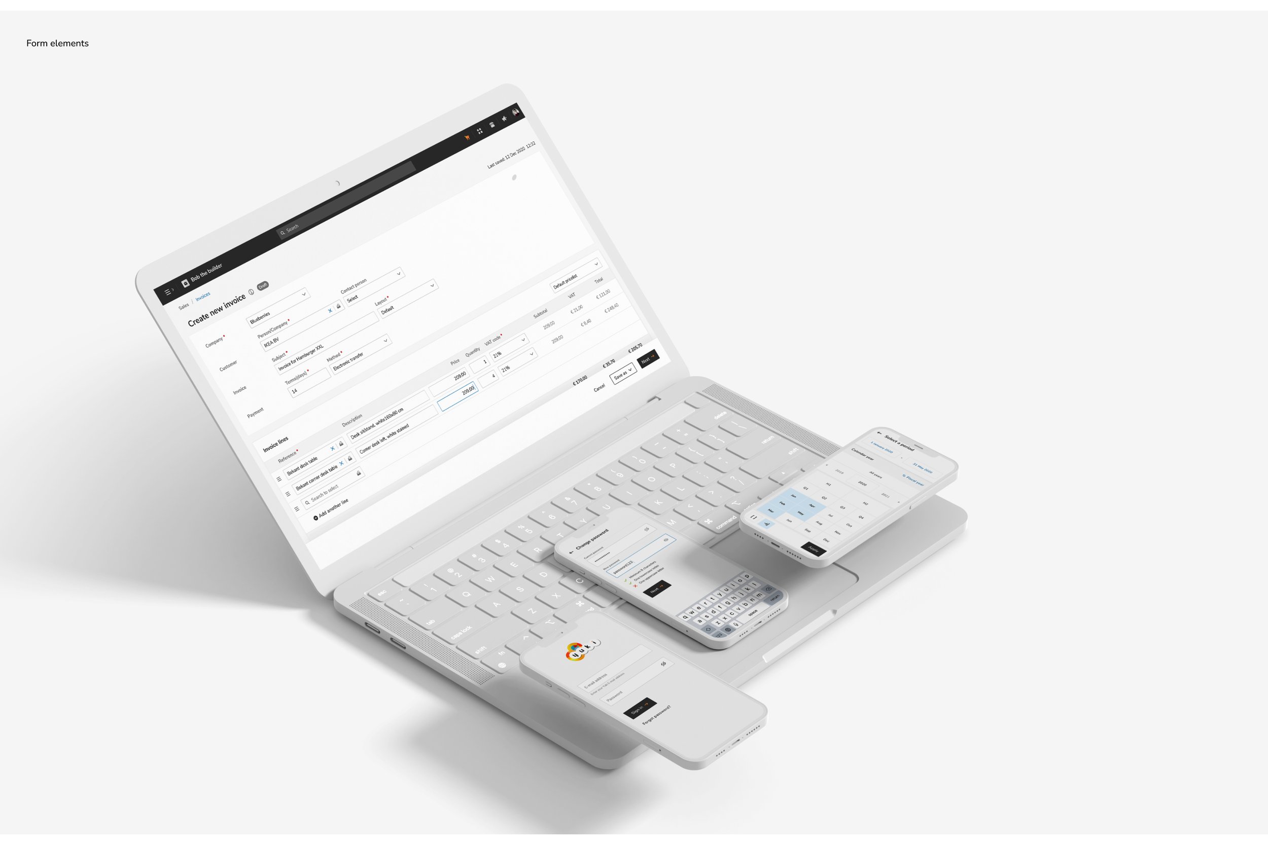
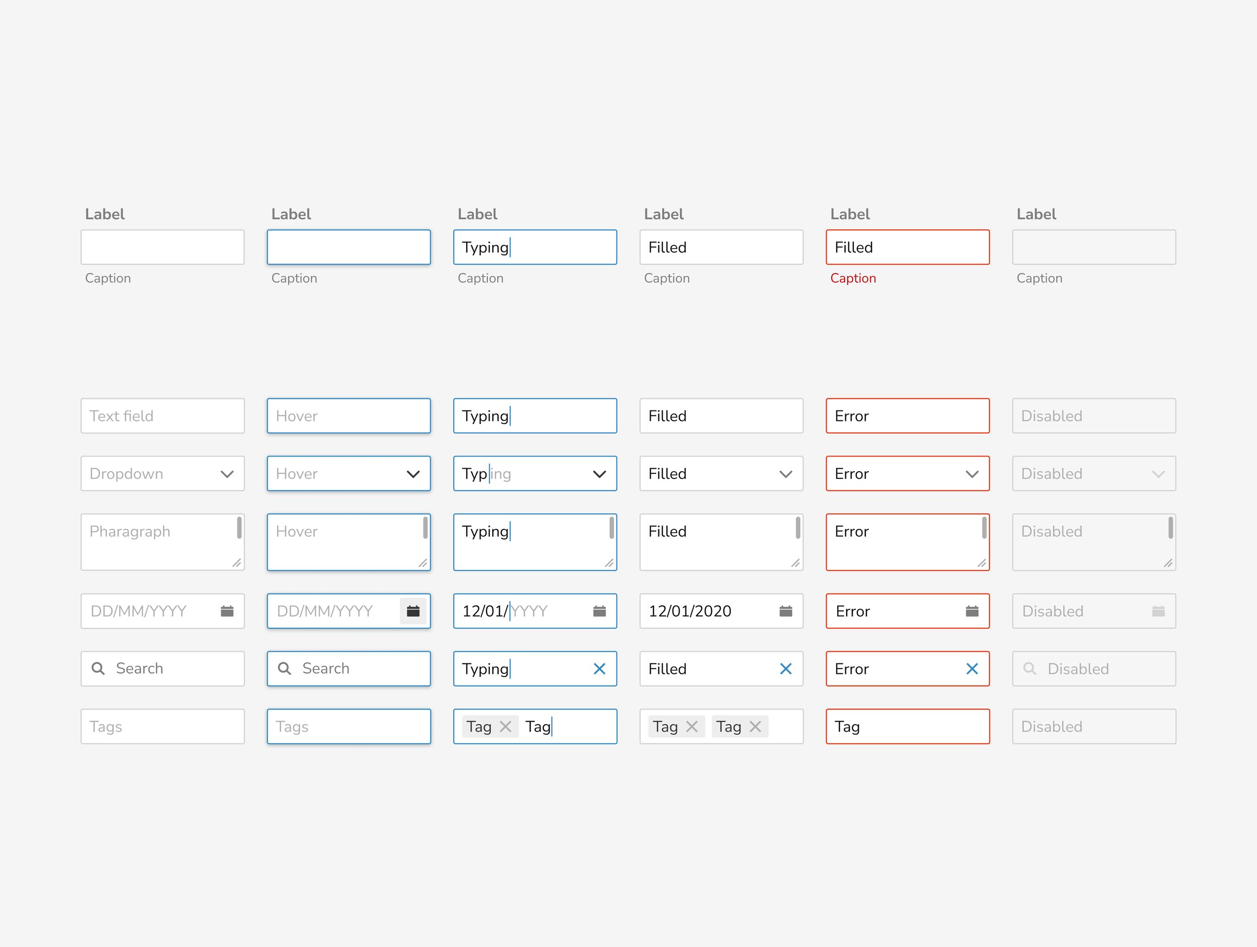
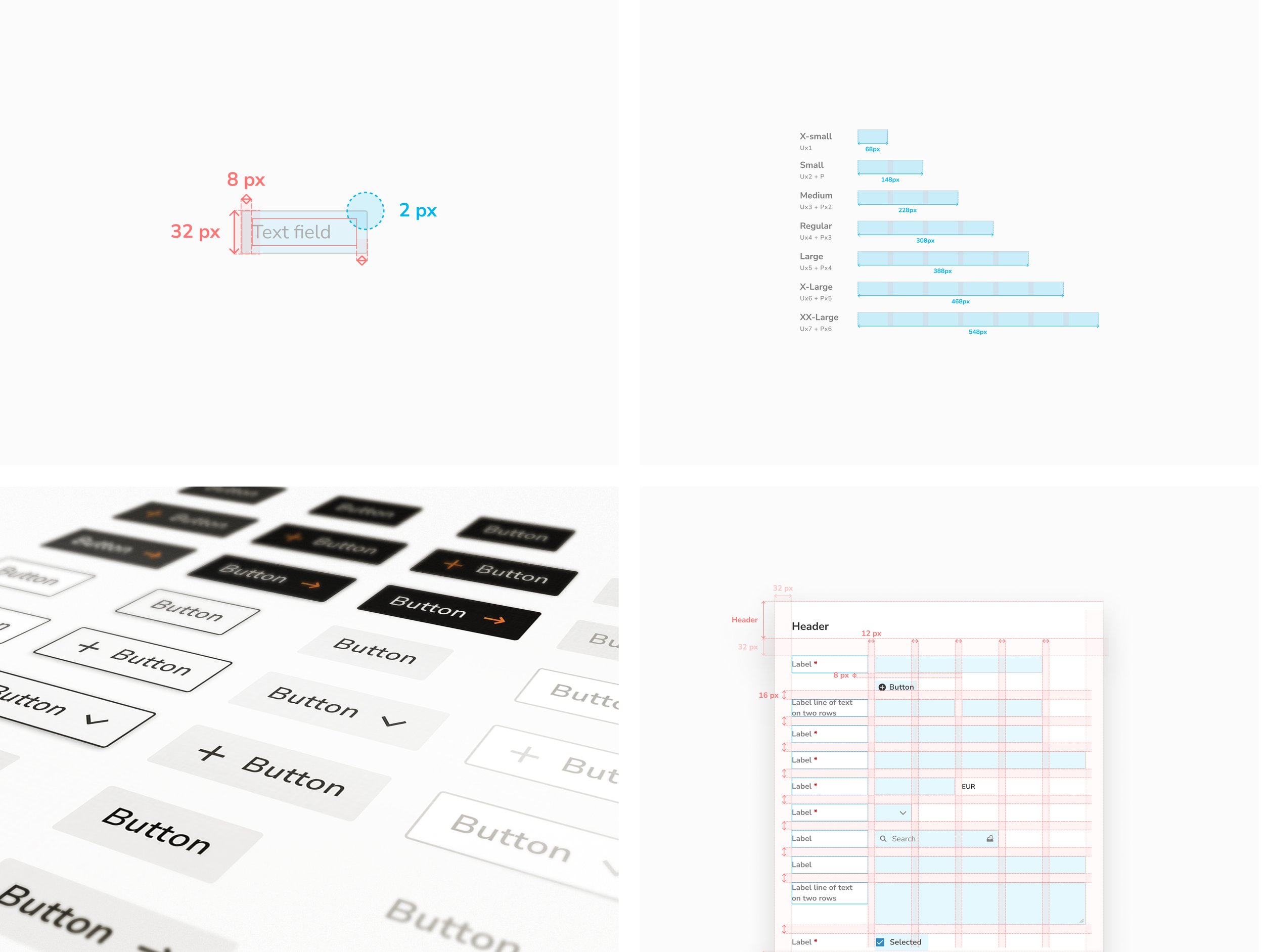
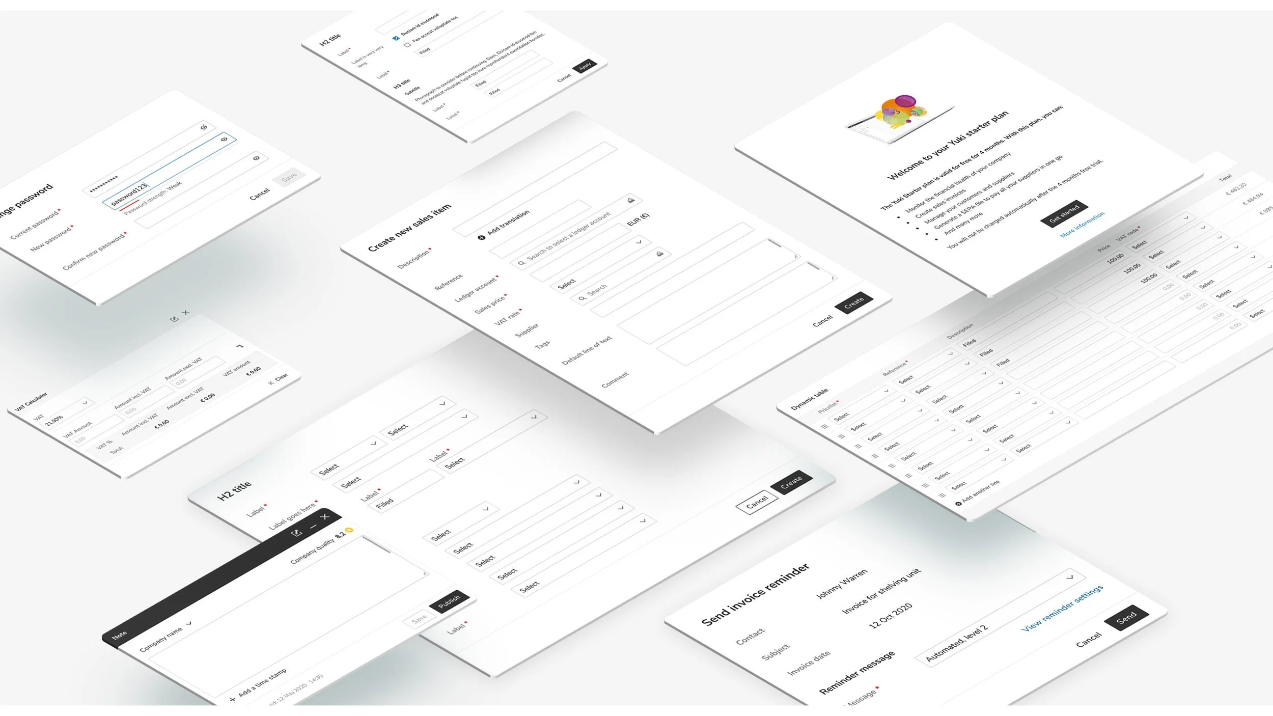
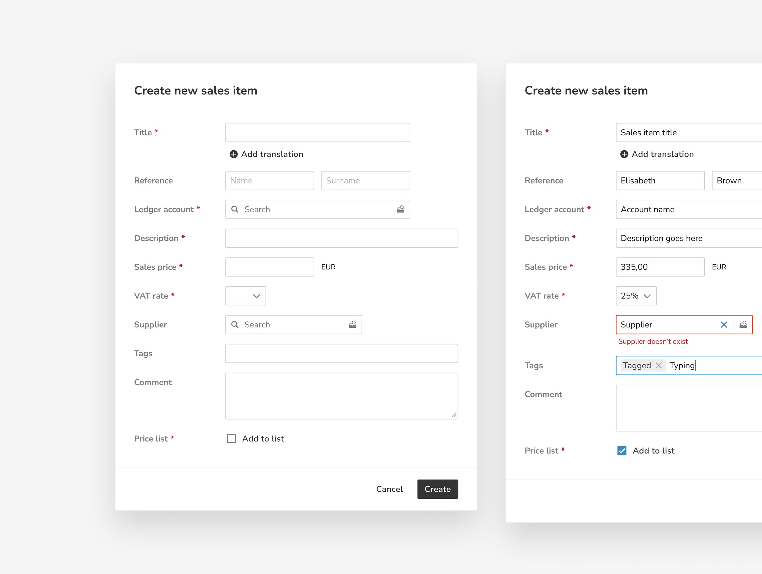
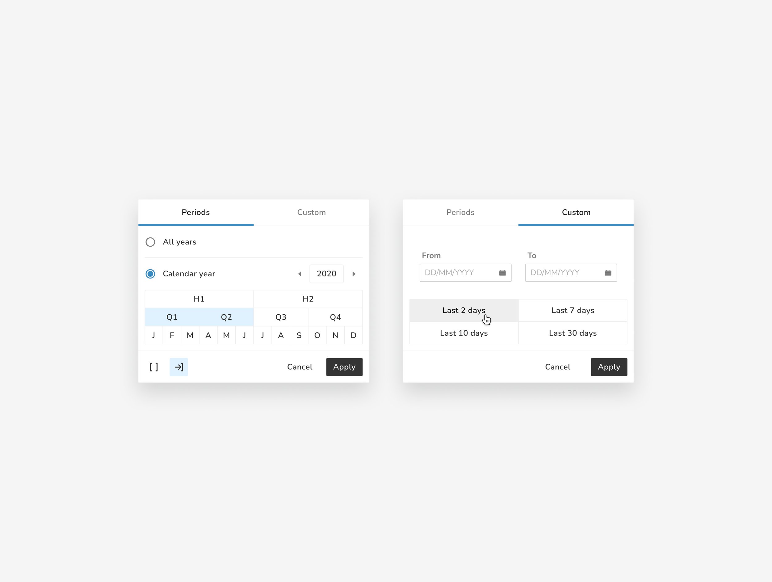
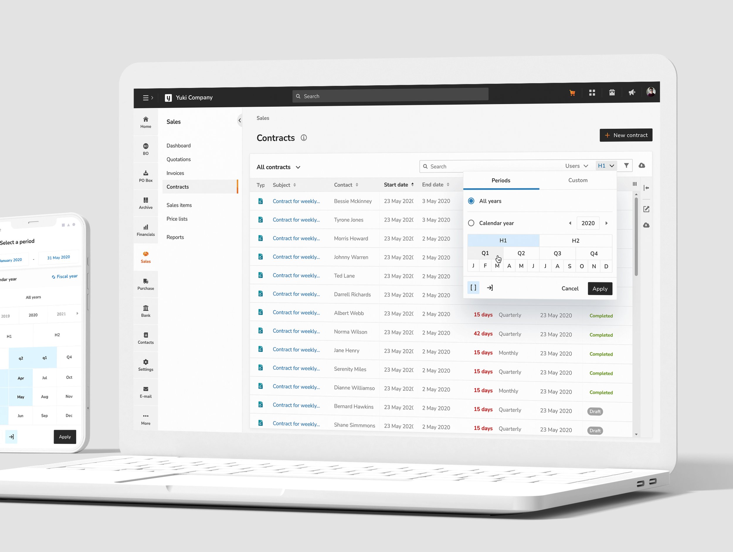
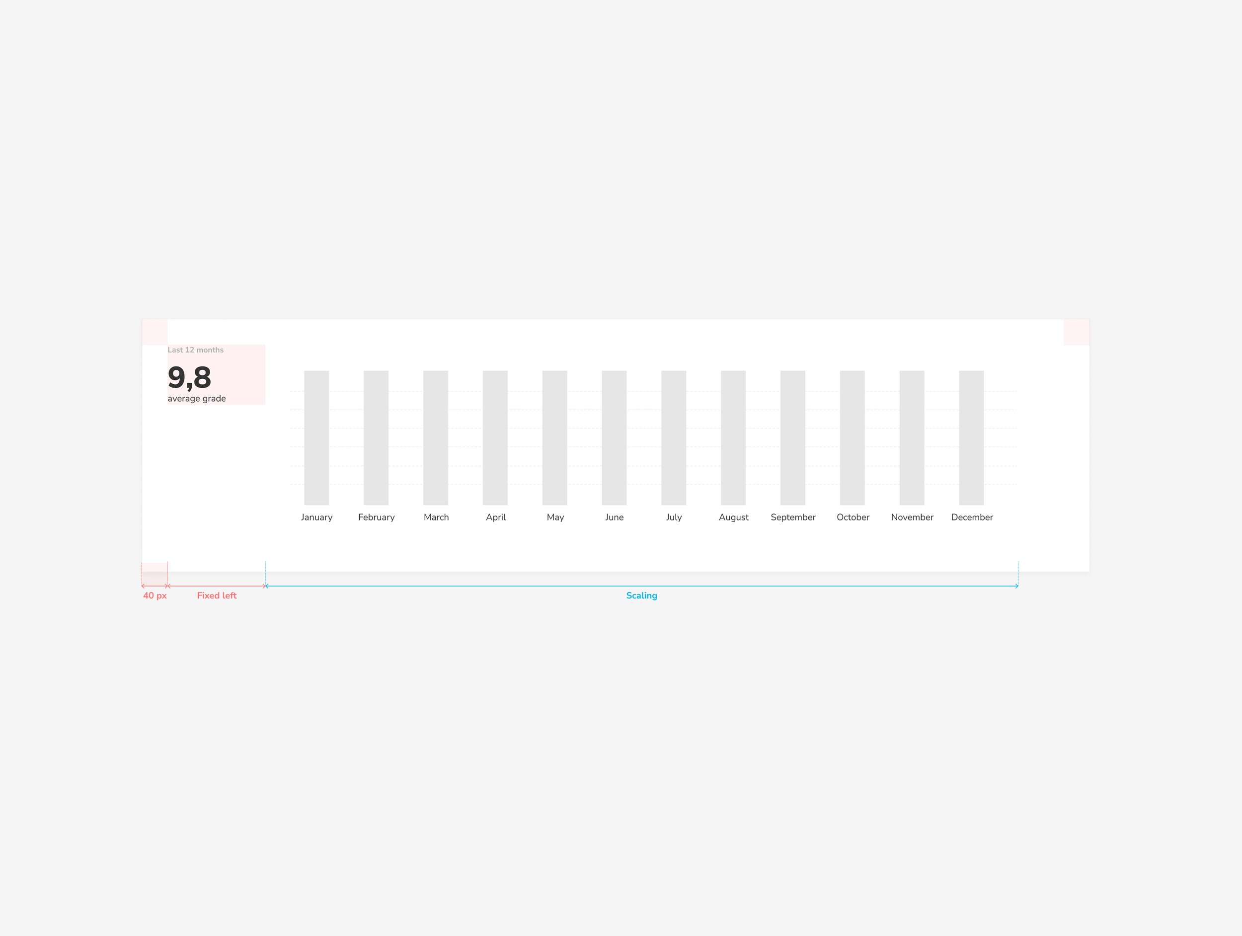
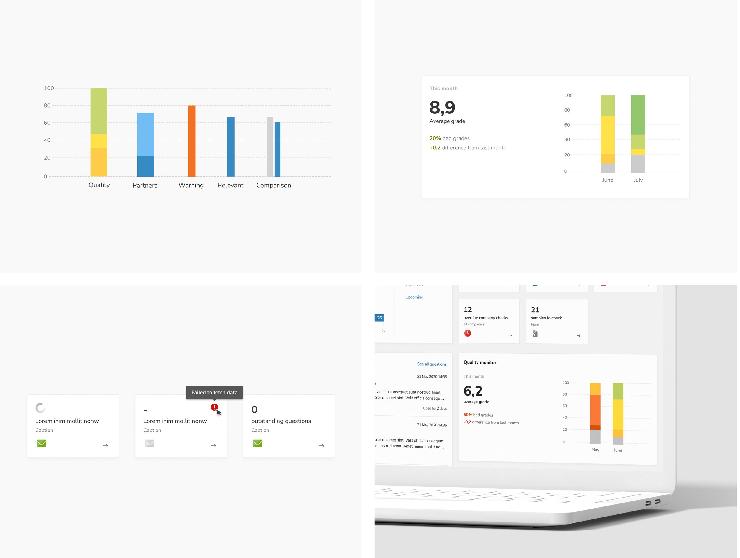
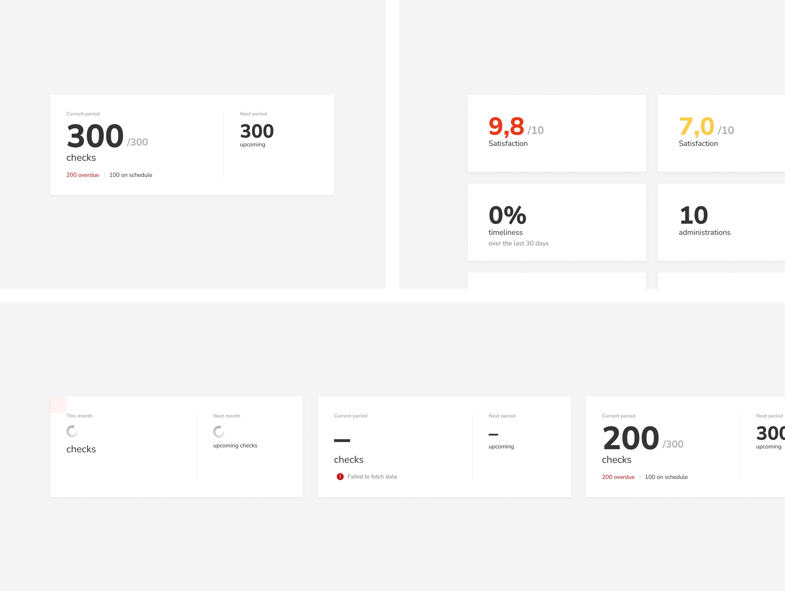
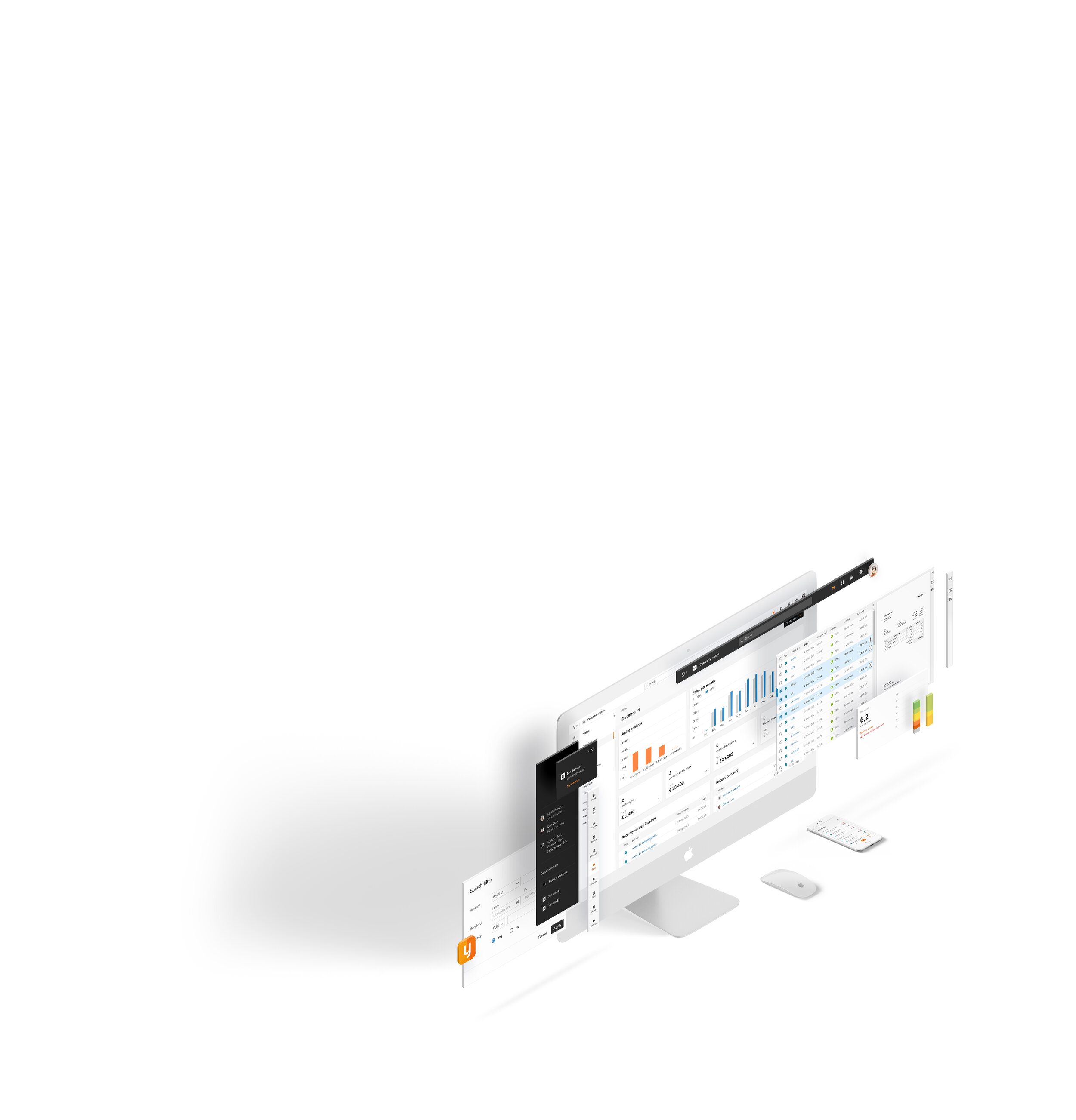
Deliverables: UI concept, styleguide, UI component library, screen templates and page design for desktop and mobile.
In collaboration with: Merve Orhan, Brianna Cohens, Wei Lun Chen, Marian Vijverberg and Kim Strigl.Assisting: Product owners and development team.
-
Inconsistent UI Elements: Disjointed styles and components created confusion and reduced efficiency for users.
Cluttered Interface: Redundant elements and an overload of visual information made it difficult for users to quickly locate and understand key functions.
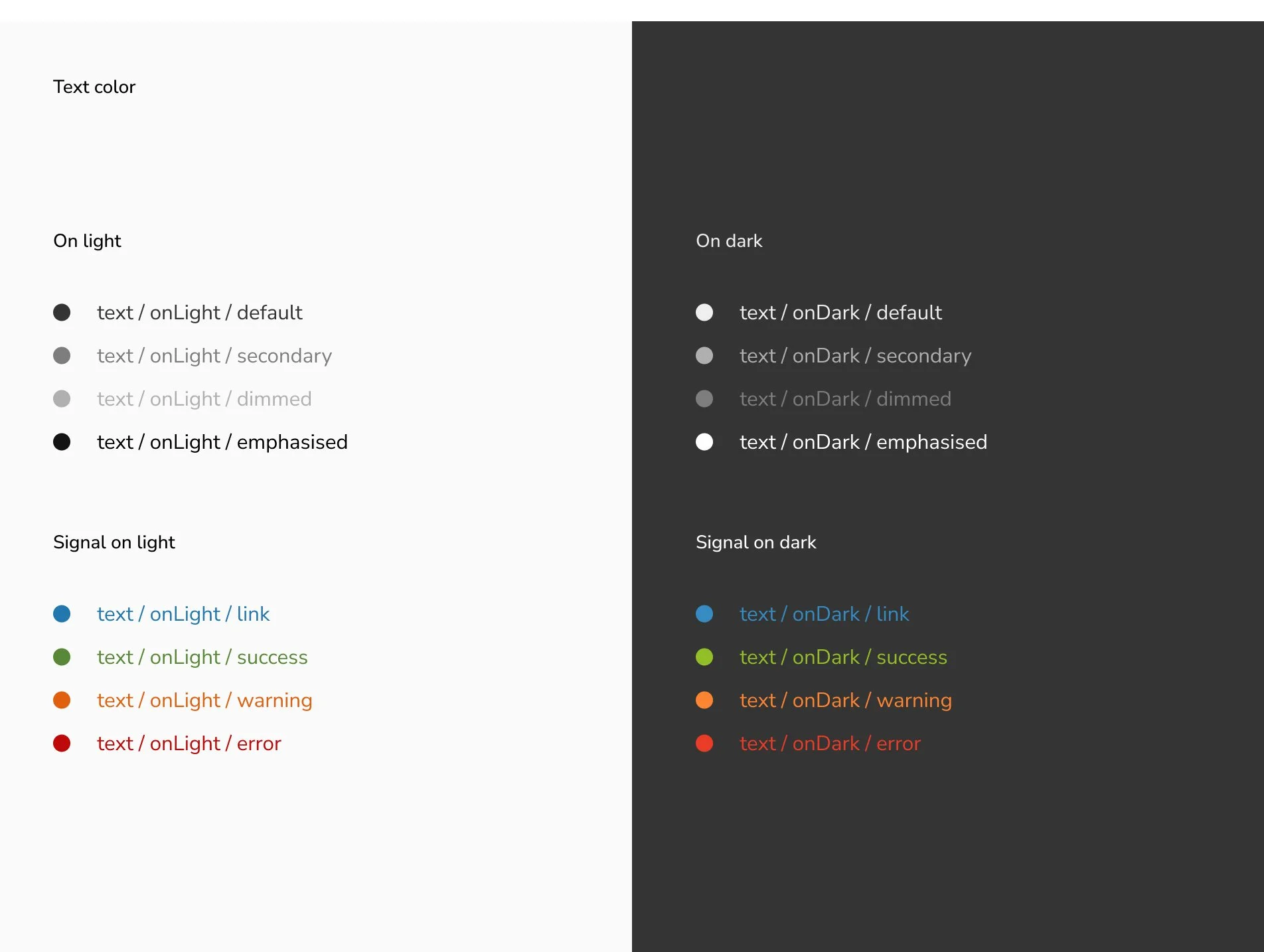
Lack of Accessibility: The existing platform did not fully support users with diverse needs, impacting usability and satisfaction.
Inefficiency in Design Updates: No unified design system meant creating or modifying components was time-consuming and inconsistent.
-
Increased Cognitive Load: Users were forced to spend more mental effort understanding inconsistent layouts and visual elements, reducing productivity.
Decreased User Confidence: Confusing and cluttered UI reduced user trust in the platform’s reliability.
Higher Learning Curve: New users struggled to get accustomed to the software due to the lack of clear, consistent design patterns.
Strategic approach
Description
-
Through collaboration with UX designers, developers, and product owners, key insights revealed:The need for a clean, modern interface aligned with Yuki’s brand identity.
Users desired clarity, consistency, and intuitive navigation to streamline their accounting tasks.
Accessibility improvements were critical for ensuring inclusivity across Yuki’s diverse user base.
-
Atomic Design Methodology: Adopted to build a scalable design system, ensuring consistency from core styles to complex layouts.
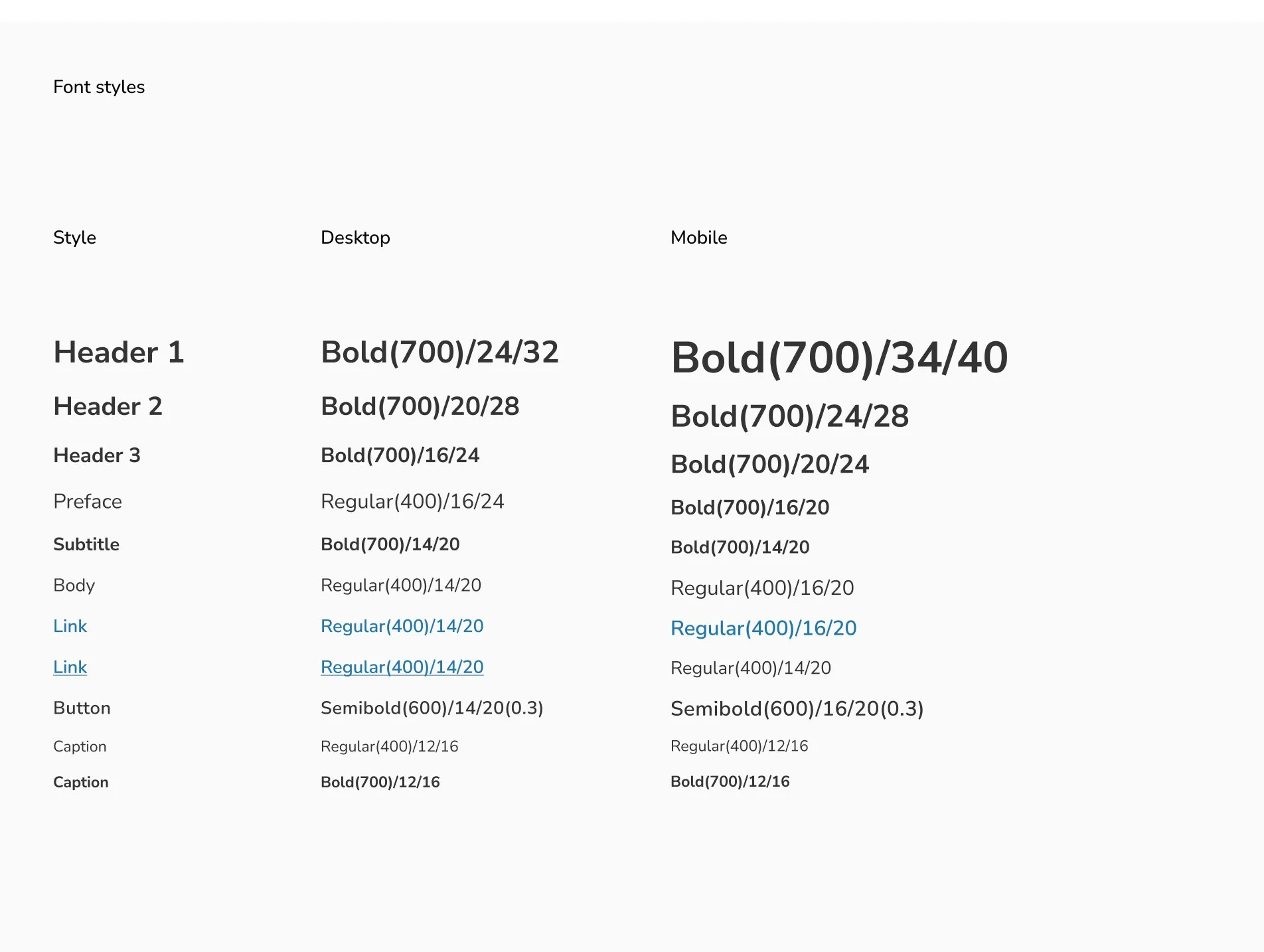
Focus on Clarity and Accessibility: Simplified visual hierarchy, clear typography, and inclusive design principles.
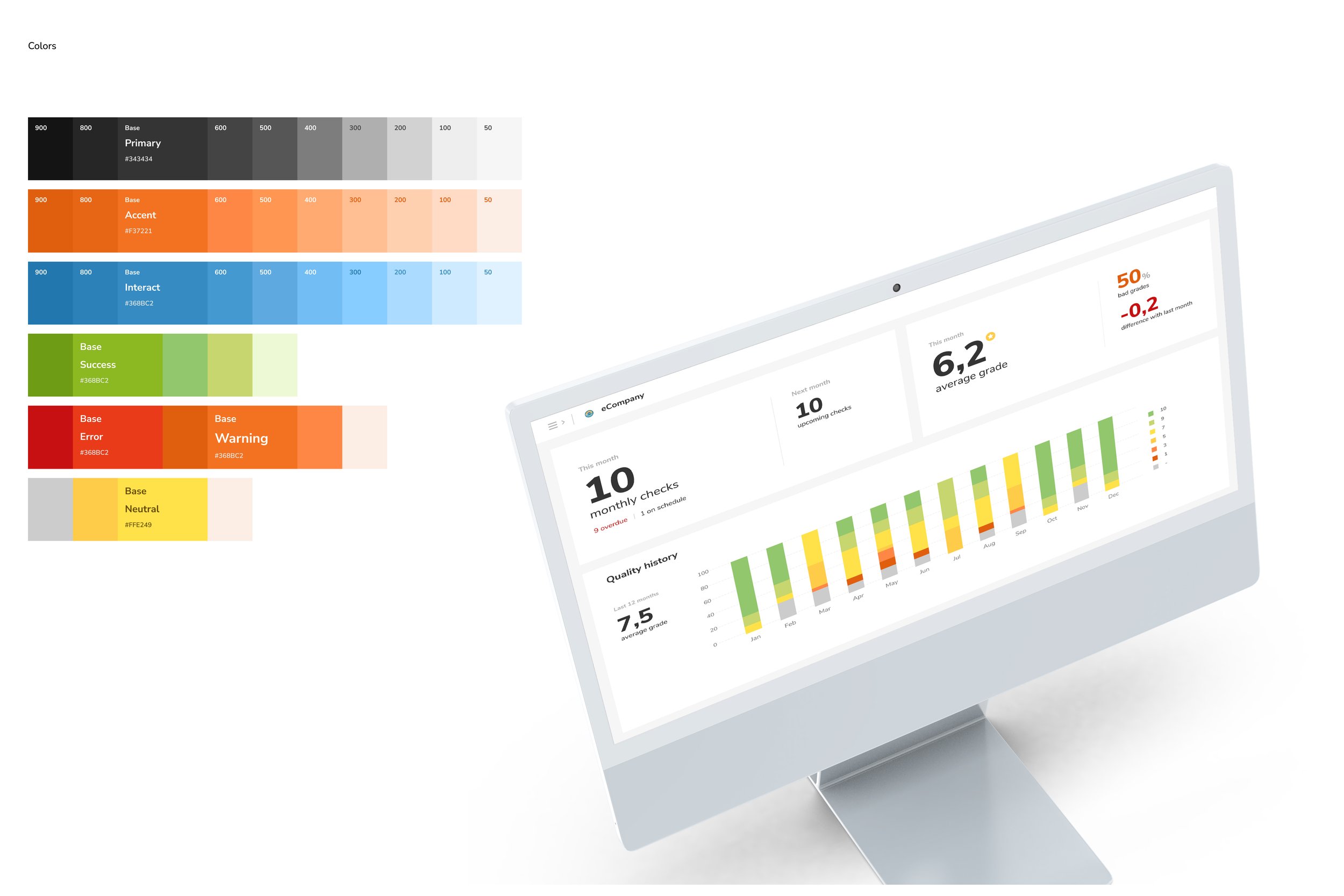
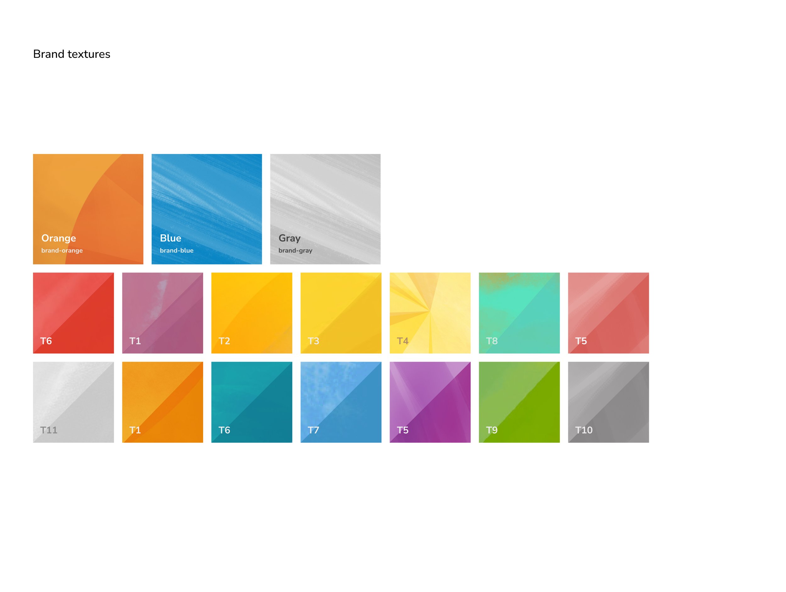
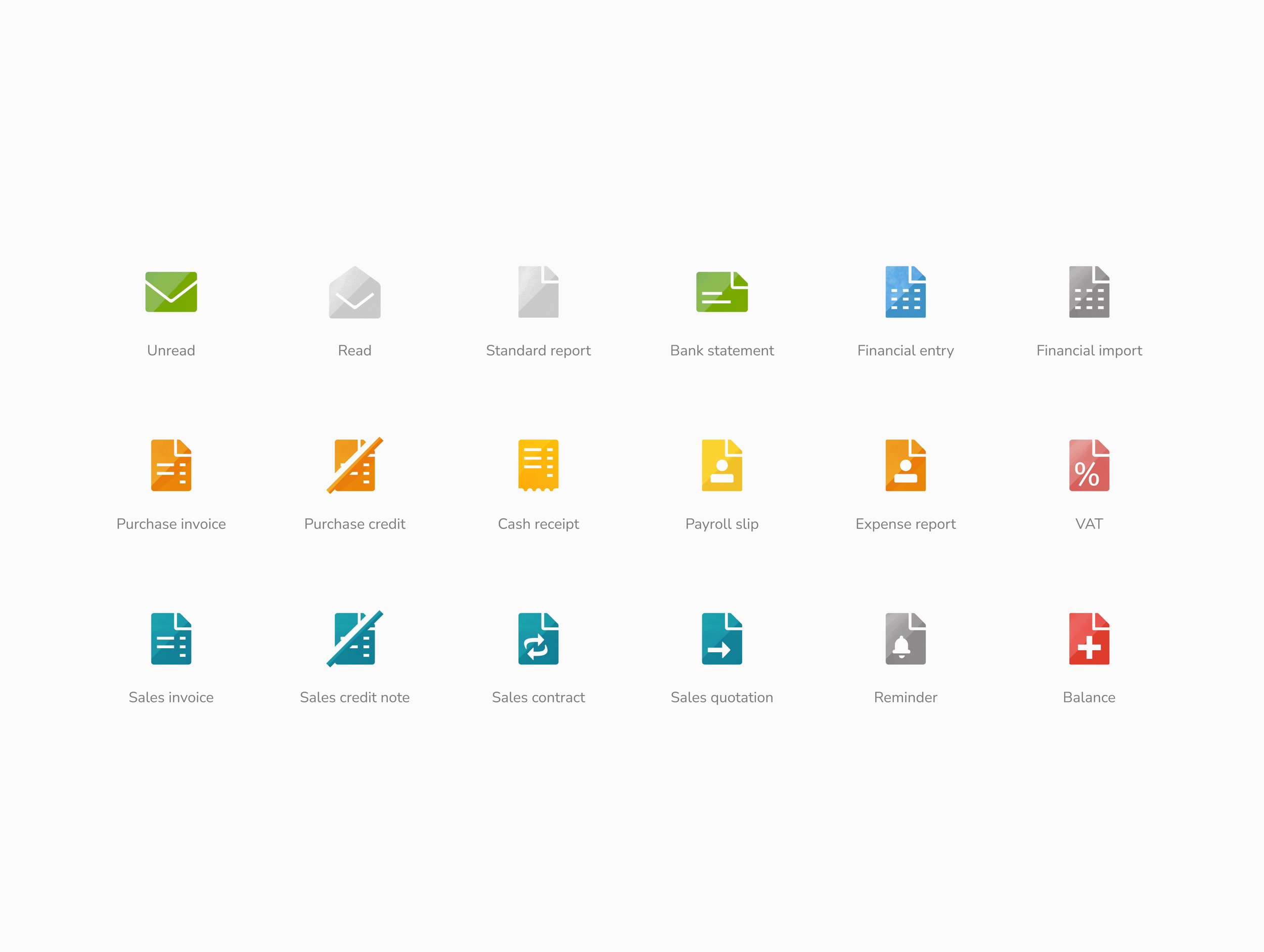
Brand Alignment: Integrated modern colors, typefaces, and iconography that resonated with Yuki’s identity and user expectations.
-
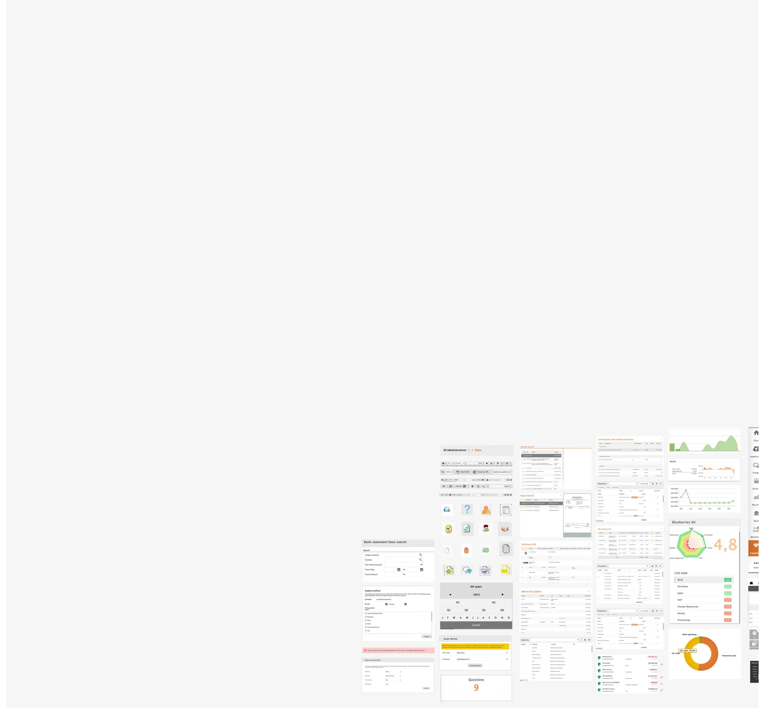
Audit: Analyzed the existing design components, identifying inconsistencies and areas of improvement.
Moodboarding: Created visual direction concepts based on user needs, brand guidelines, and technical constraints.
Exploration: Designed initial concepts, iterating based on stakeholder feedback and usability testing.
Wireframing: Collaborating with UX designers, developed wireframes to map out new layouts and structures.
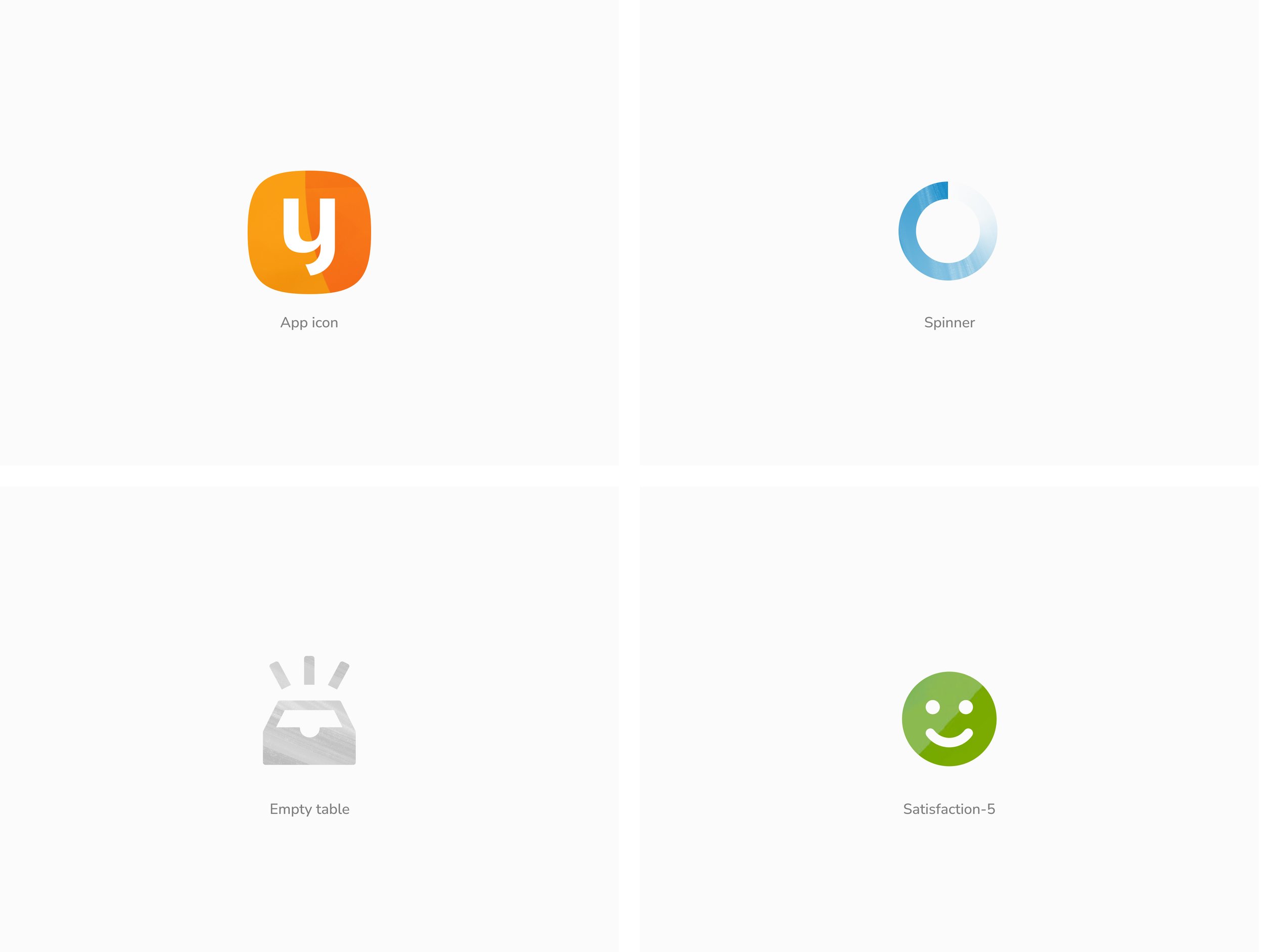
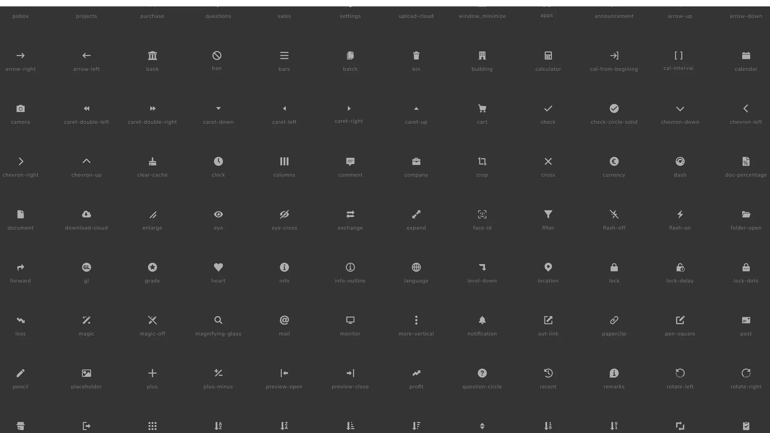
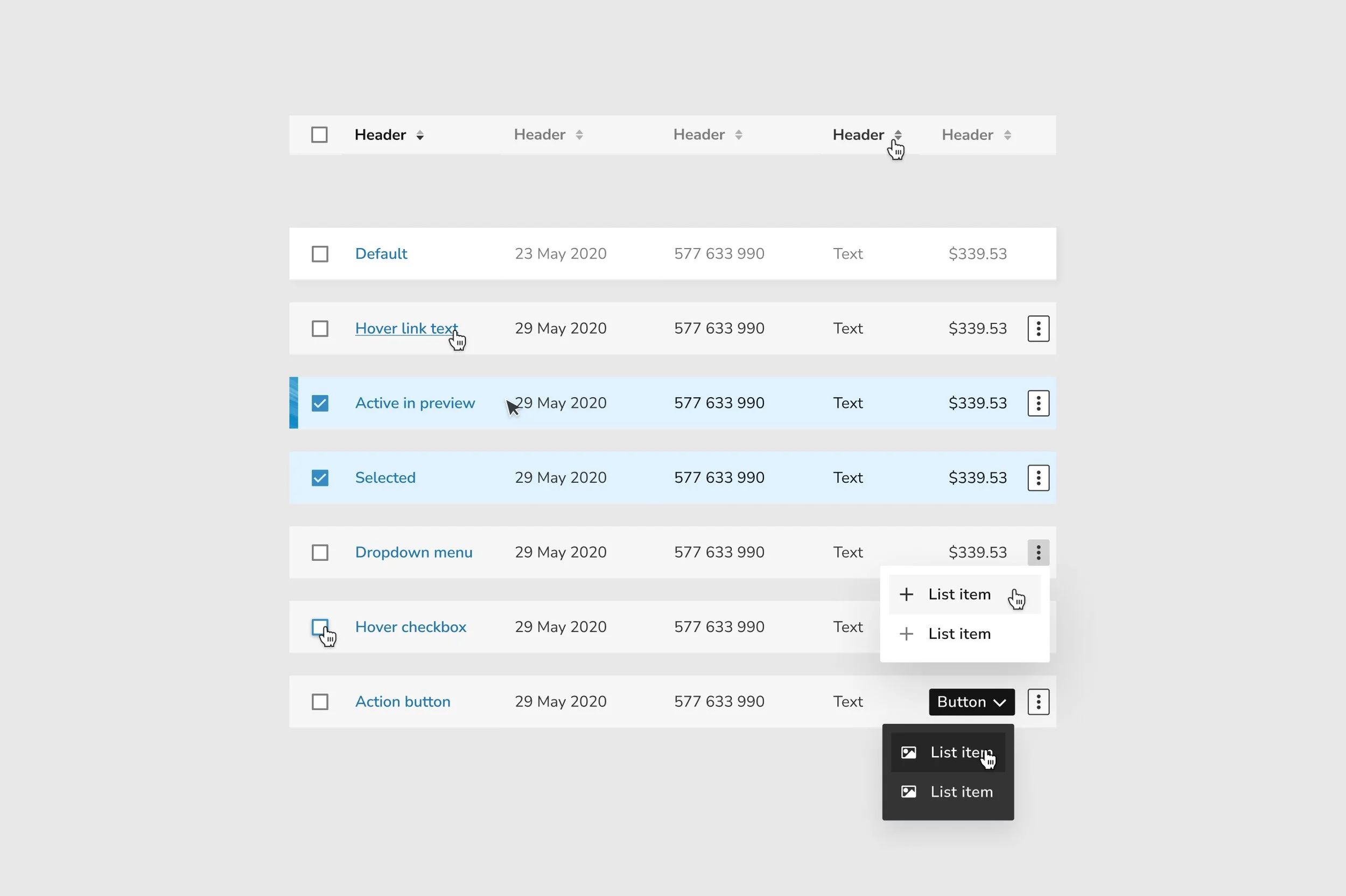
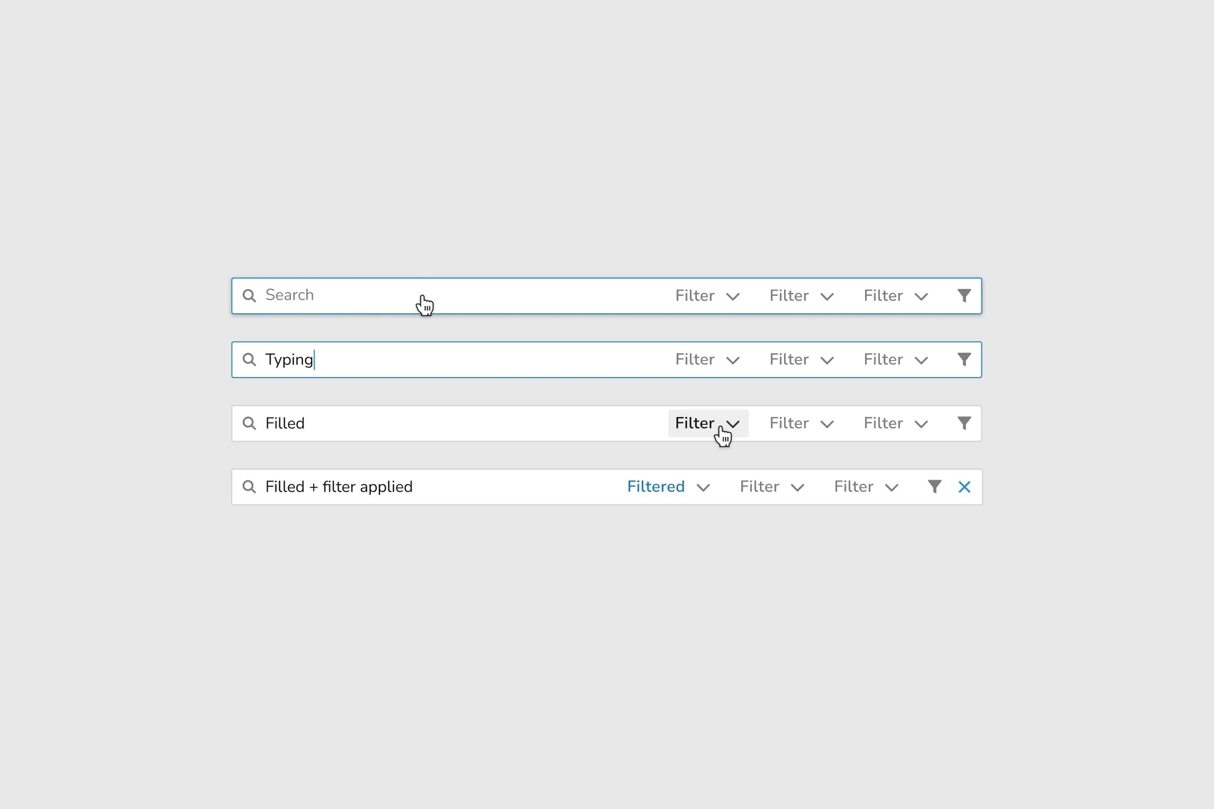
Final UI Design: Created high-fidelity prototypes, including new core styles, component designs, iconography, and illustrations.
Goals
Yuki should feel like a smart, reliable, and enjoyable partner that supports users effectively, freeing them to focus on what truly matters.
-
Our goal is to make Yuki a smart, reliable, and enjoyable platform by focusing on:
Convenient: Easy to use, seamlessly fits into users’ daily flow.
Innovative: Leverages modern technology to stay ahead of needs.
Unburdening: Reduces effort and simplifies tasks.
Friendly: Notifies users only when necessary, minimizing disruptions.
Trustworthy: Provides accurate data users can rely on.
Effective: Helps users work efficiently and feel in control.
Enjoyable: Makes tasks satisfying and keeps users coming back.
Personal: Shows only relevant, tailored information.
Clear: Easy to understand and navigate.
-
Atomic Design Methodology: Adopted to build a scalable design system, ensuring consistency from core styles to complex layouts.
Focus on Clarity and Accessibility: Simplified visual hierarchy, clear typography, and inclusive design principles.
Brand Alignment: Integrated modern colors, typefaces, and iconography that resonated with Yuki’s identity and user expectations.
-
Audit: Analyzed the existing design components, identifying inconsistencies and areas of improvement.
Moodboarding: Created visual direction concepts based on user needs, brand guidelines, and technical constraints.
Exploration: Designed initial concepts, iterating based on stakeholder feedback and usability testing.
Wireframing: Collaborating with UX designers, developed wireframes to map out new layouts and structures.
Final UI Design: Created high-fidelity prototypes, including new core styles, component designs, iconography, and illustrations.
Results
Description
-
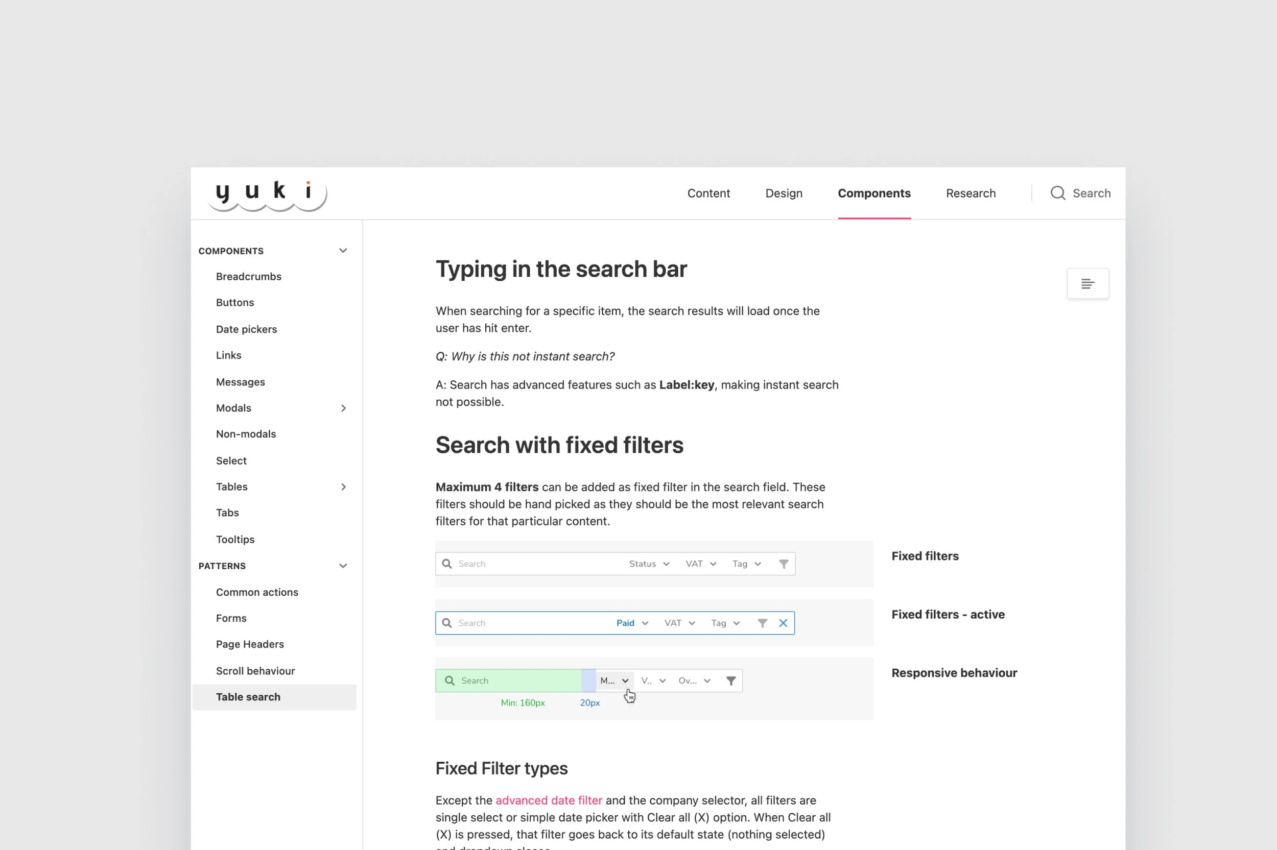
Streamlined Design Processes: The design system reduced time spent on creating and updating components, boosting efficiency for designers and developers.
Faster Implementation: A unified library enabled developers to implement designs with greater speed and consistency.
-
Consistent Visual Language: The new design system ensured that all components adhered to the same style rules, eliminating inconsistencies.
Maintainable Libraries: Clear documentation and structured libraries facilitated ongoing maintenance and scalability.
-
Enhanced Clarity: Simplified and de-cluttered interfaces made navigation intuitive and tasks easier to complete.
Accessible Design: Improvements in accessibility supported a broader range of users, improving satisfaction and usability.
User Confidence: Consistent and modern visuals reinforced user trust in the platform.

