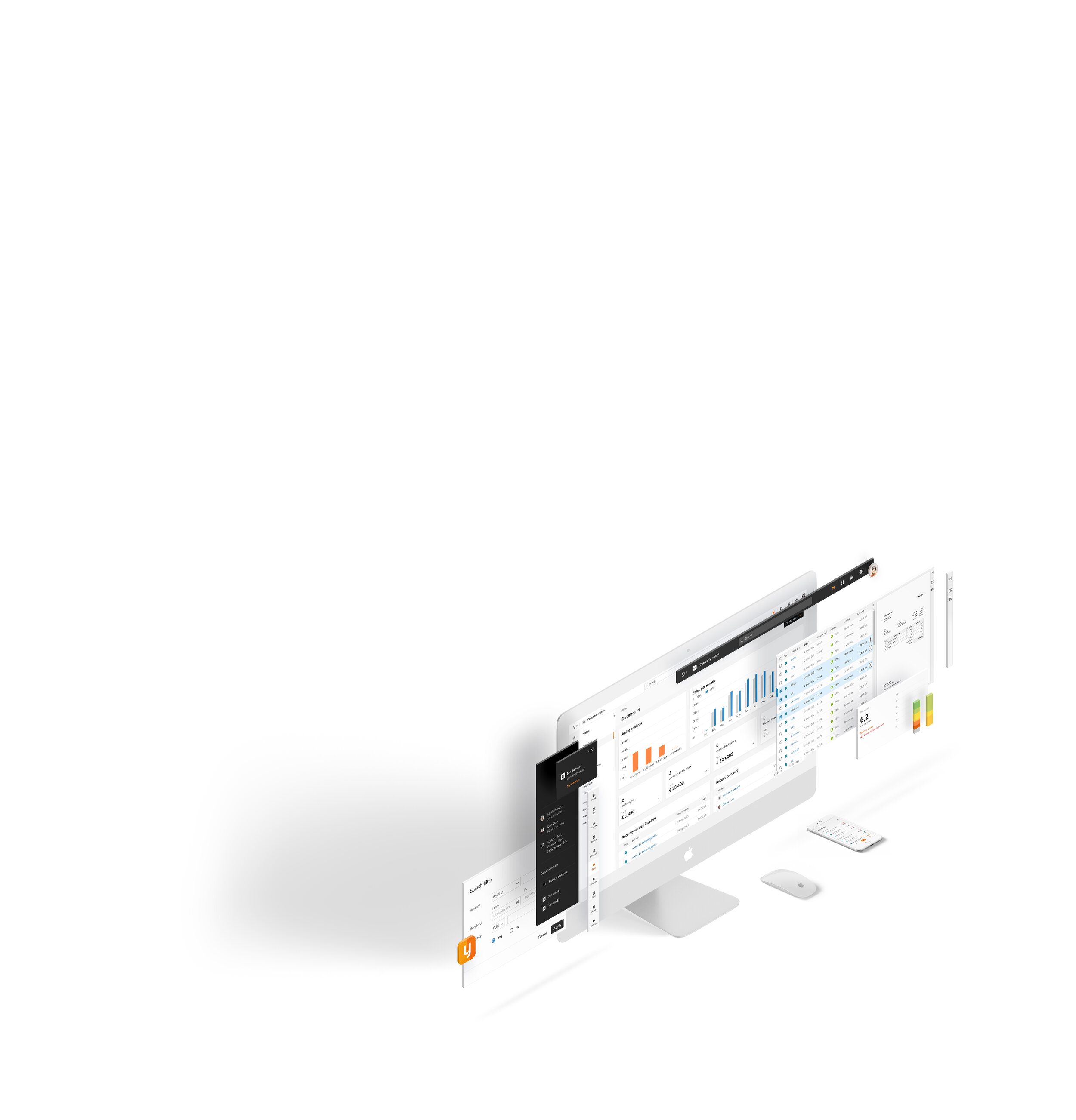
work /
Yuki Accounting
Redesigning Yuki: A Modular Design System to Make Accounting Easy, Intuitive, and Enjoyable
UI concept, Design System, Component Library
Visma | Yuki, Rotterdam Netherlands
About Yuki
Yuki is a cloud-based accounting platform designed to streamline bookkeeping for SMEs and accounting firms across the Netherlands, Belgium, and Spain. By automating key financial tasks, Yuki delivers real-time financial insights, invoice tracking, and document management. Tailored to simplify accounting processes, it empowers users with enhanced financial oversight and improved operational efficiency.
The challenge
Yuki faced a significant challenge during an ambitious code migration project. The mission was to enhance the user interface and user experience to modernize the platform and create a scalable, consistent design system. This required designing a solution that addressed usability, consistency, and accessibility while catering to developers across multiple countries.
Company: Visma | Yuki, Rotterdam Netherlands
My role: UI designer
Deliverables: I developed the UI concept, style guide, and component libraries, screen templates and page design for desktop and mobile. Ensured everything was scalable, organized, efficient, and built to last.
Design in collaboration with: Merve Orhan, Brianna Cohens, Wei Lun Chen, Marian Vijverberg and Kim Strigl.

The problem
The old platform had a few issues with its UI:
Inconsistent Design: Layouts were cluttered, and elements didn’t match across different screens.
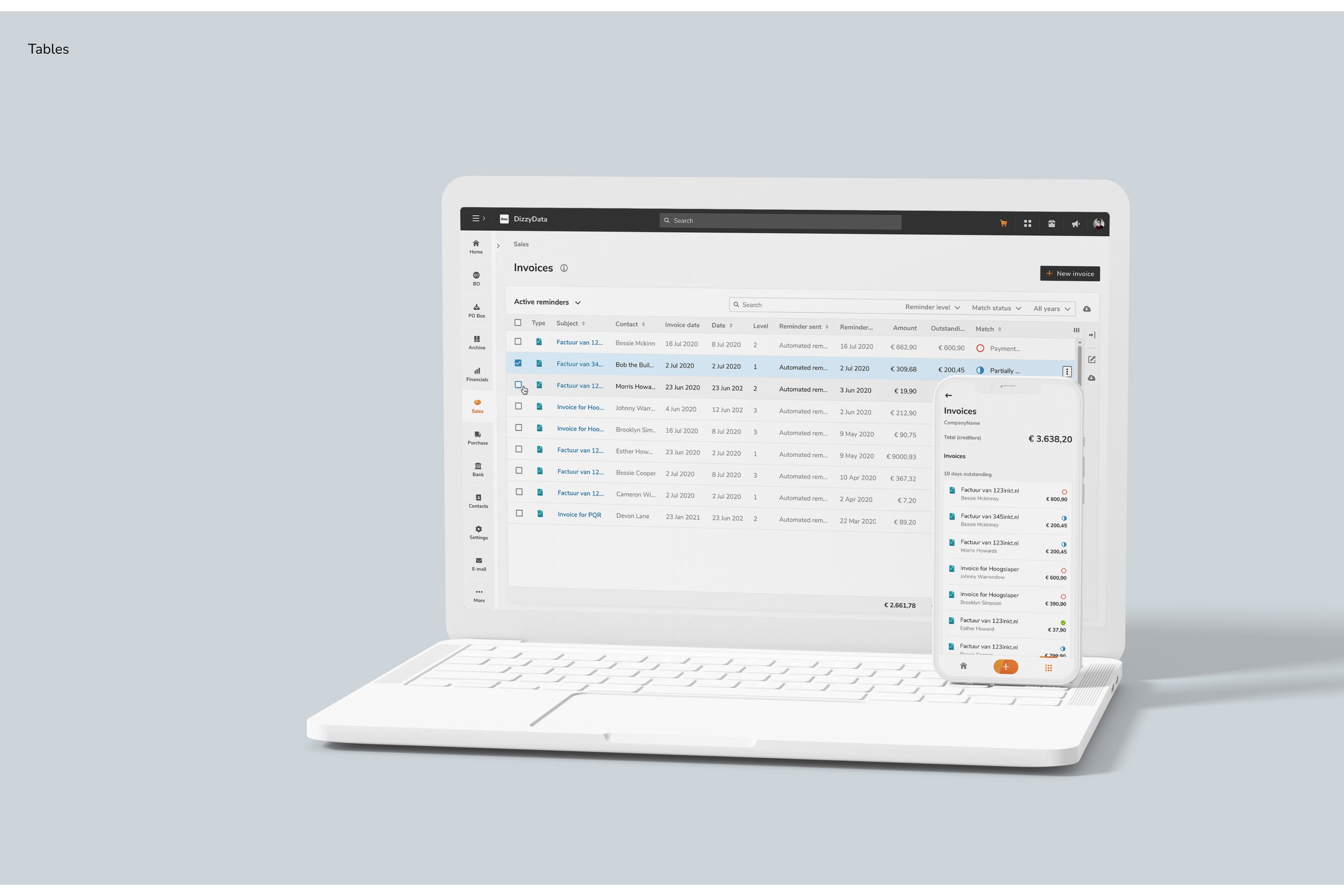
Lack of Clarity: Navigation, data tables, and forms were confusing to use.
Outdated Visuals: The design felt old-fashioned and didn’t meet modern standards.
Limited Accessibility: There wasn’t much focus on making the platform accessible to everyone.
Maintenance Headaches: Keeping things updated was a real pain.
A complete redesign was needed to fix these issues.
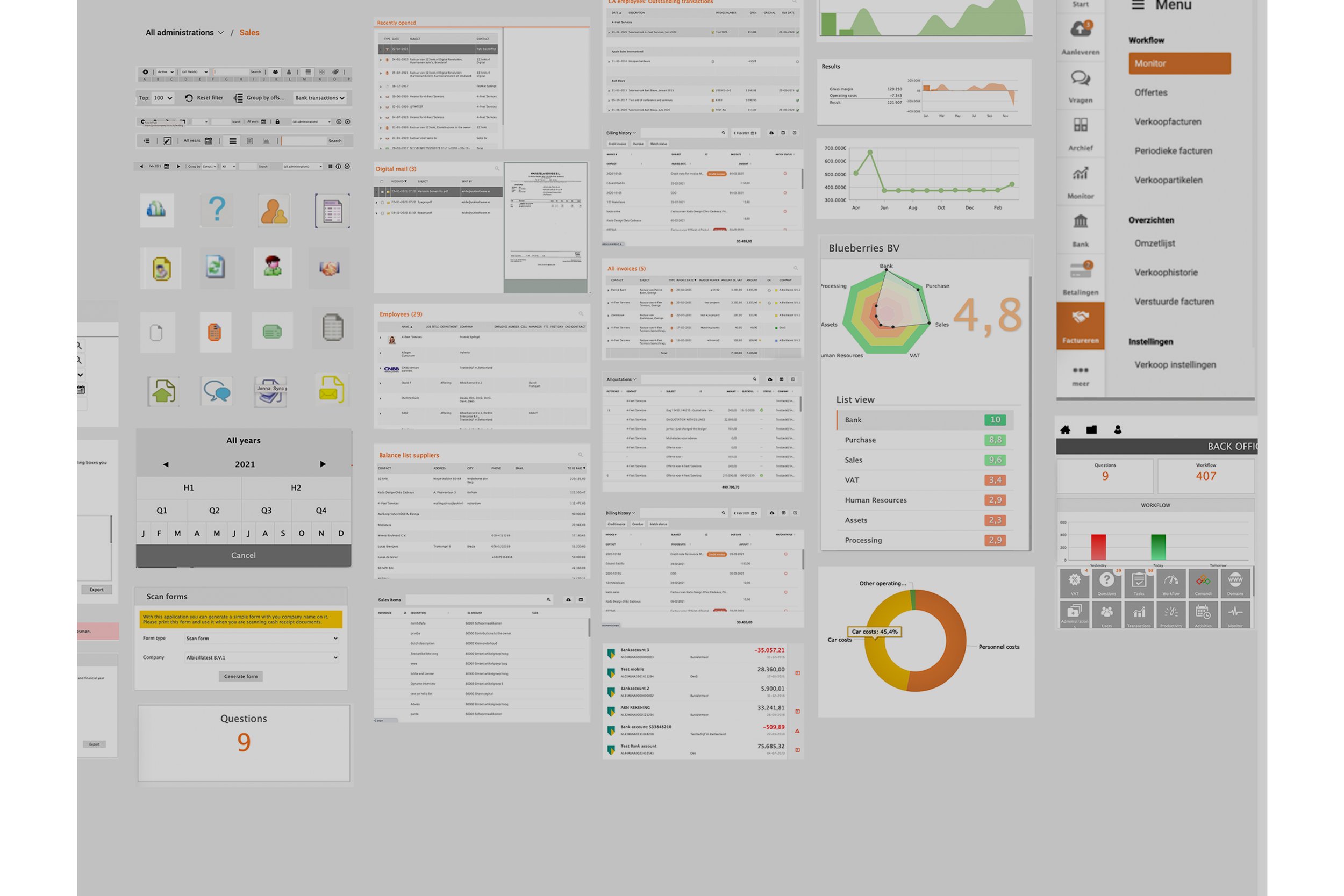
Inventory
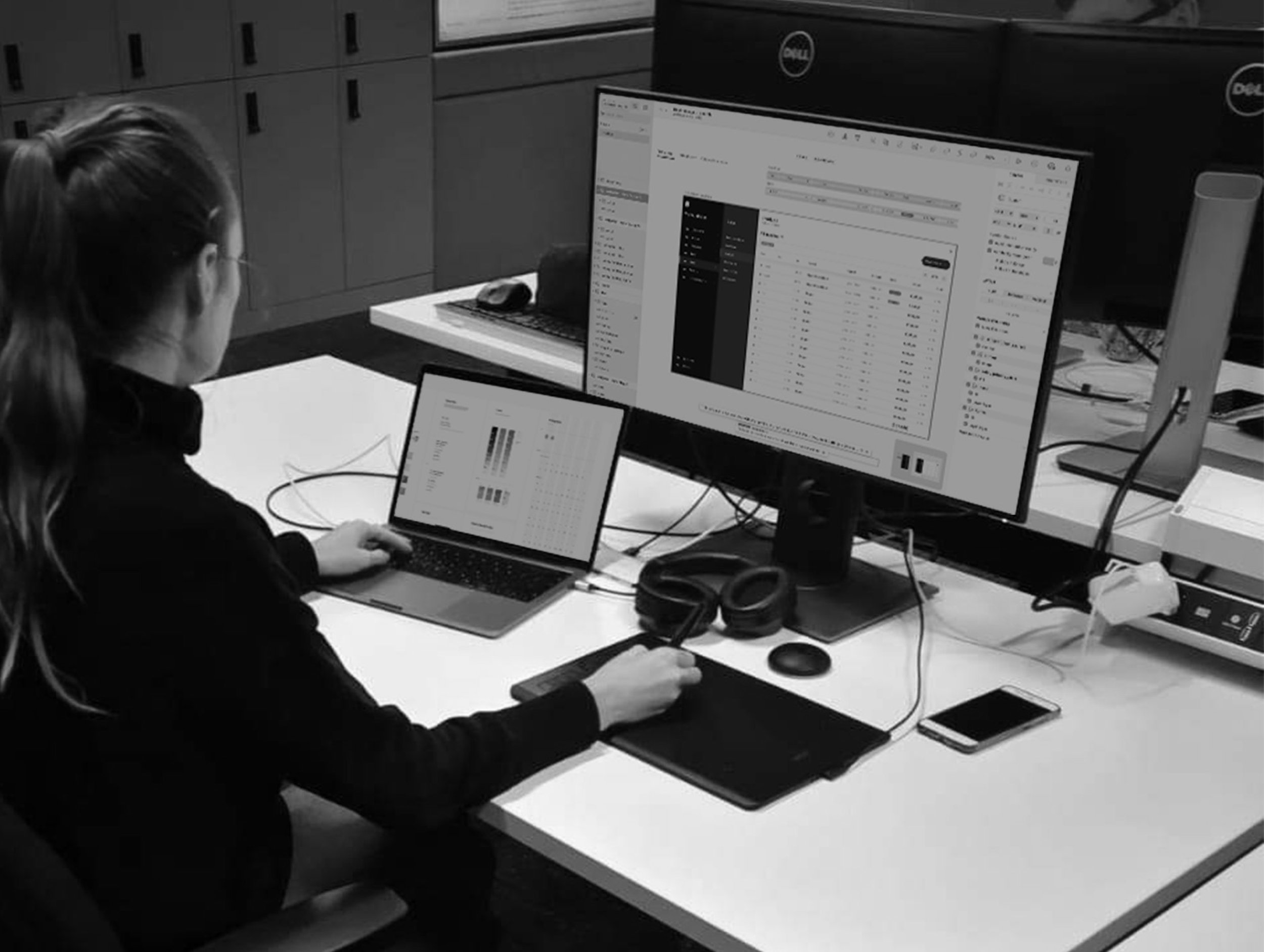
Ground work
User research, brand alignment, sketching, goal setting and mood boarding.
Understanding the user.
Embracing the Yuki brand.
Sketching
Goals
The Yuki redesign focused on creating a user experience that was intuitive, reliable, and enjoyable. By aligning with users’ needs and business vision, we aimed to deliver a product that felt empowering, innovative, and seamlessly integrated into daily life. The goals below outline the key outcomes we aimed to achieve.
As a user, when I use Yuki, I feel:
Unburdened: I feel relieved knowing Yuki will notify me about what I need to know, when I need to know it, and what I need to do. This allows me to focus on what truly matters to me.
Effective: I can complete my work quickly, stay in control, and feel productive.
Happy: I keep returning to the application because it’s enjoyable to use.
Calm: The app helps me complete my tasks without being intrusive.
Innovative: I’m using a smart product powered by the latest modern technology.Trust: I feel confident that the numbers provided are accurate.
Clear: I understand how the app works and what’s relevant to me.
Convenient: The platform is intuitive, easy to use, and fits seamlessly into my daily life.Yuki: I instantly recognize this as a Yuki product.
Moodboard


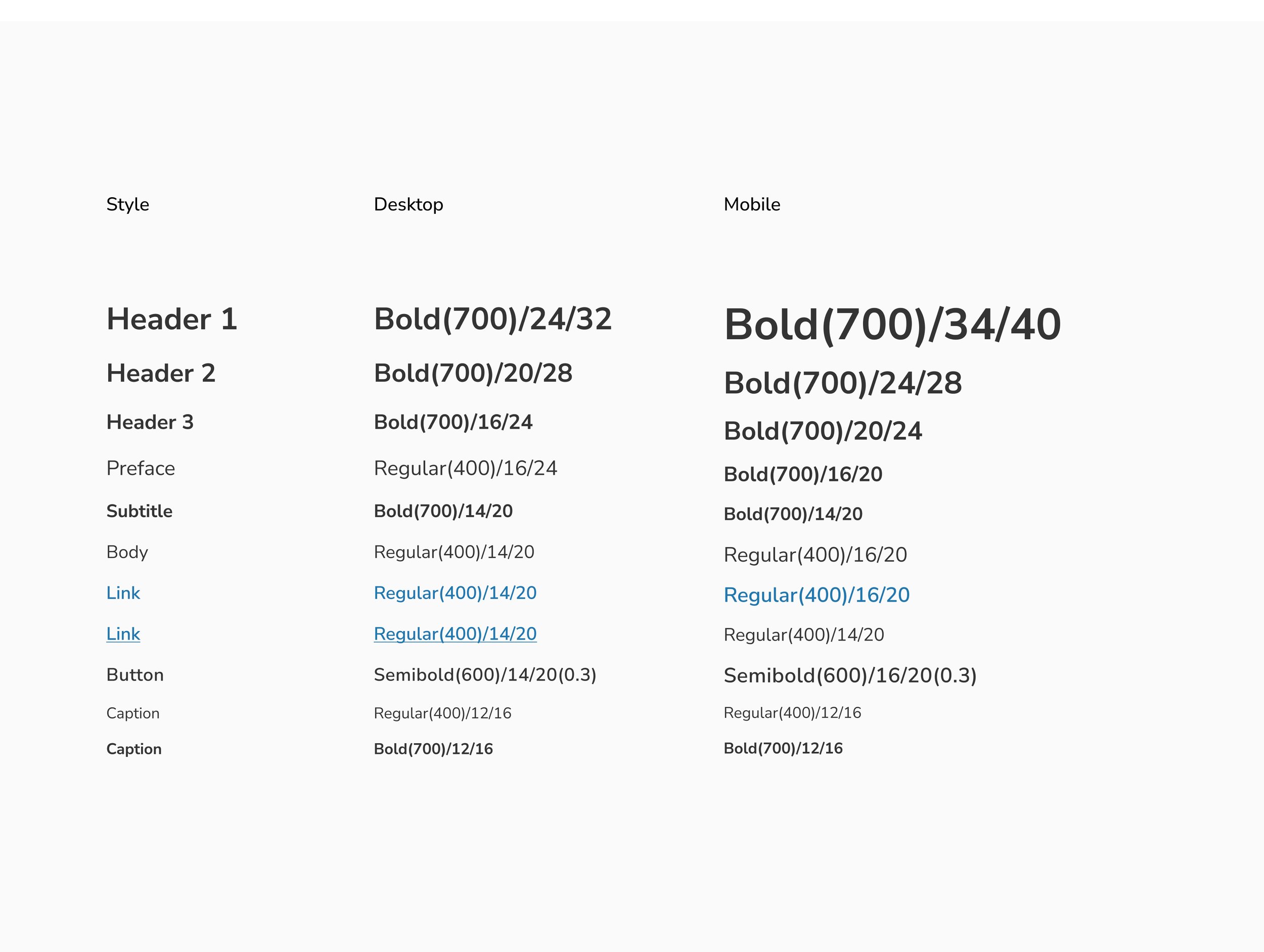
Solution
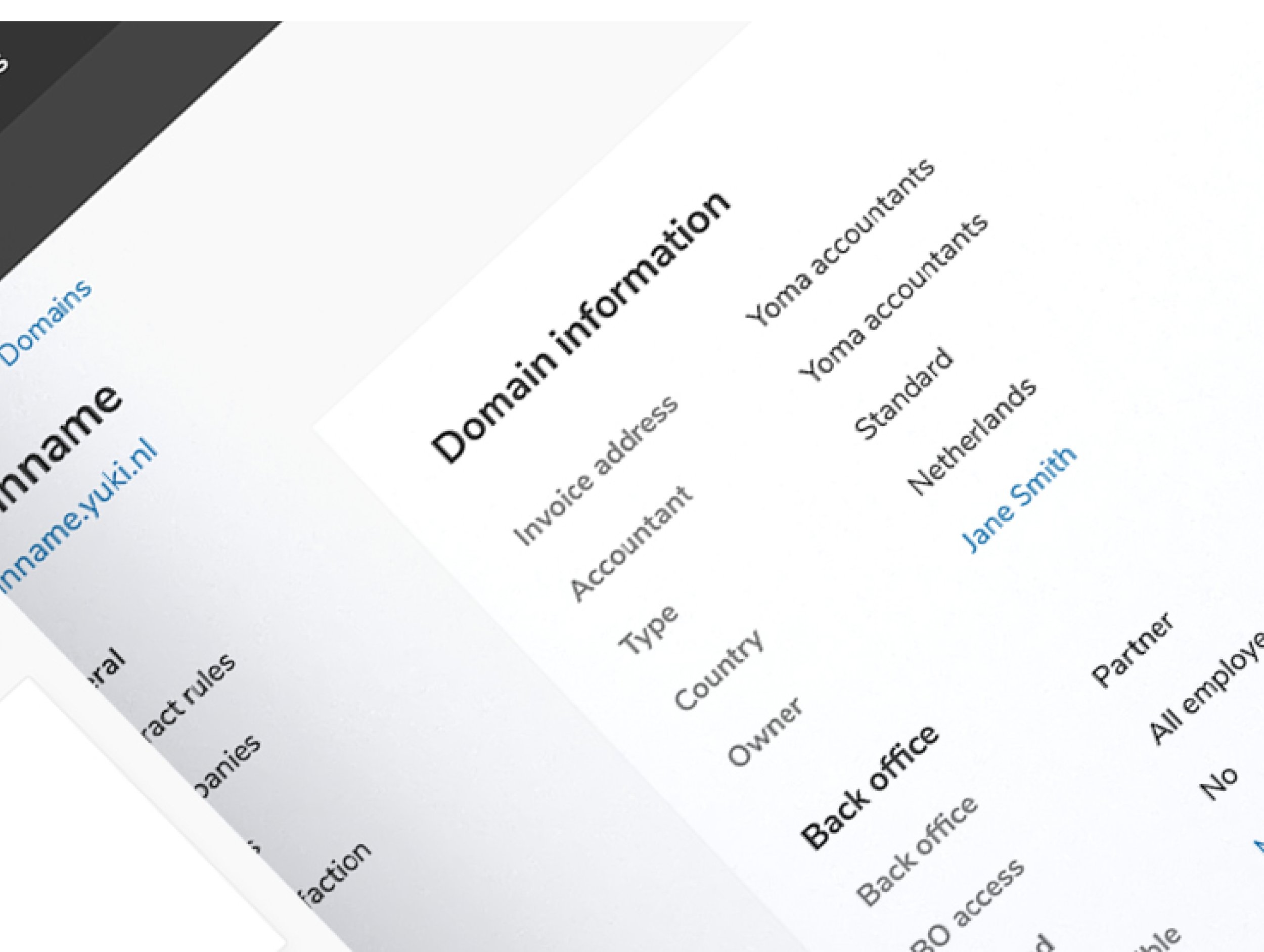
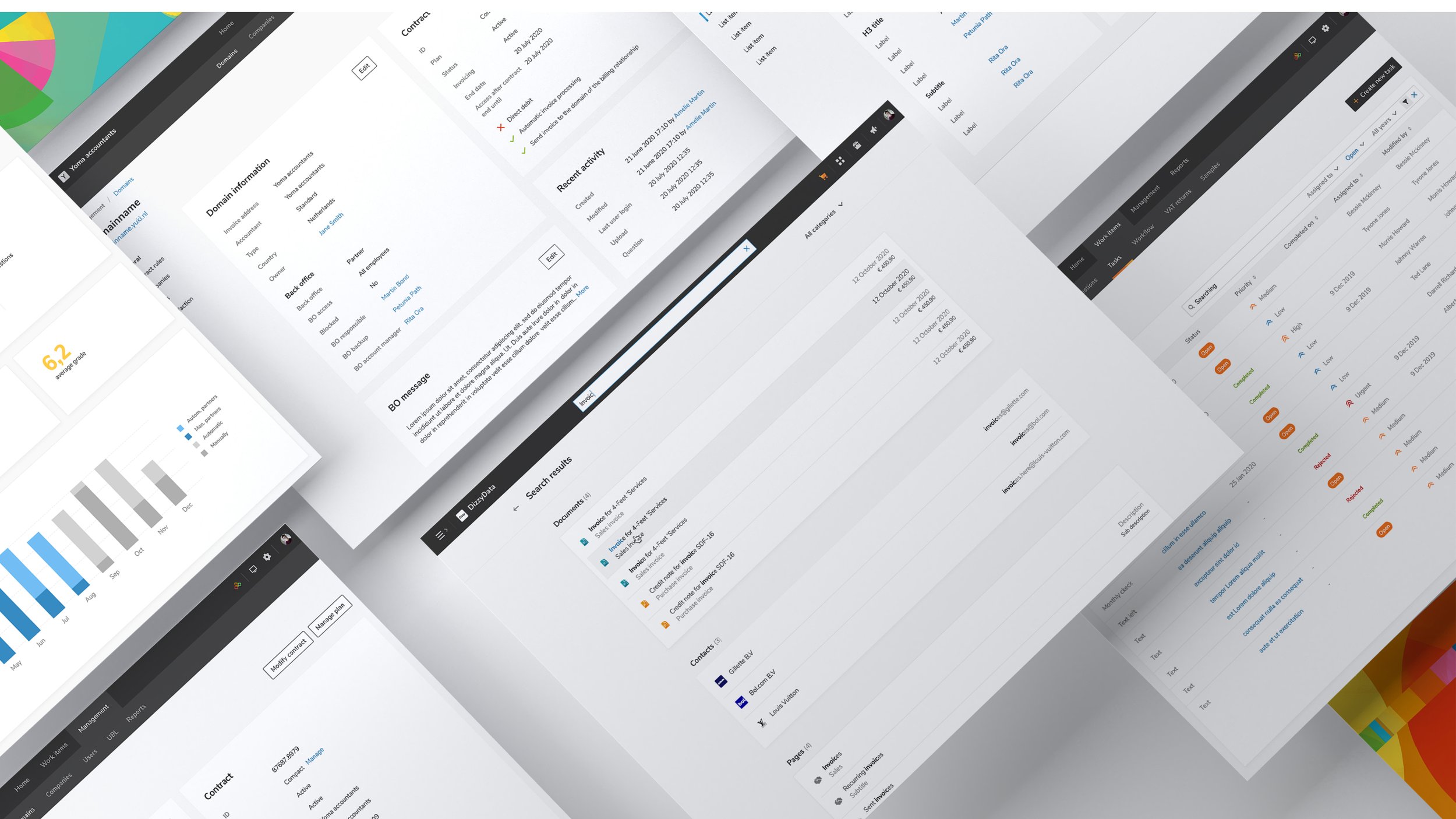
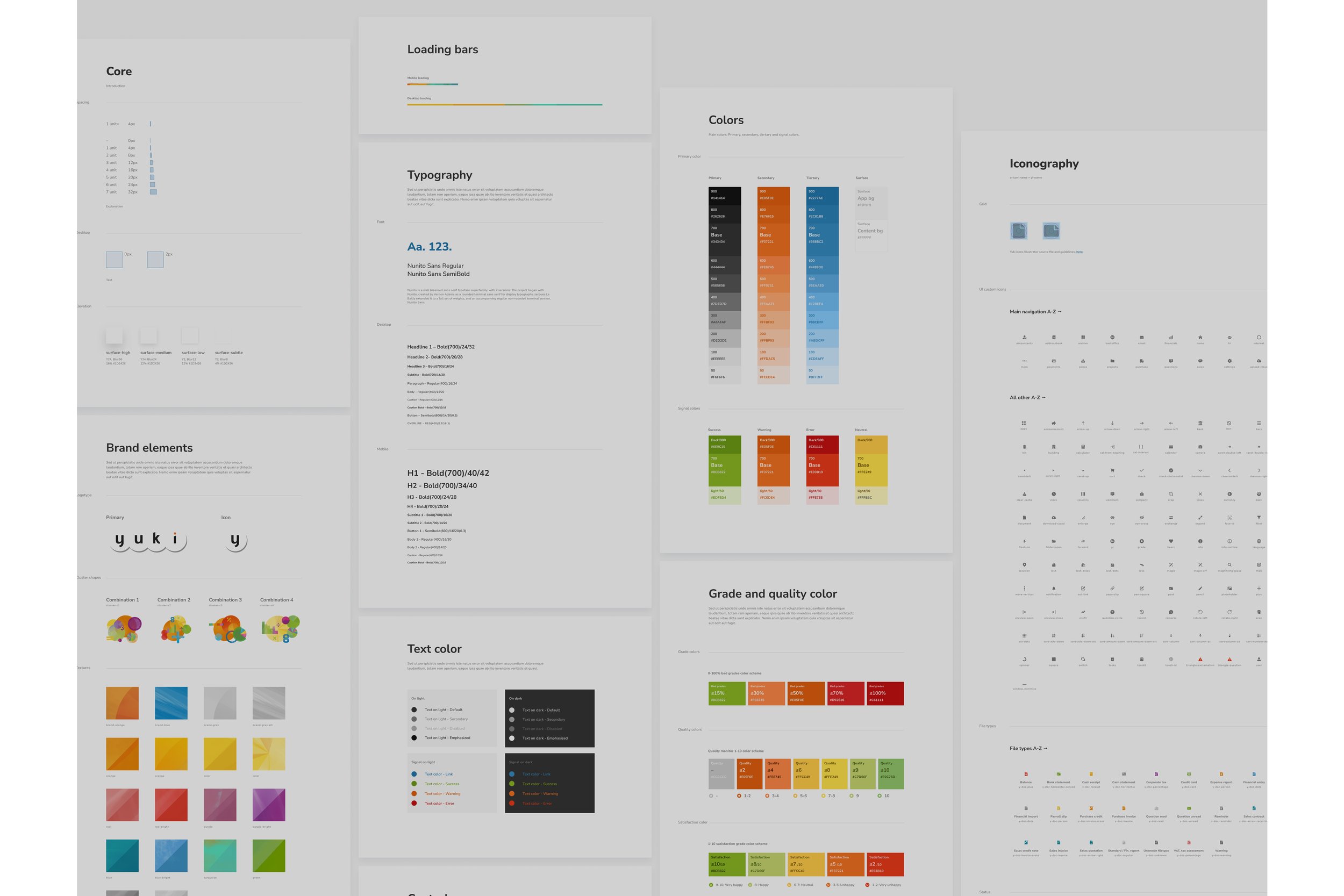
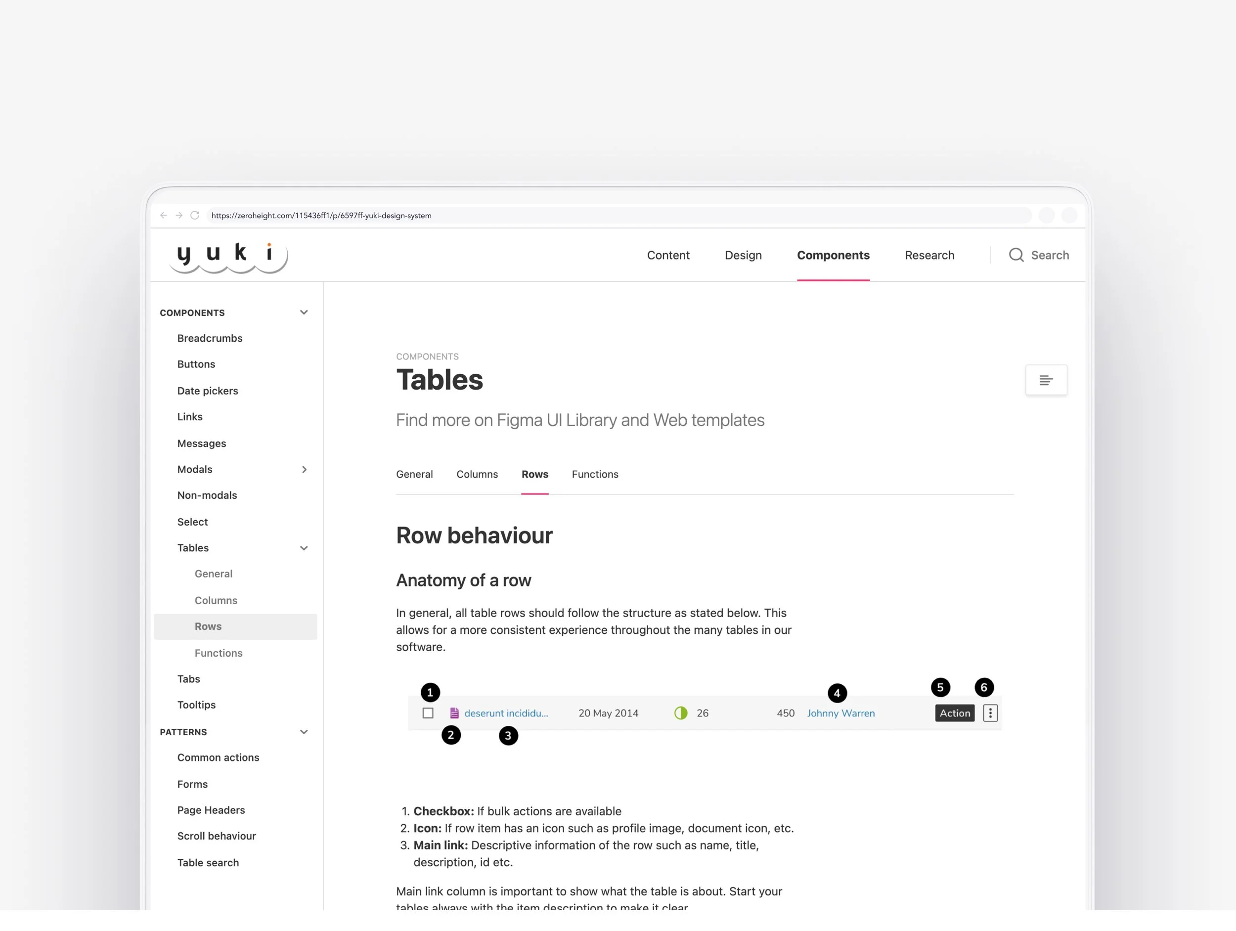
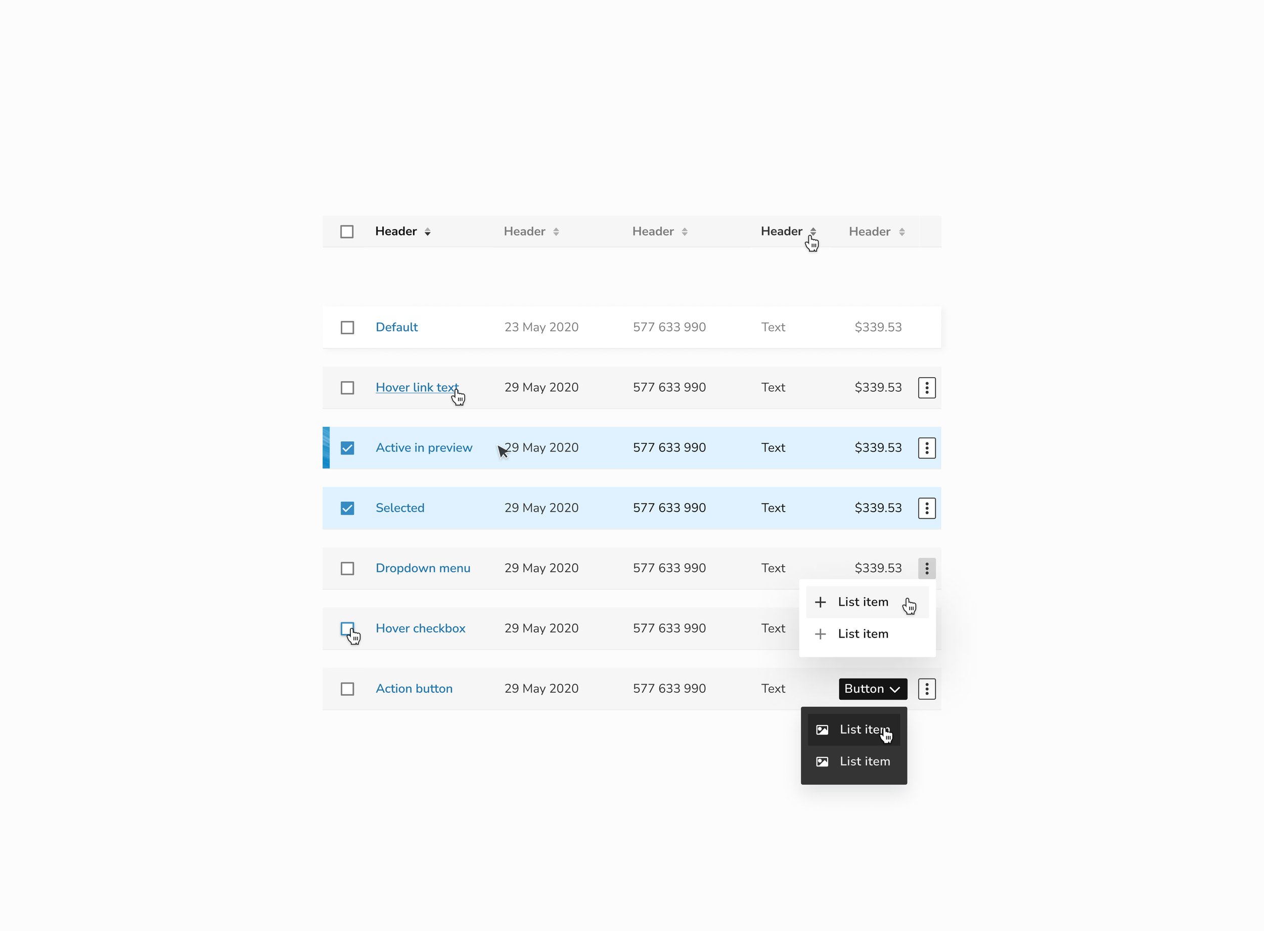
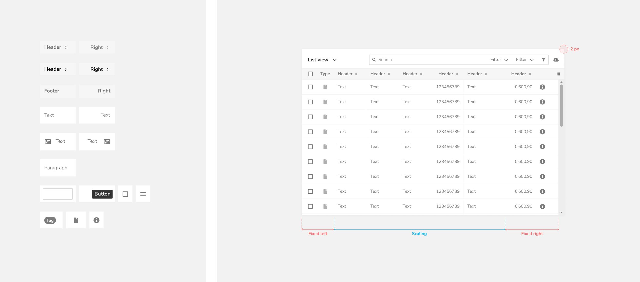
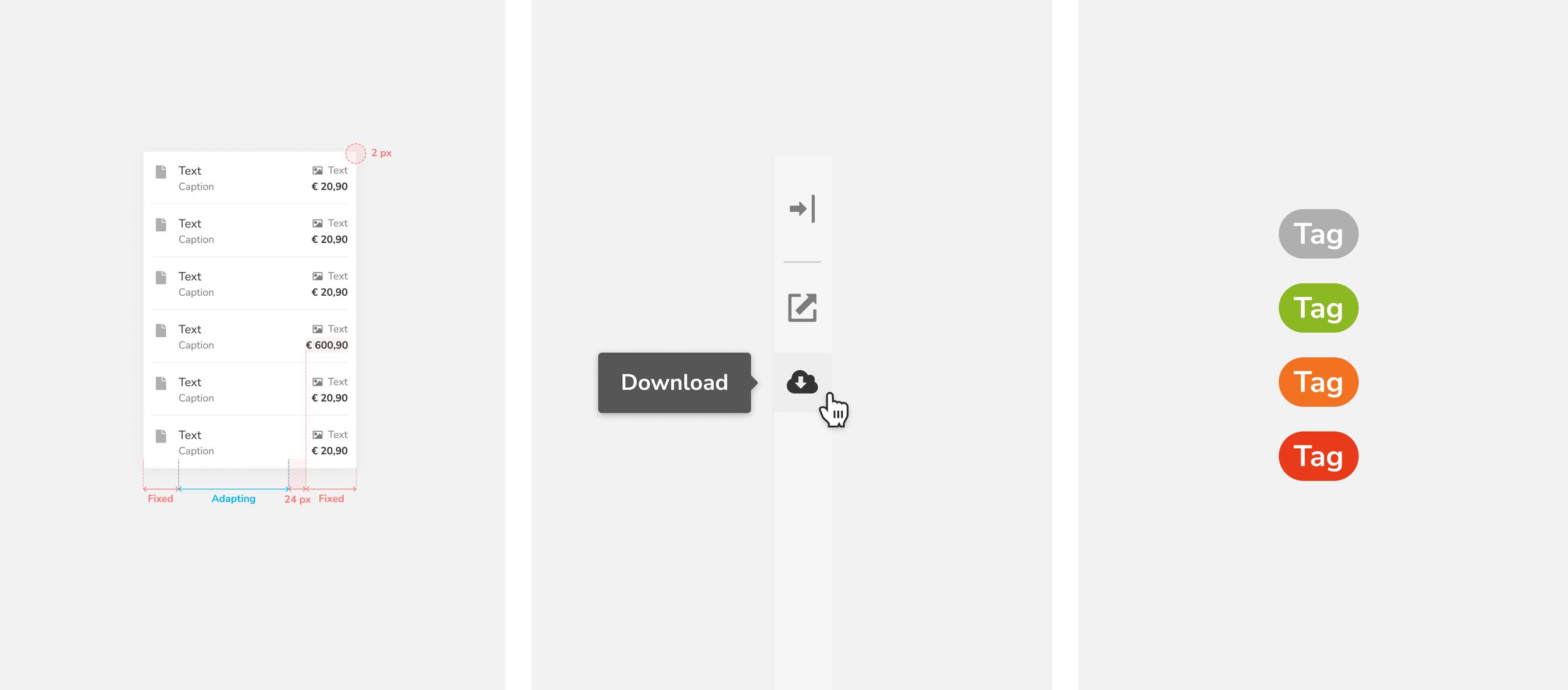
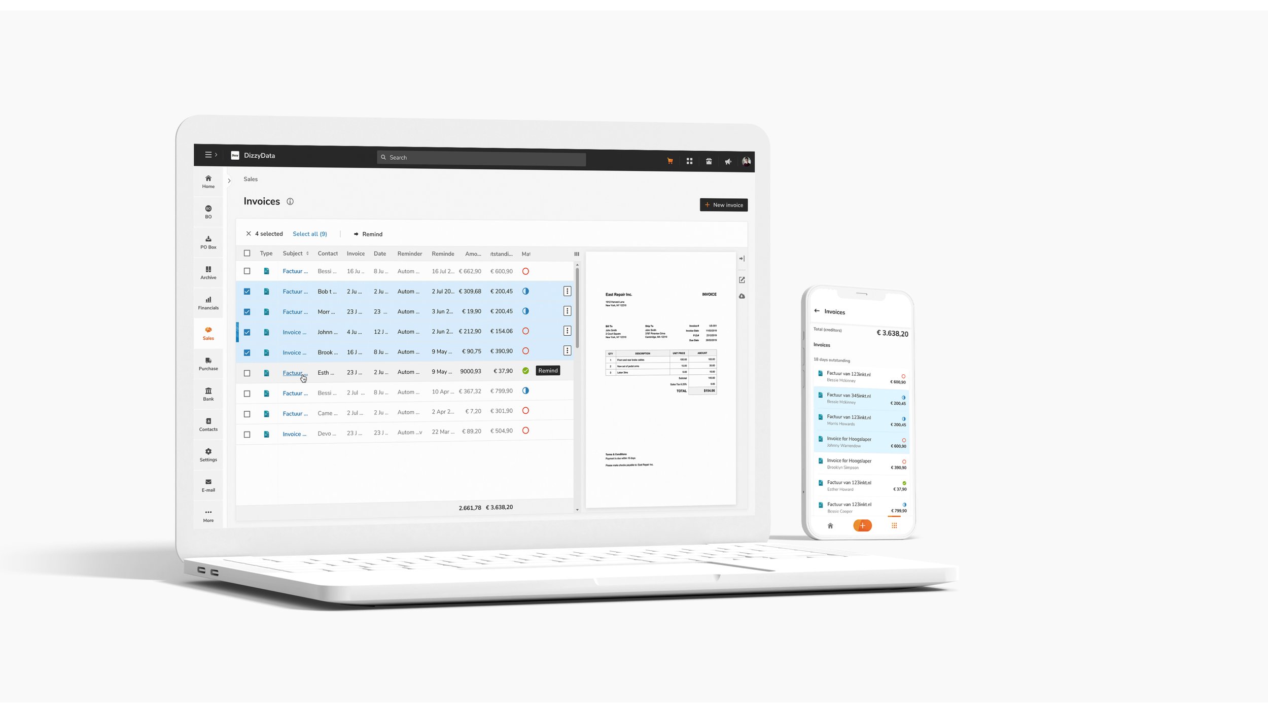
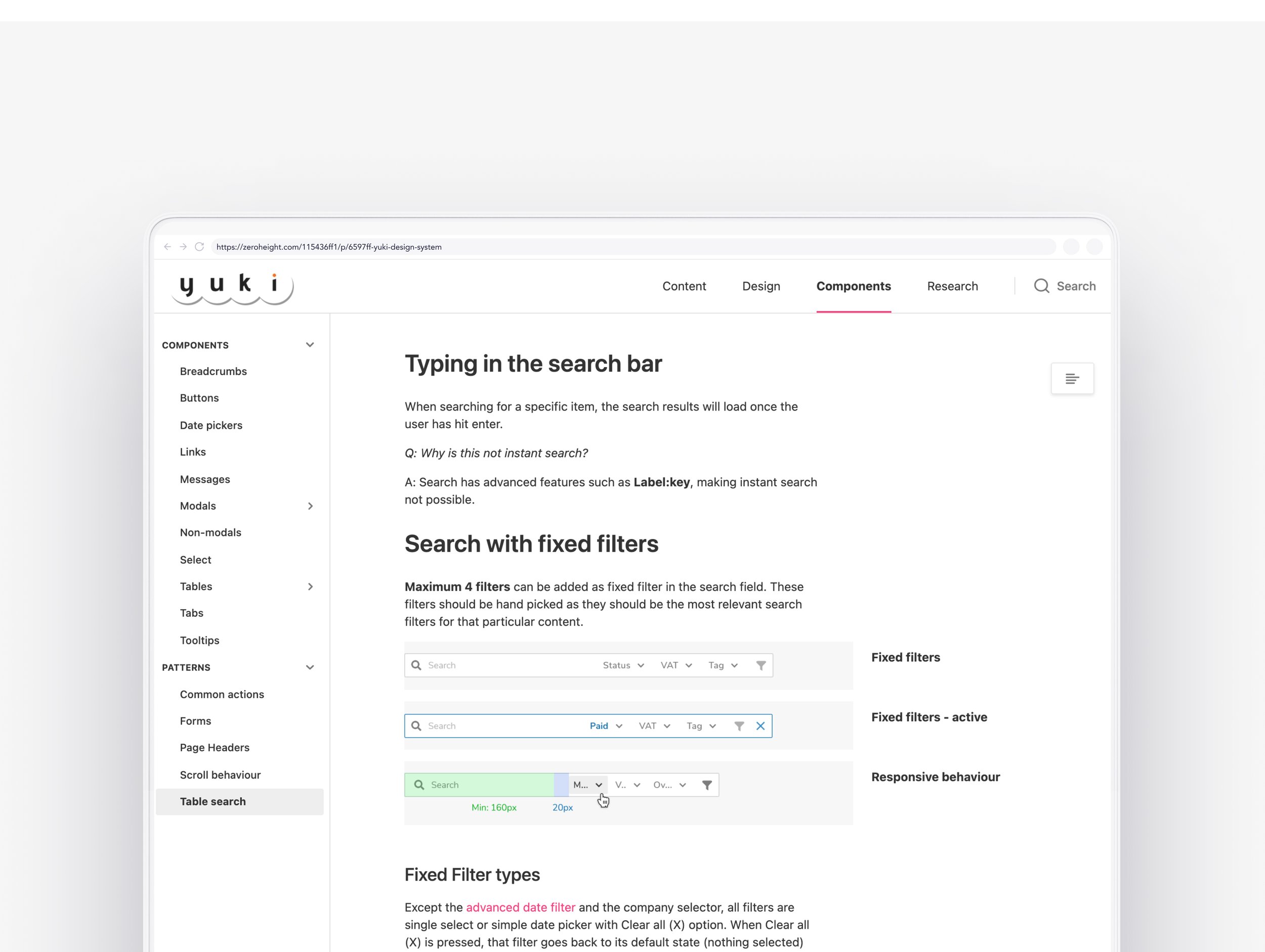
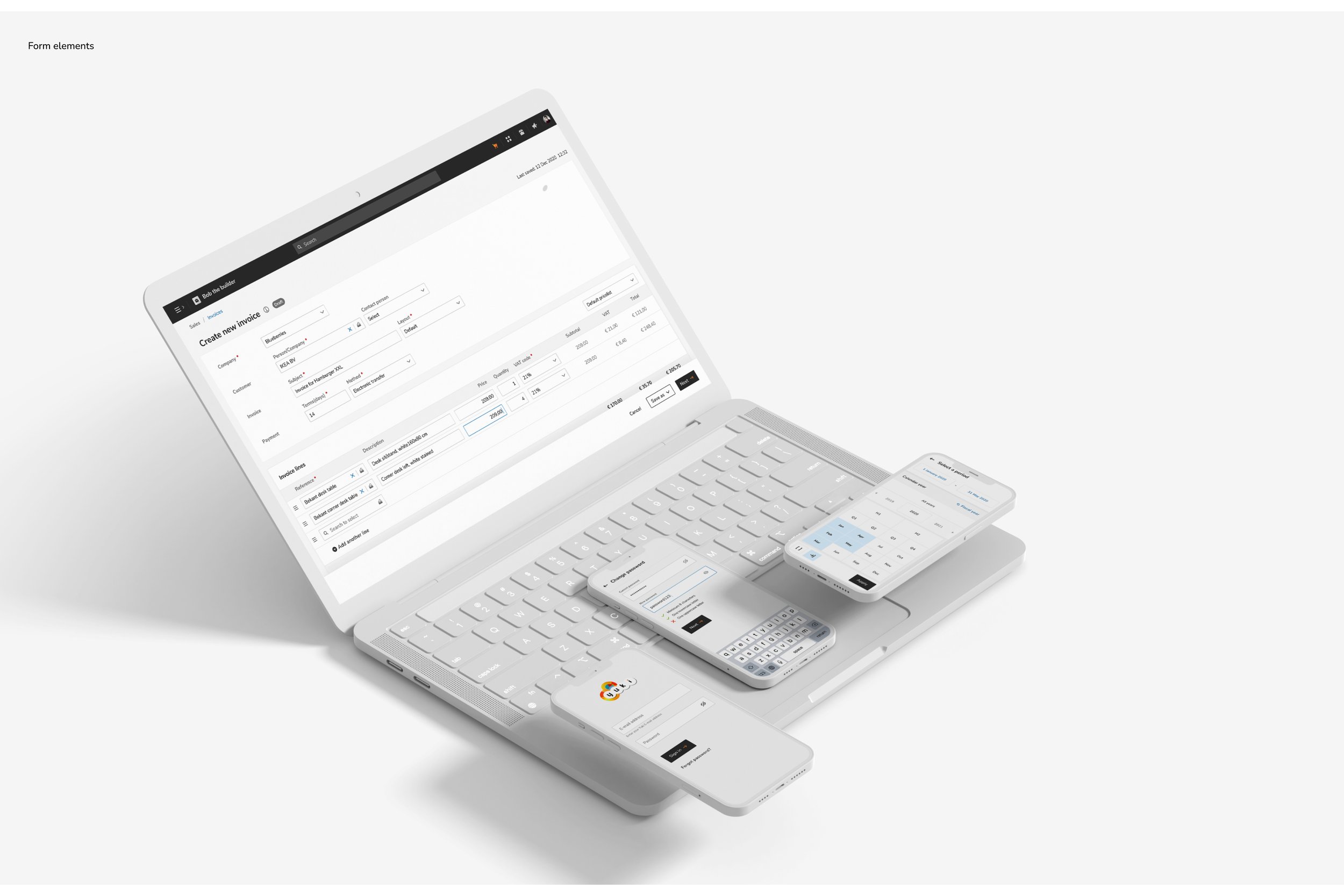
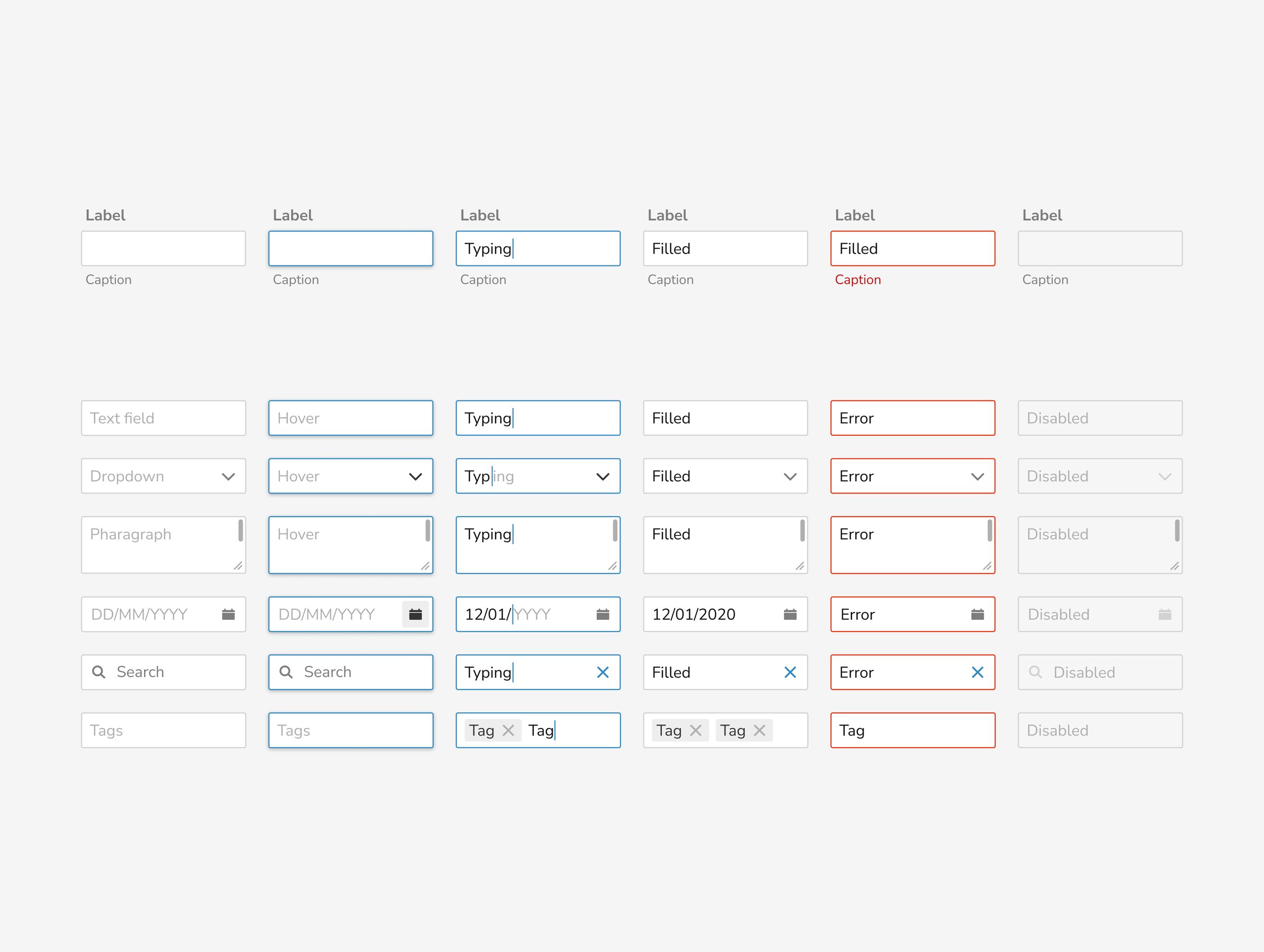
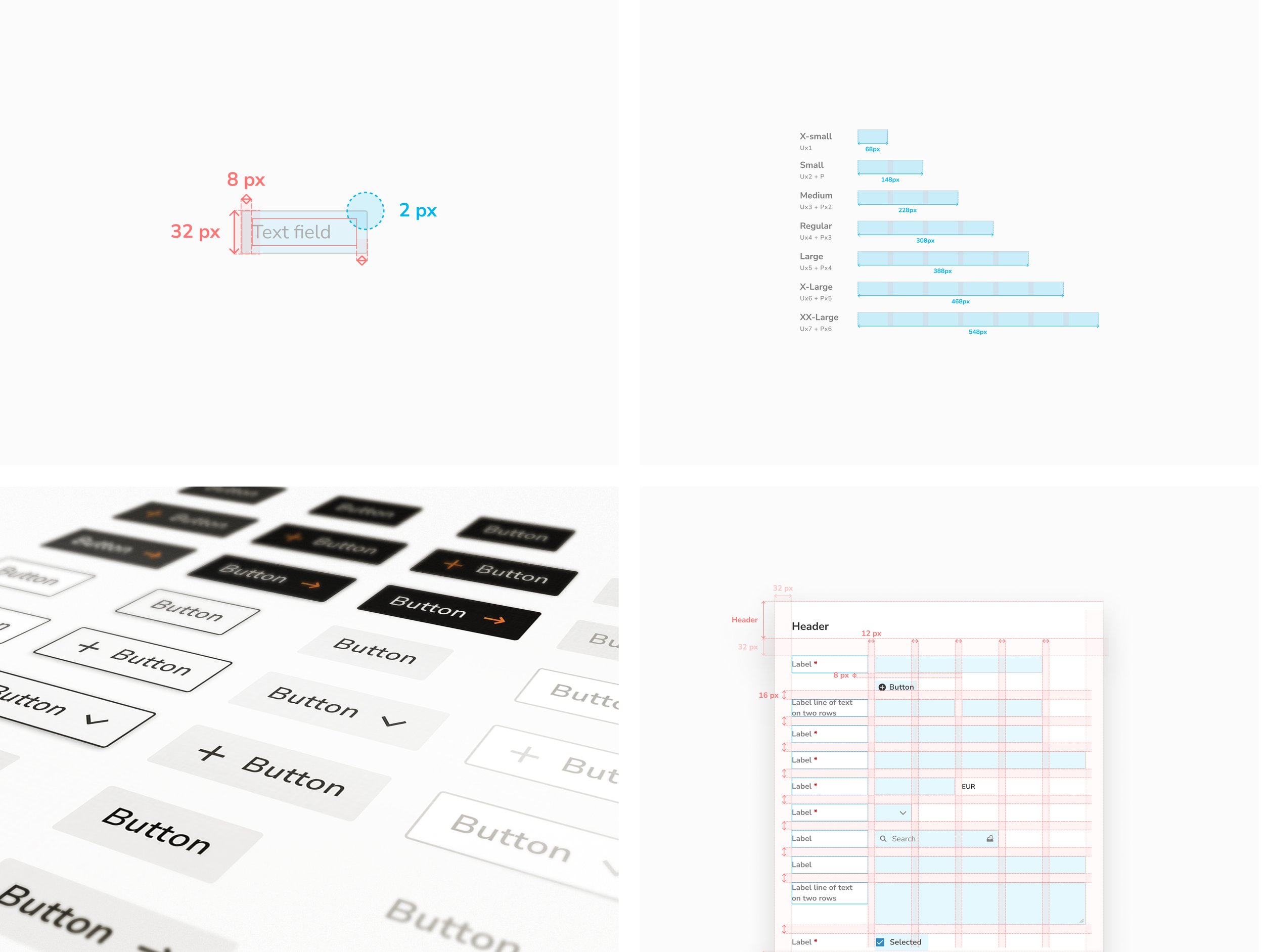
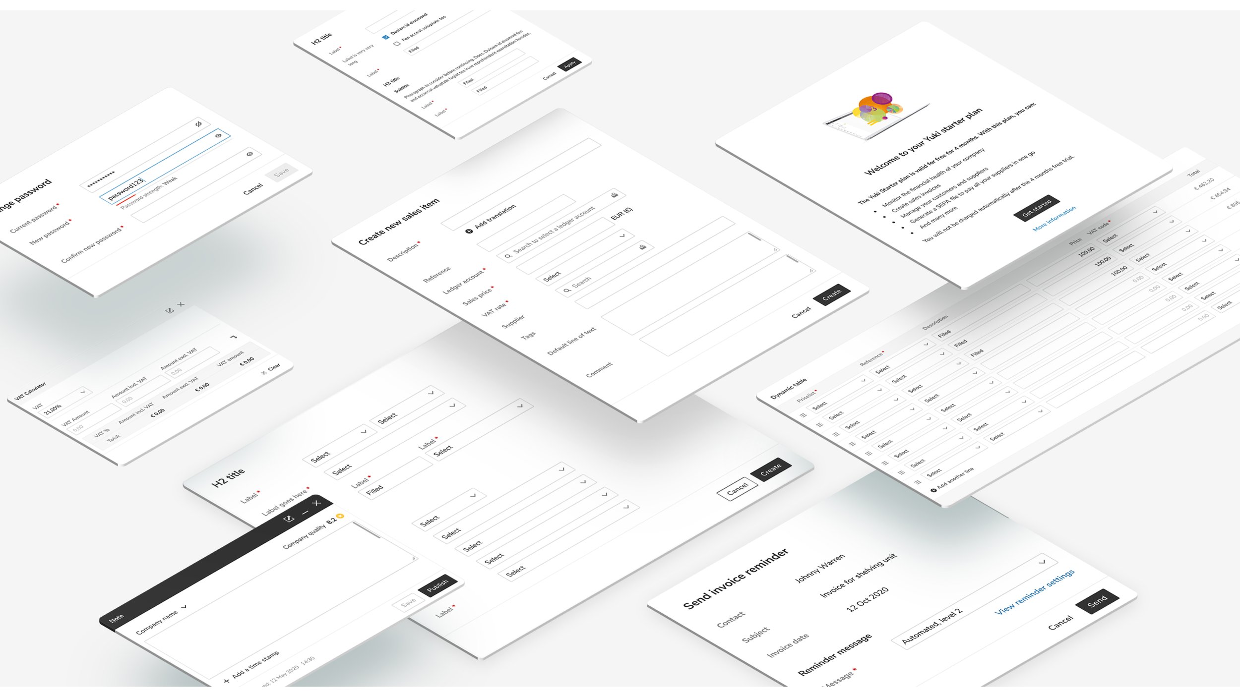
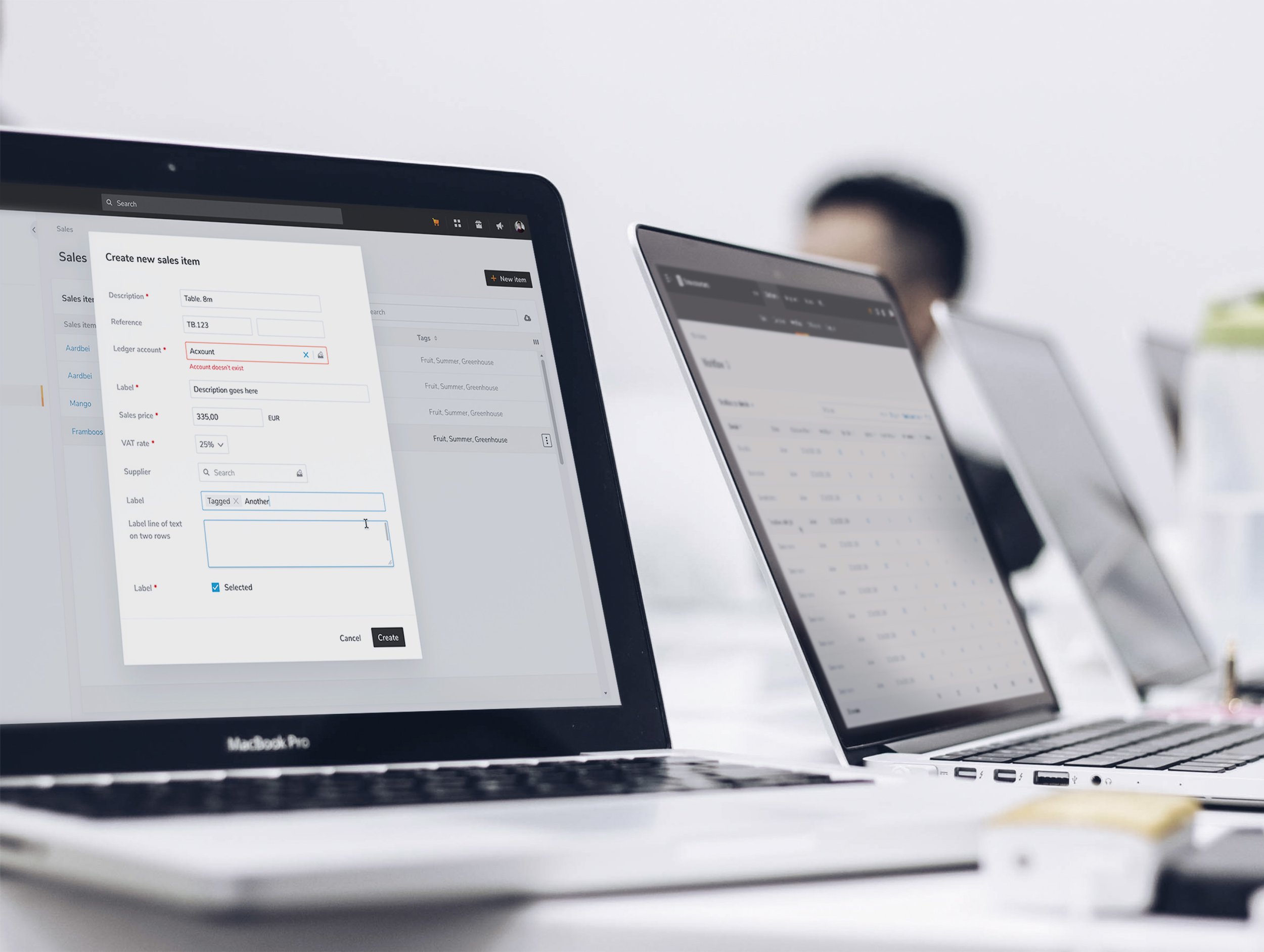
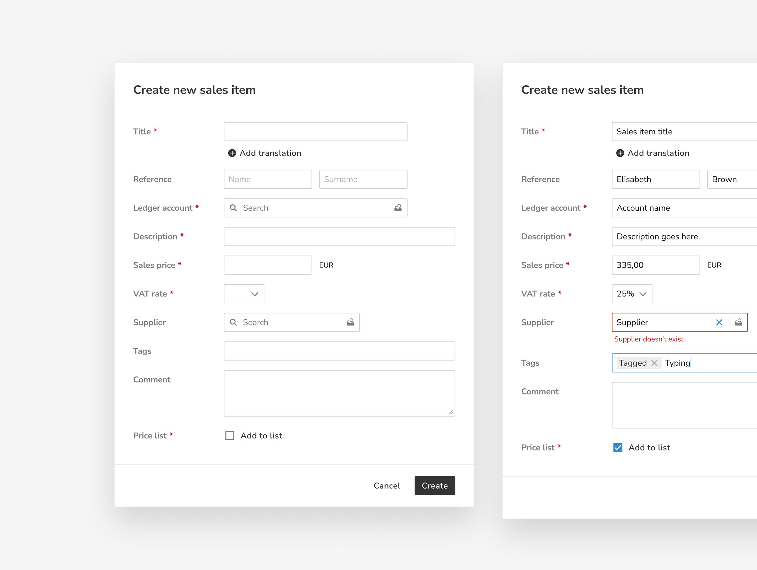
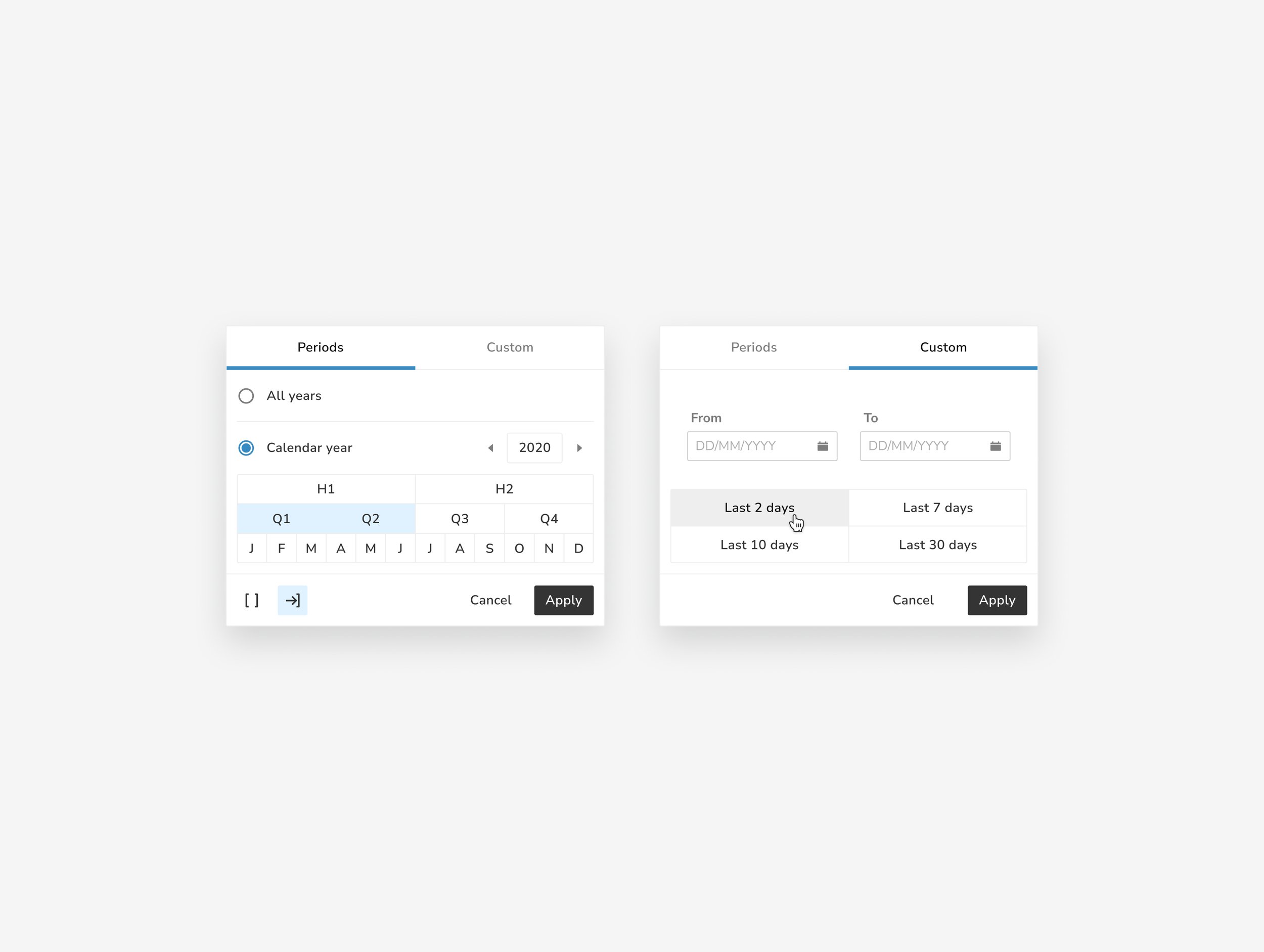
To address the challenges, we developed a Design System using these strategies:
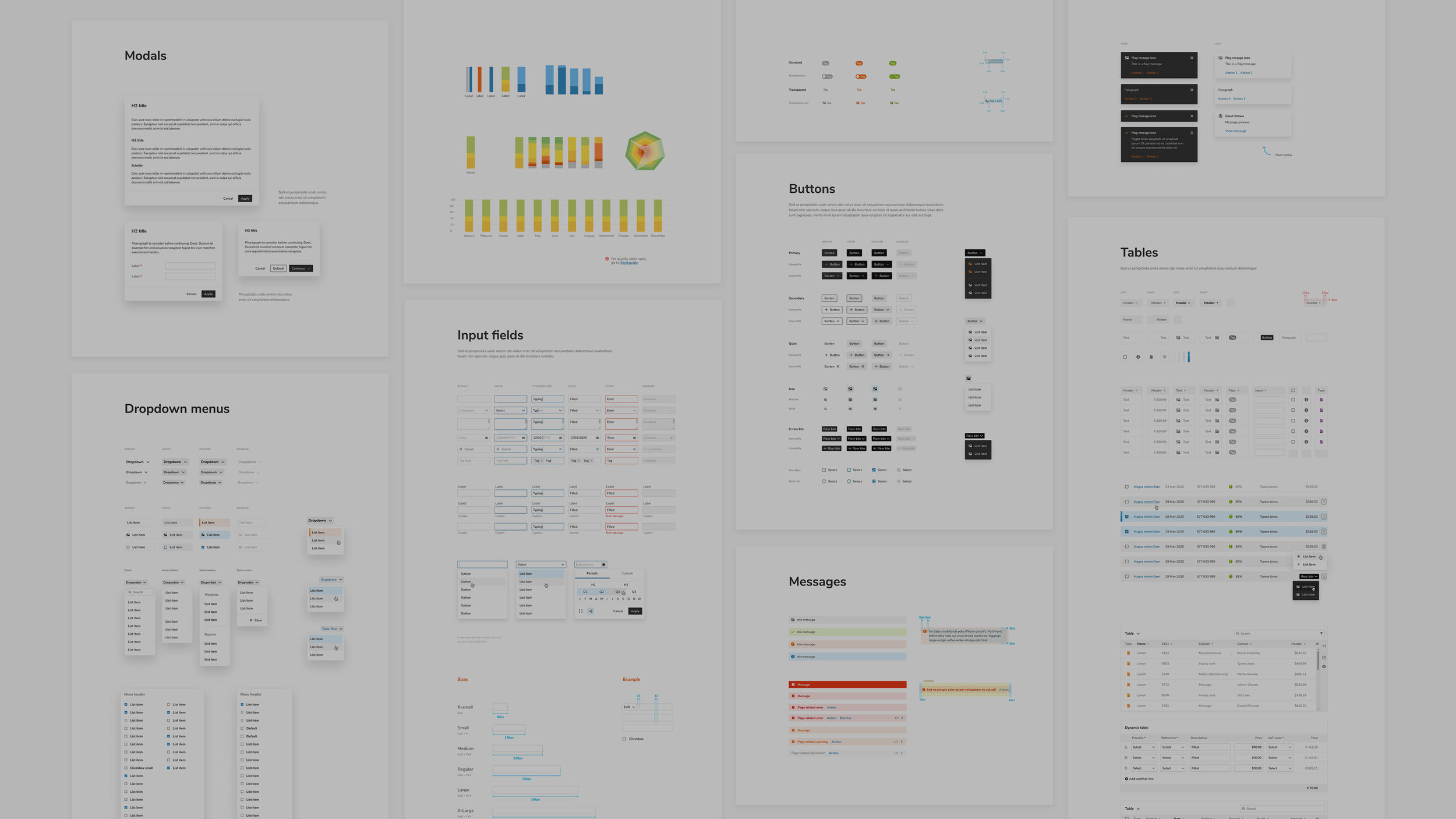
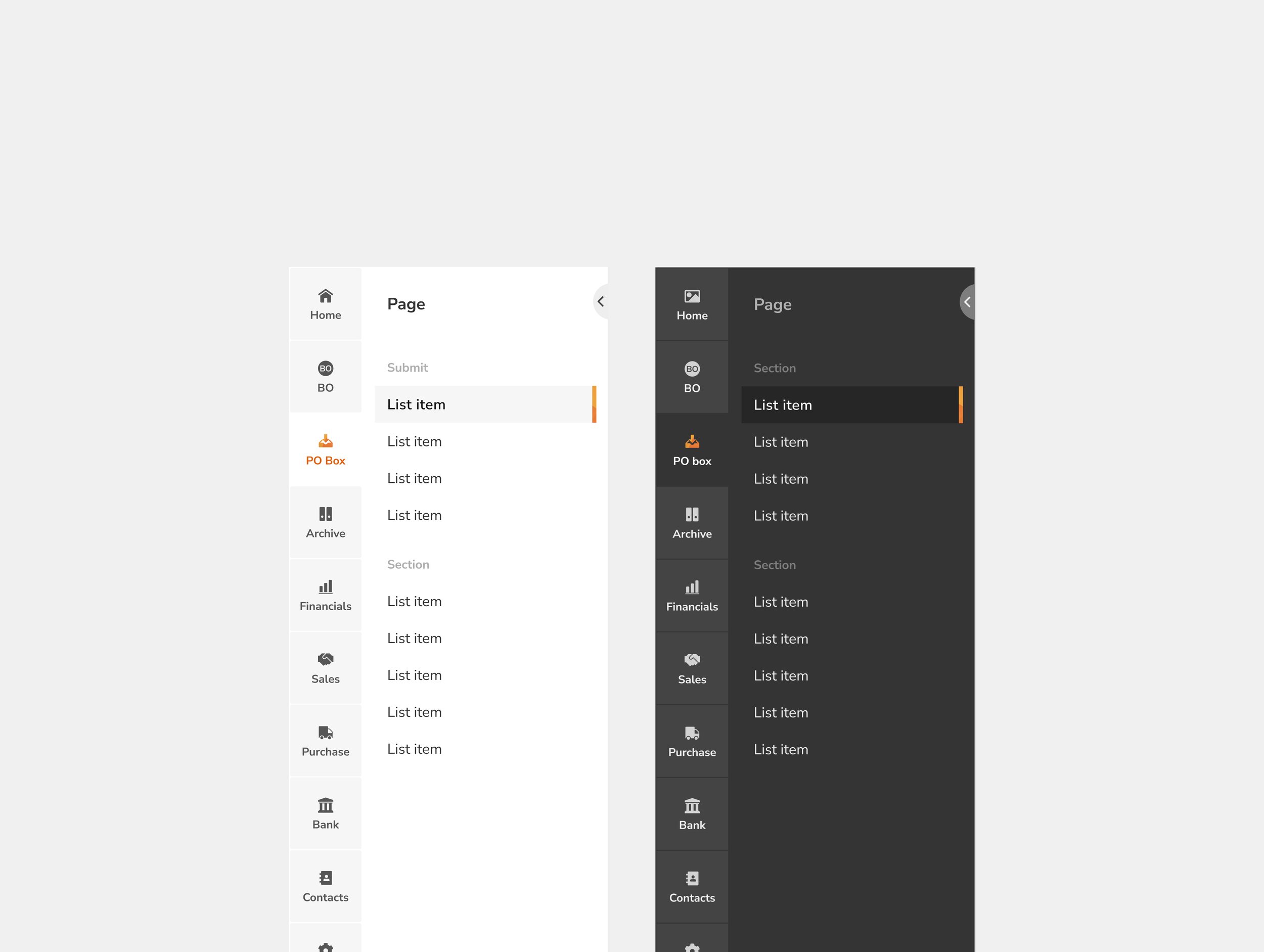
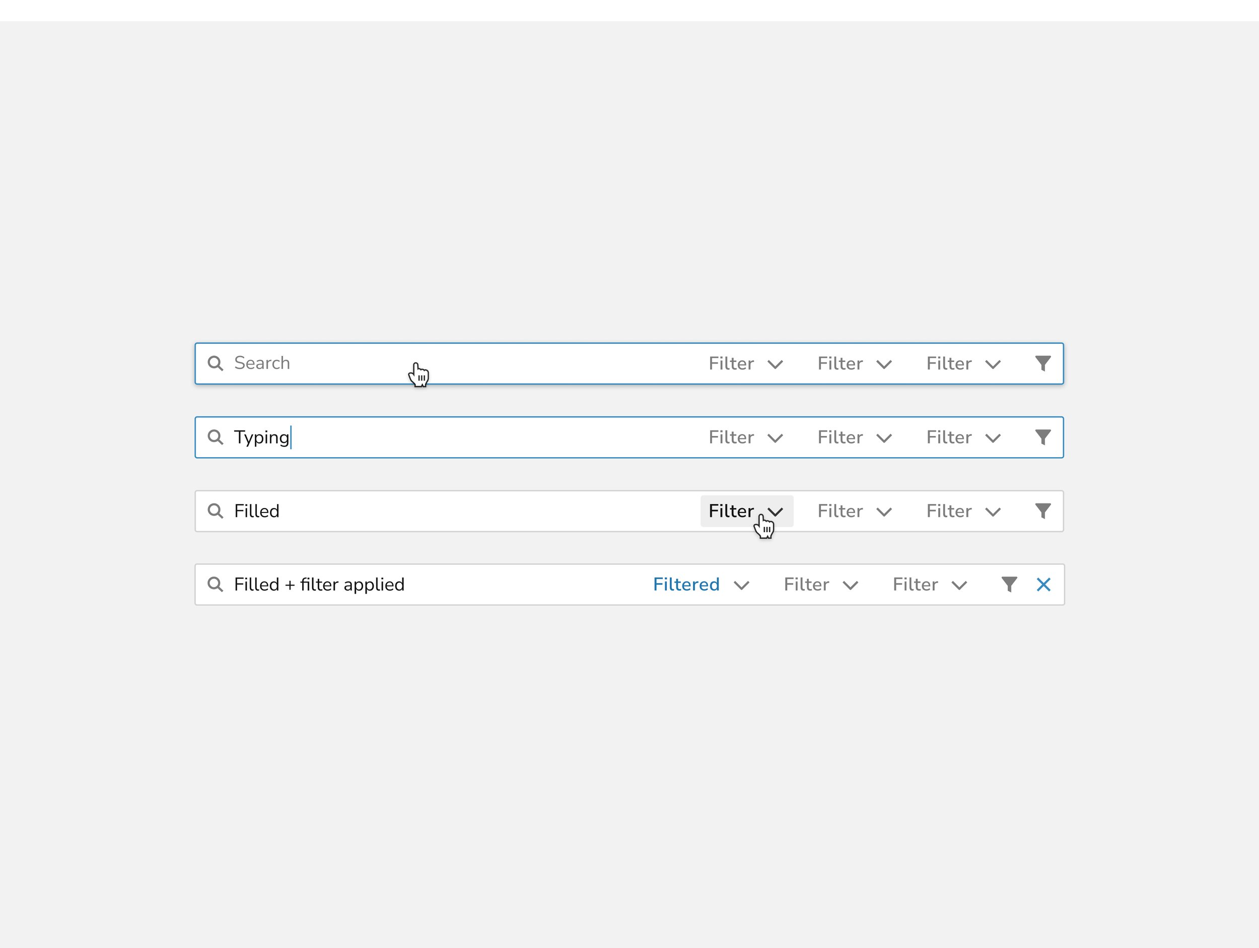
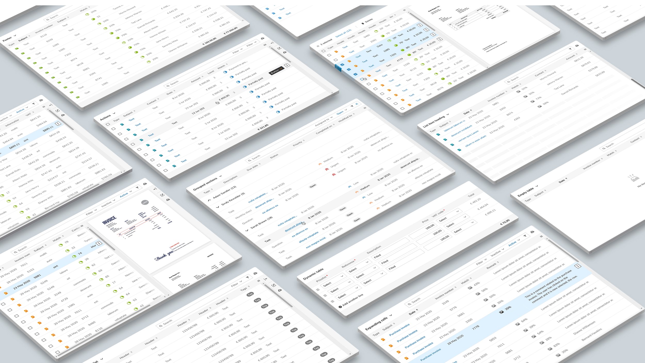
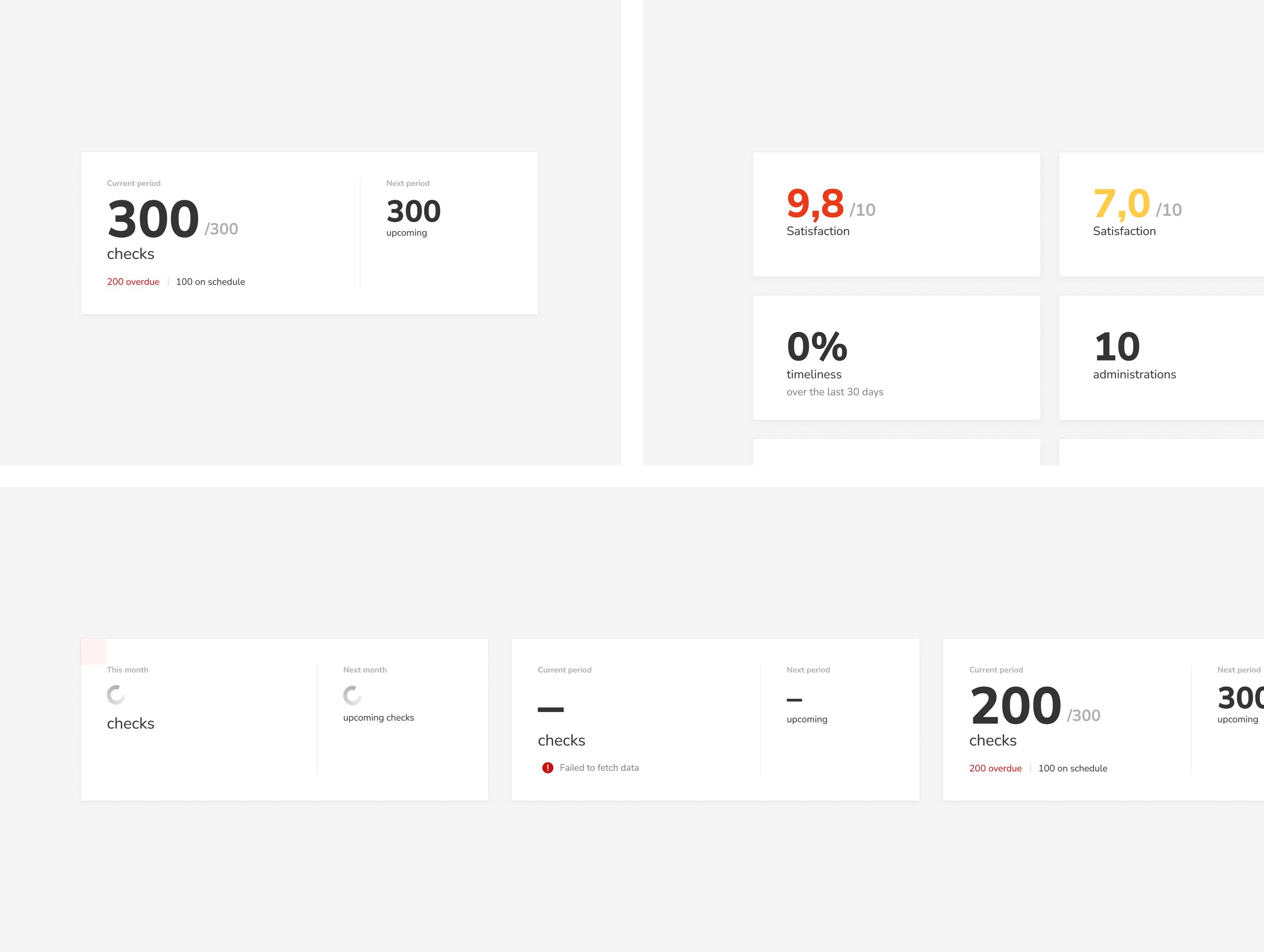
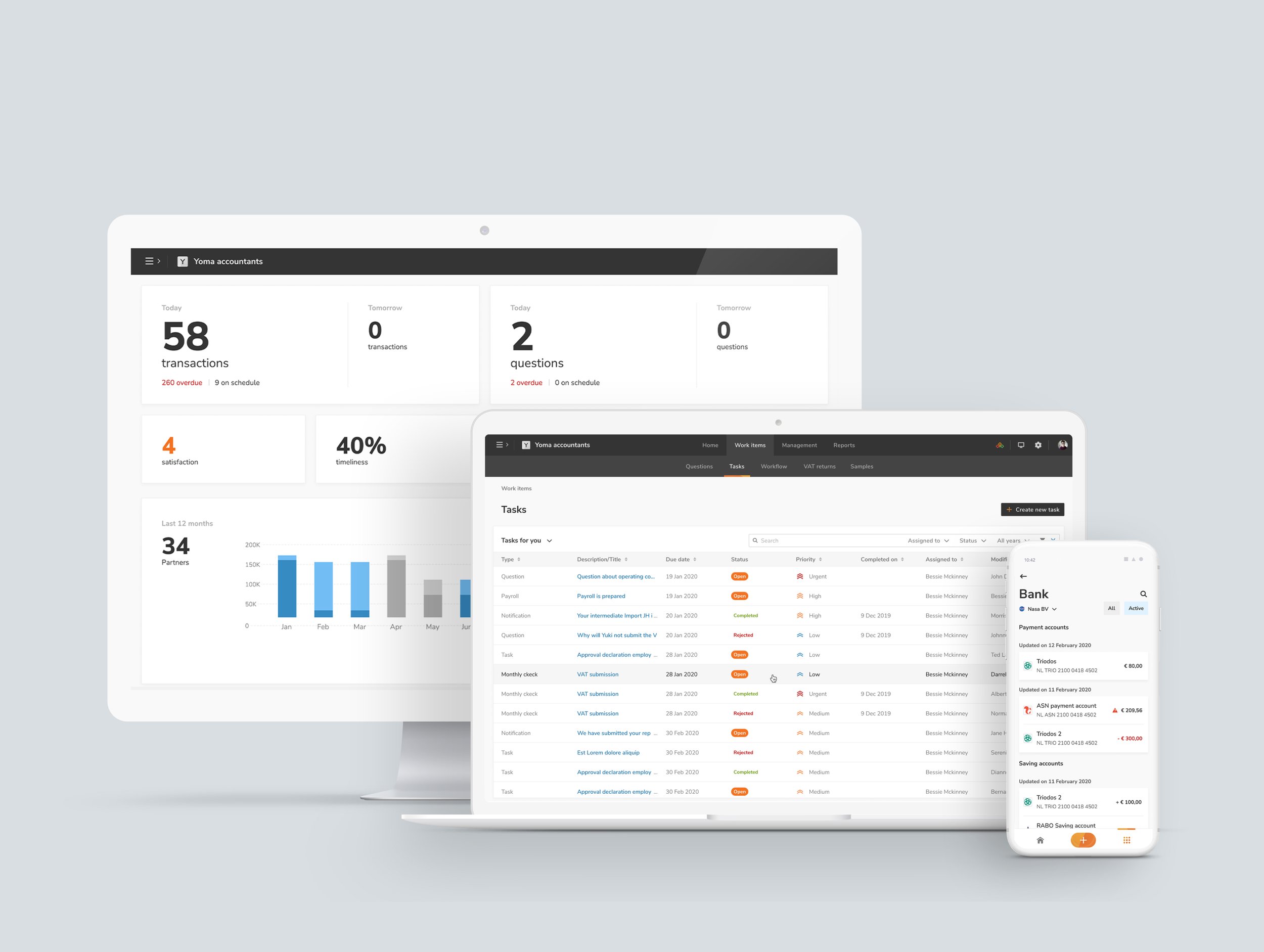
Atomic Design Approach: Built a modular system with reusable components and patterns.
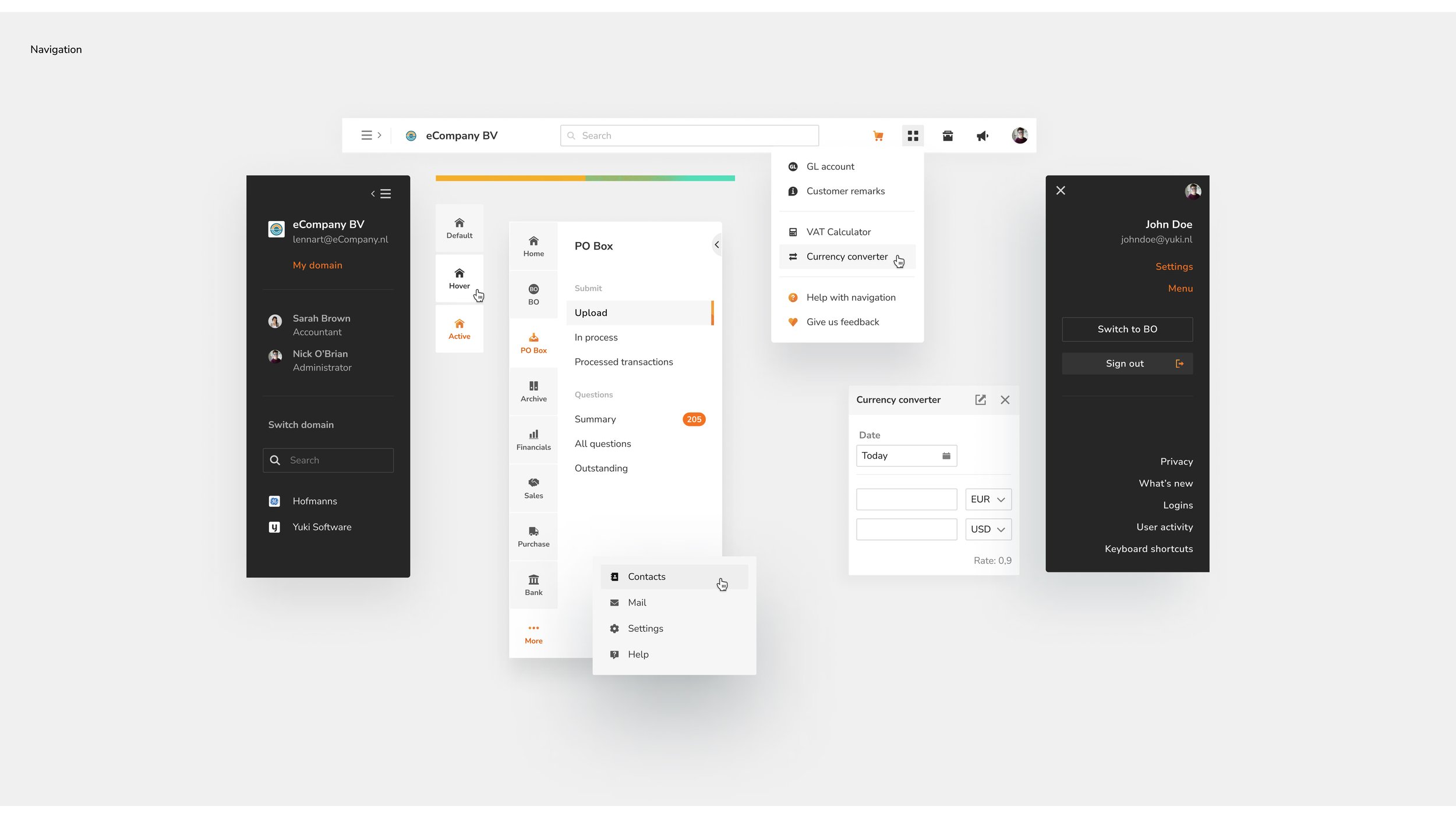
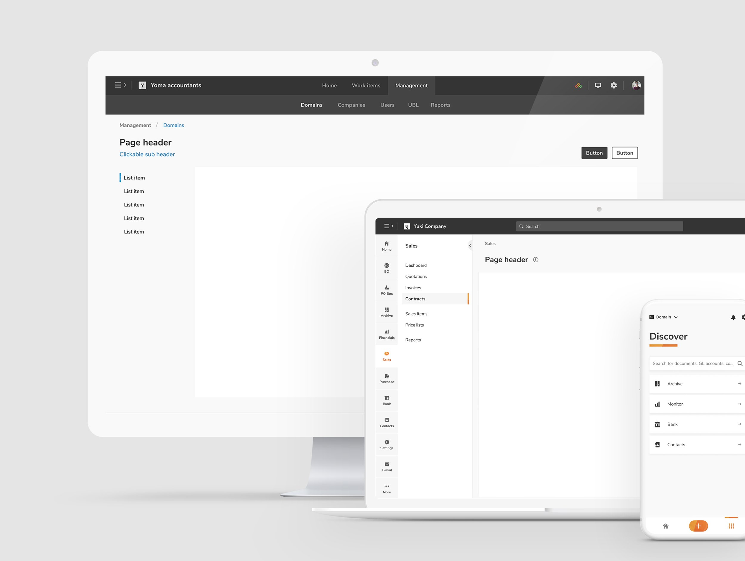
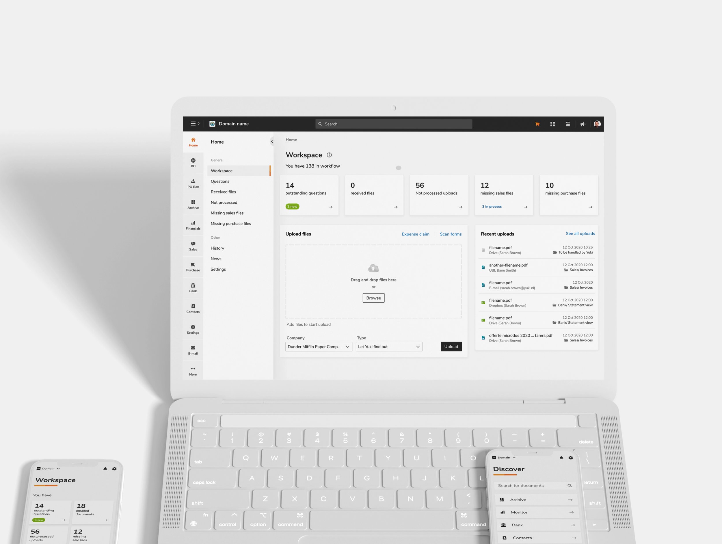
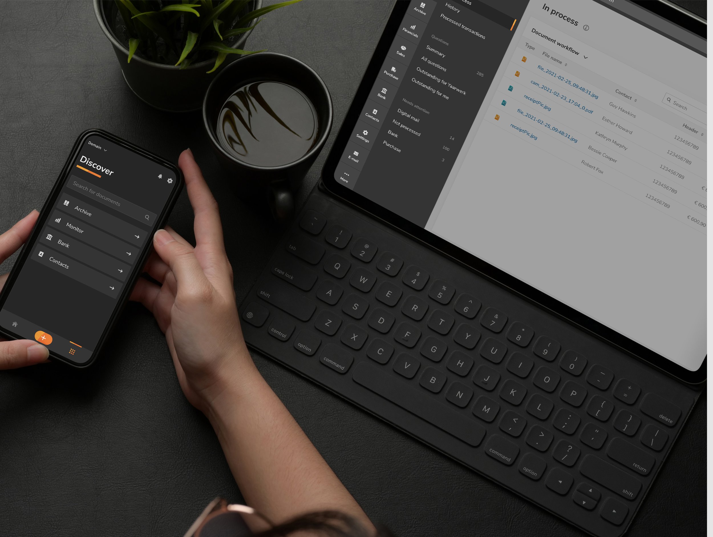
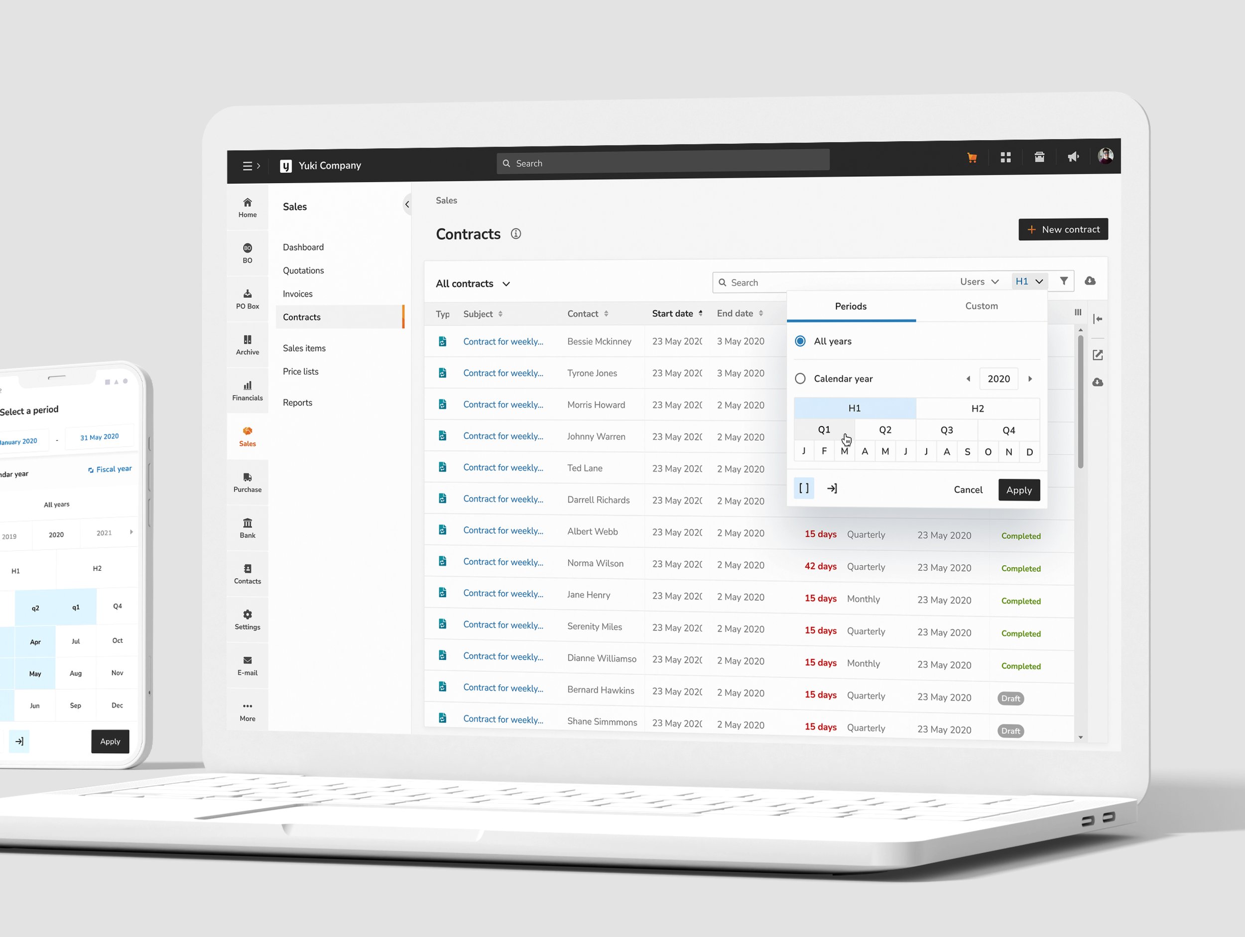
Core Styles and Templates: Ensured consistency across desktop and mobile platforms.
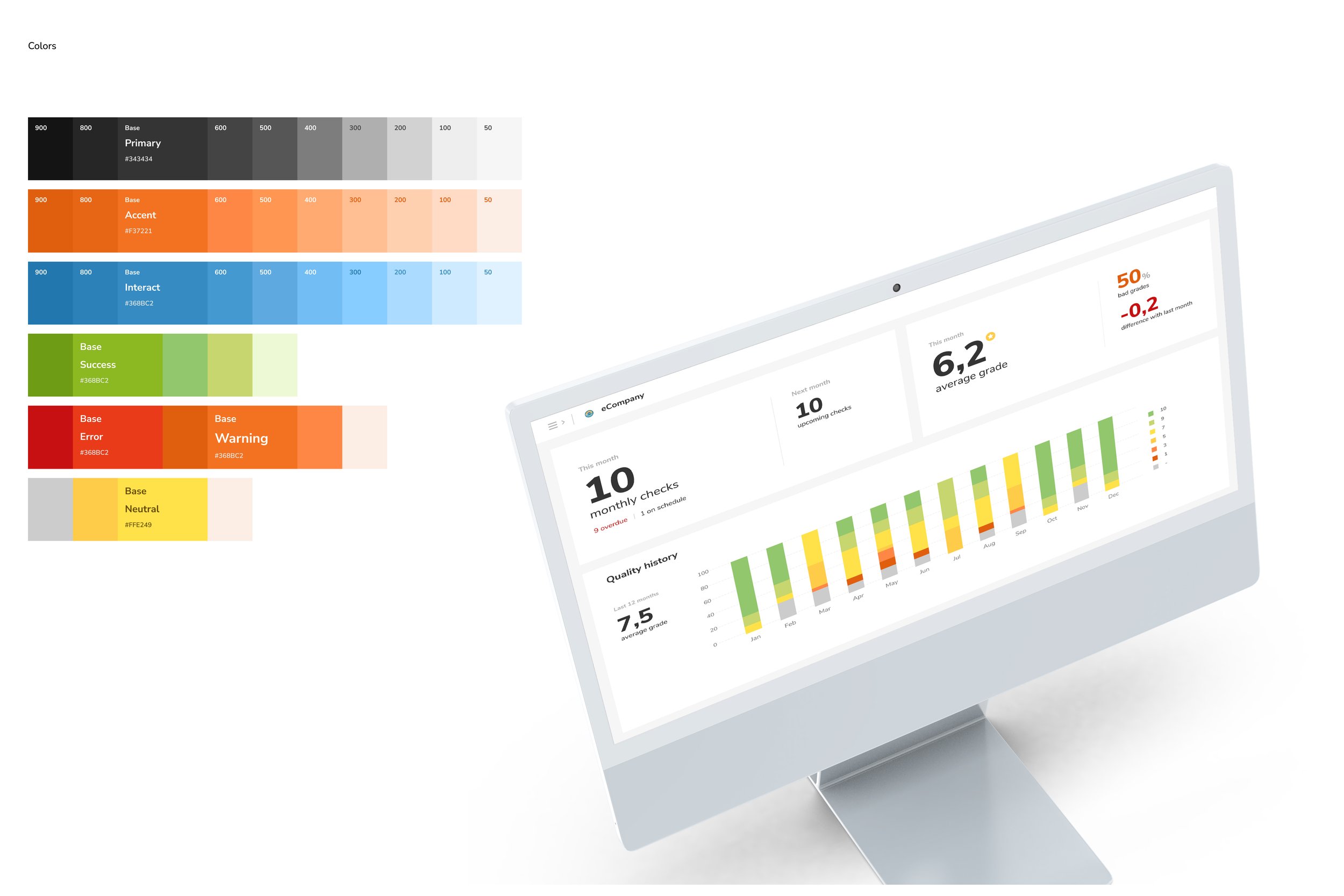
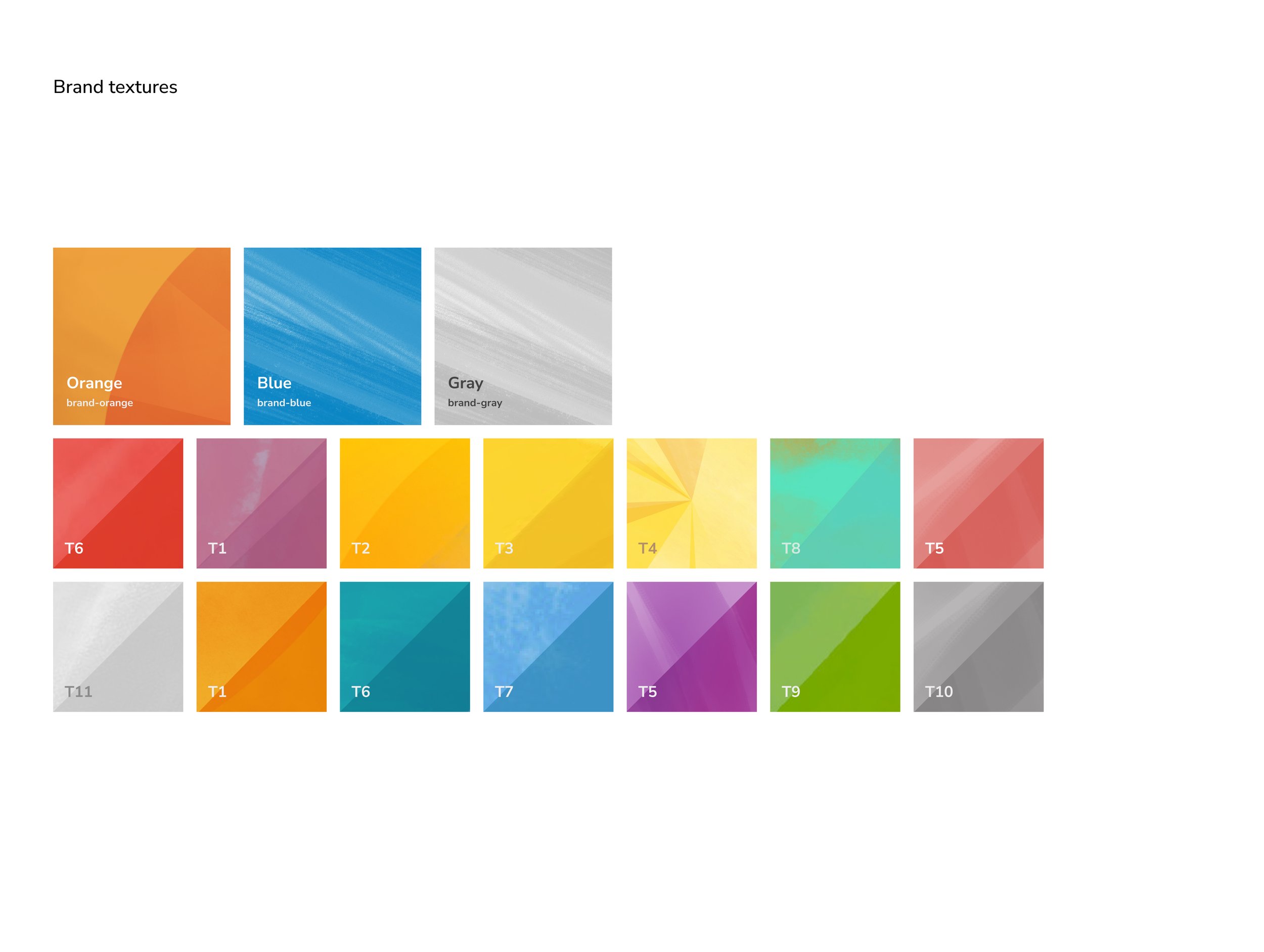
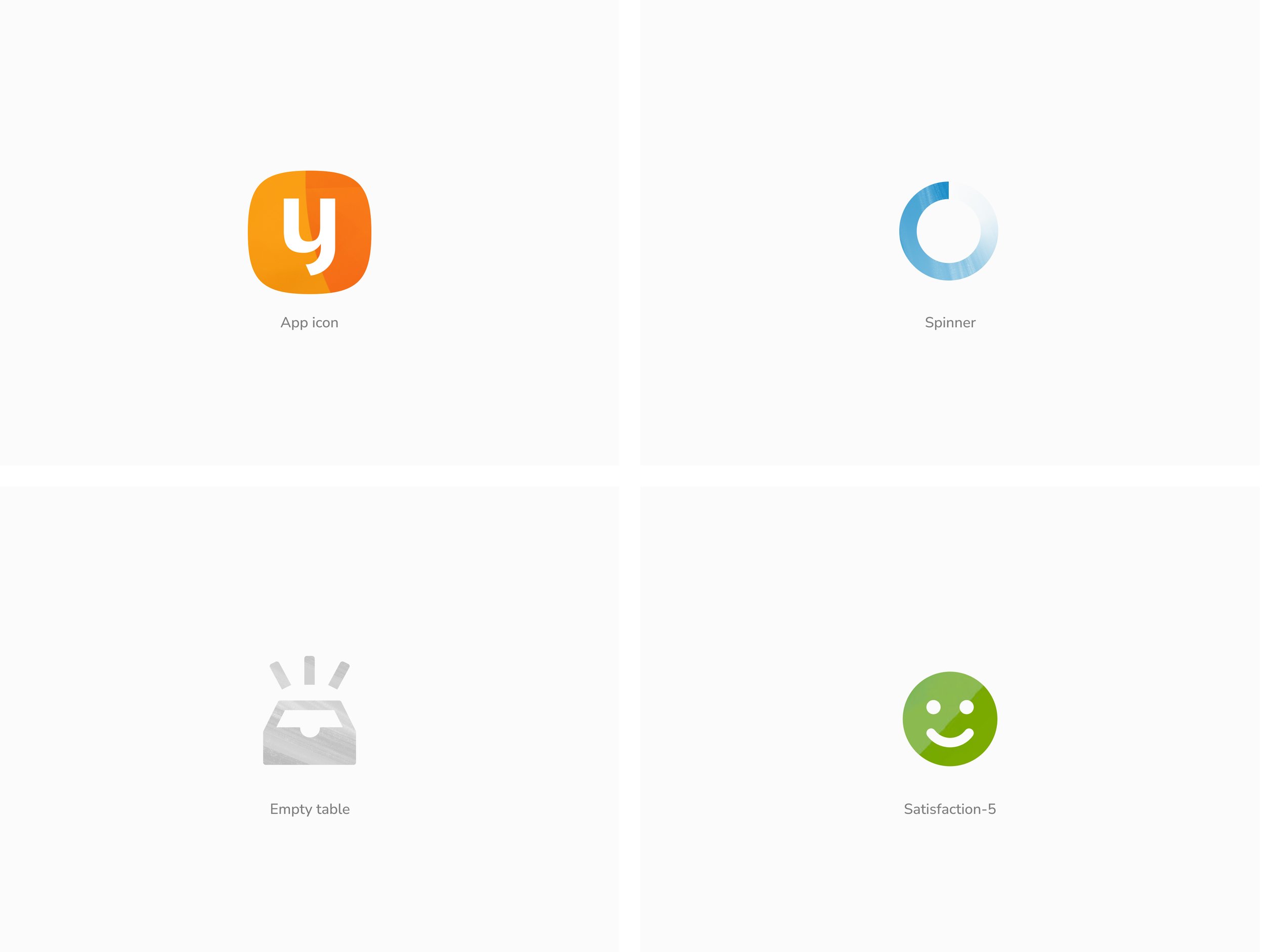
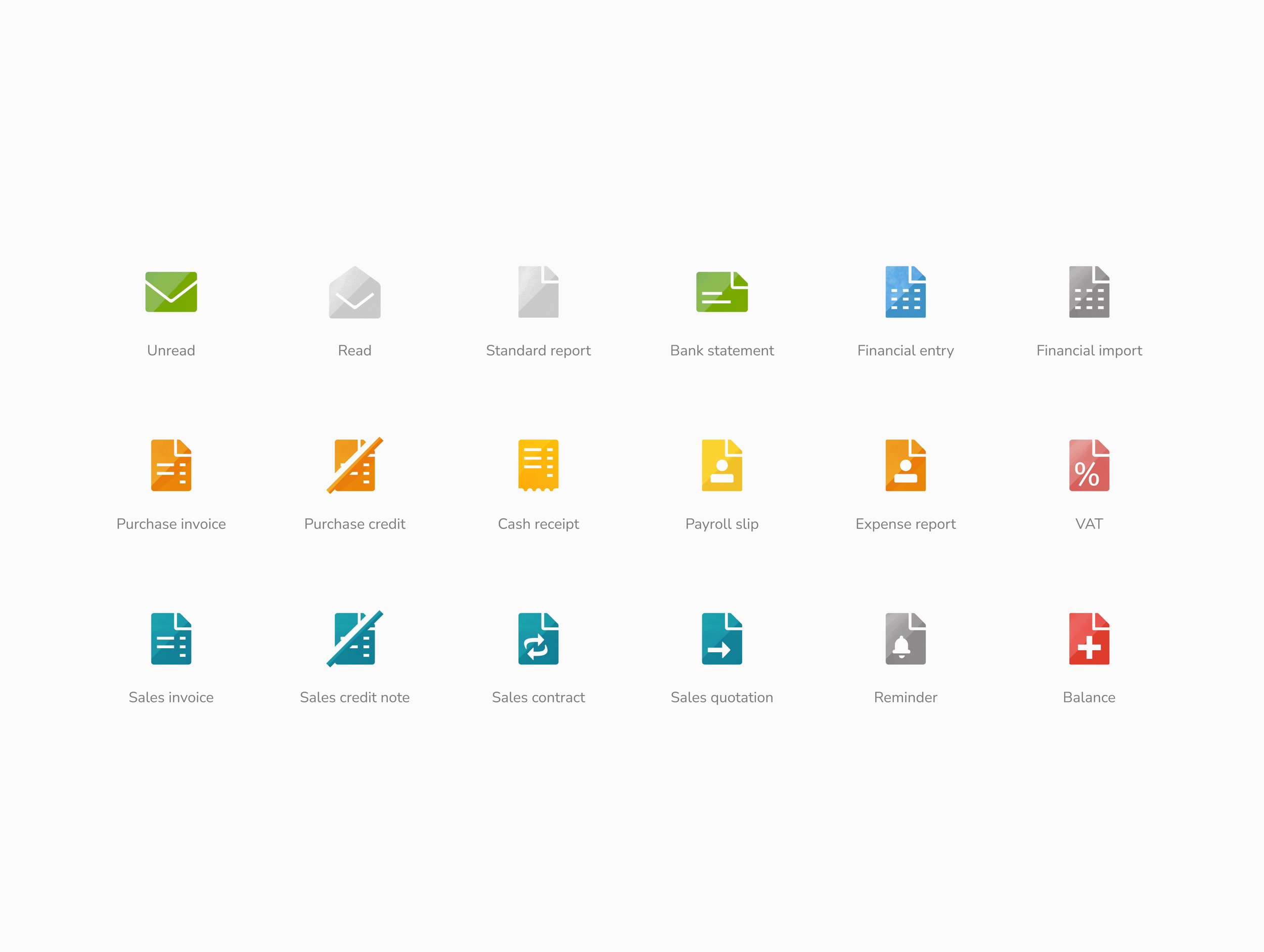
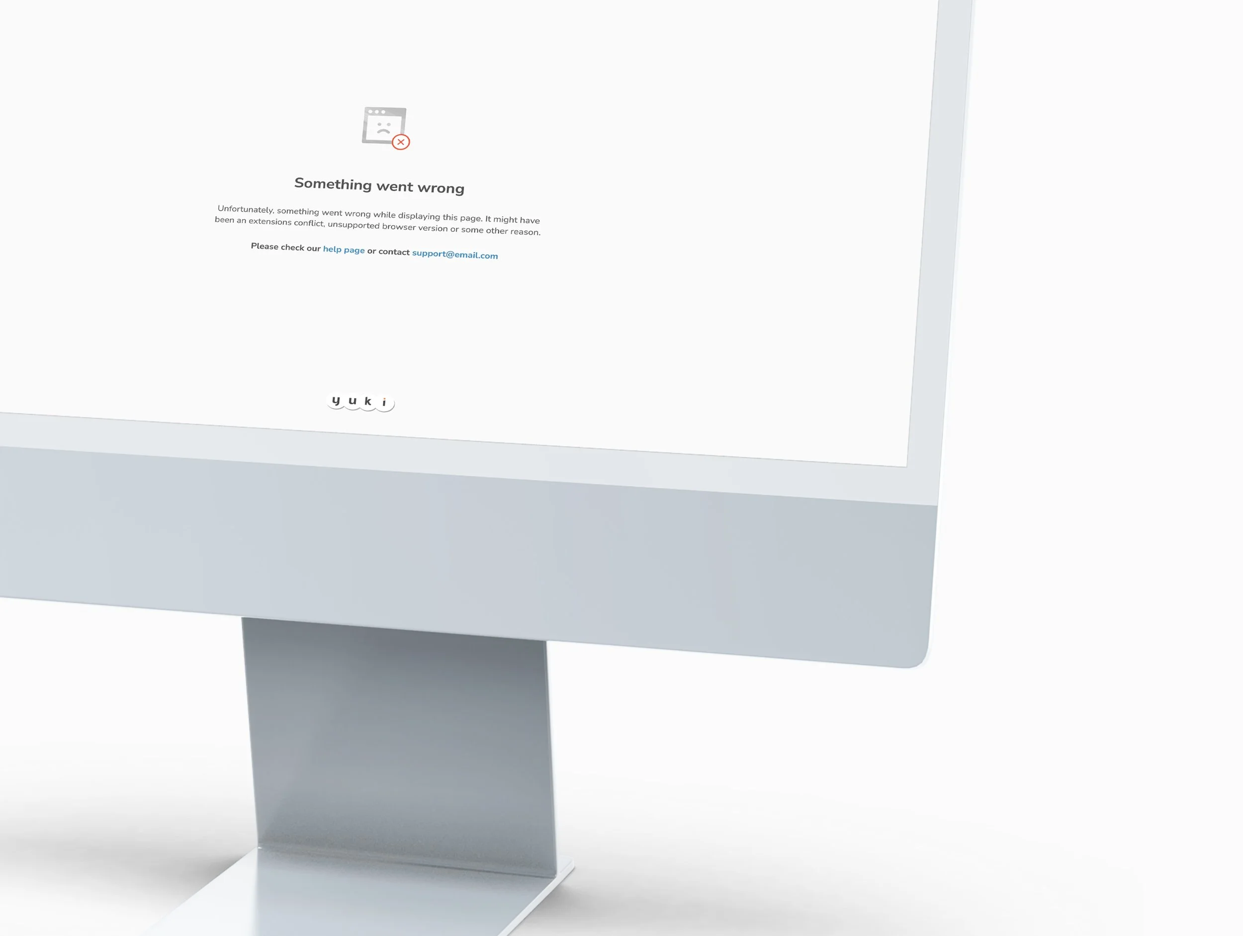
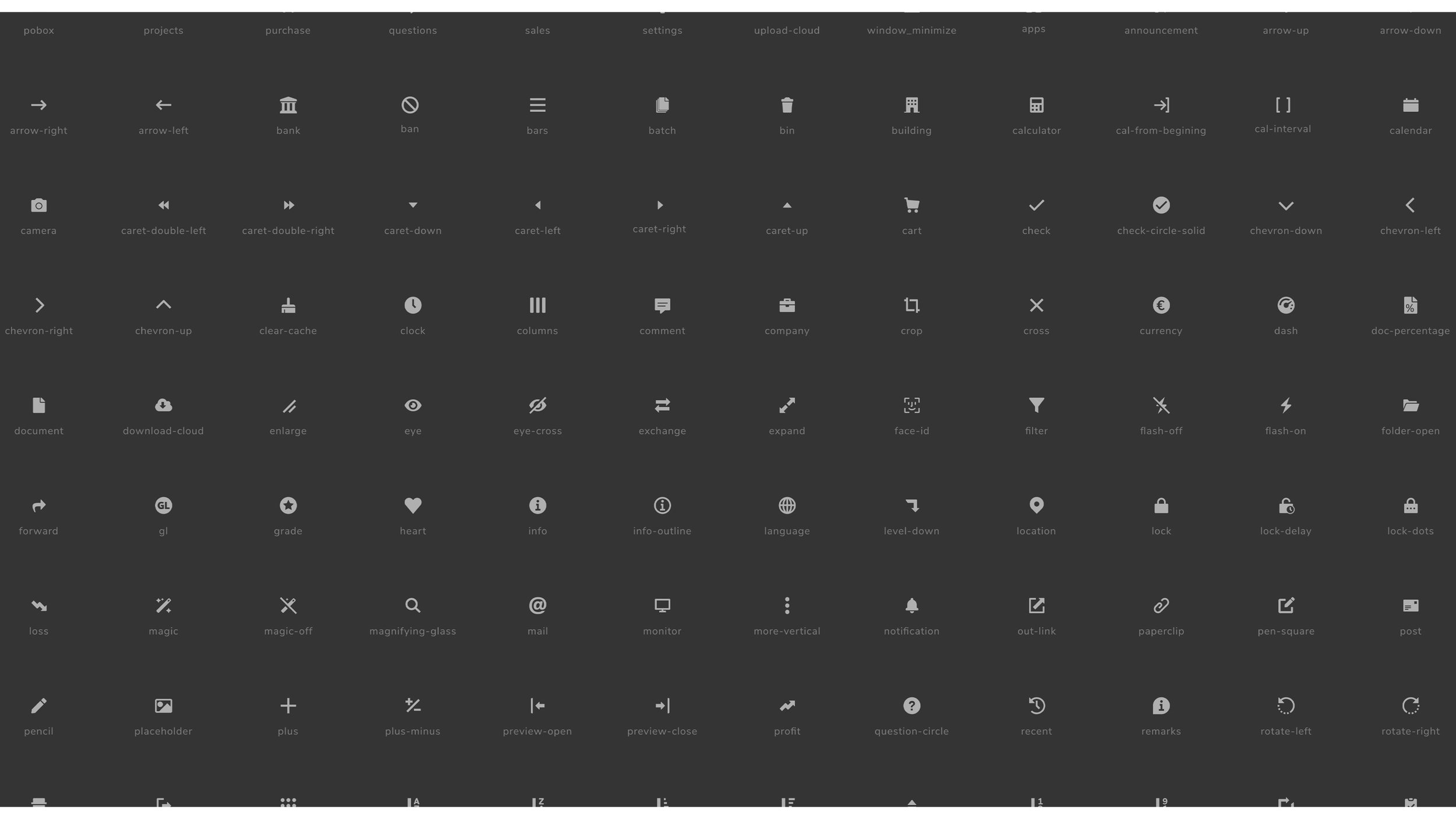
Improved Accessibility: Introduced colors, typefaces, icons, and illustrations for clarity and cohesion.



Reflection
Redesigning the Yuki accounting platform was a challenge that combined creativity with functionality. Our goal was to make Yuki scalable, intuitive, and visually appealing while staying true to its mood goals: convenient, trustworthy, effective, and enjoyable.
A key challenge was blending Yuki’s bright, playful identity with the professionalism expected of an accounting tool. Initially, I struggled to fully embrace the brand’s bold, colorful aesthetic, leaning instead towards a more subdued and traditional design approach. My initial sketches, while functional, received pushback for not fully reflecting Yuki’s vibrant identity. This feedback was invaluable, guiding me to reimagine how the brand could shine within a financial context. Through user testing, we discovered that the bold colors, when used thoughtfully, could enhance usability—highlighting key features and graphic elements in a way that felt intuitive and engaging.
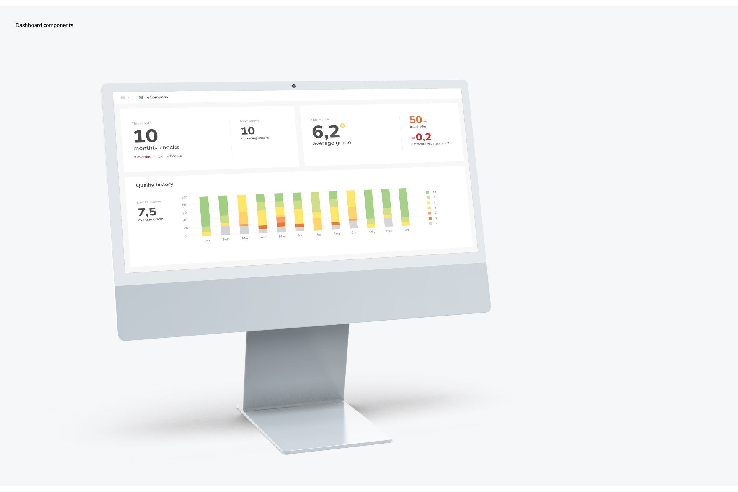
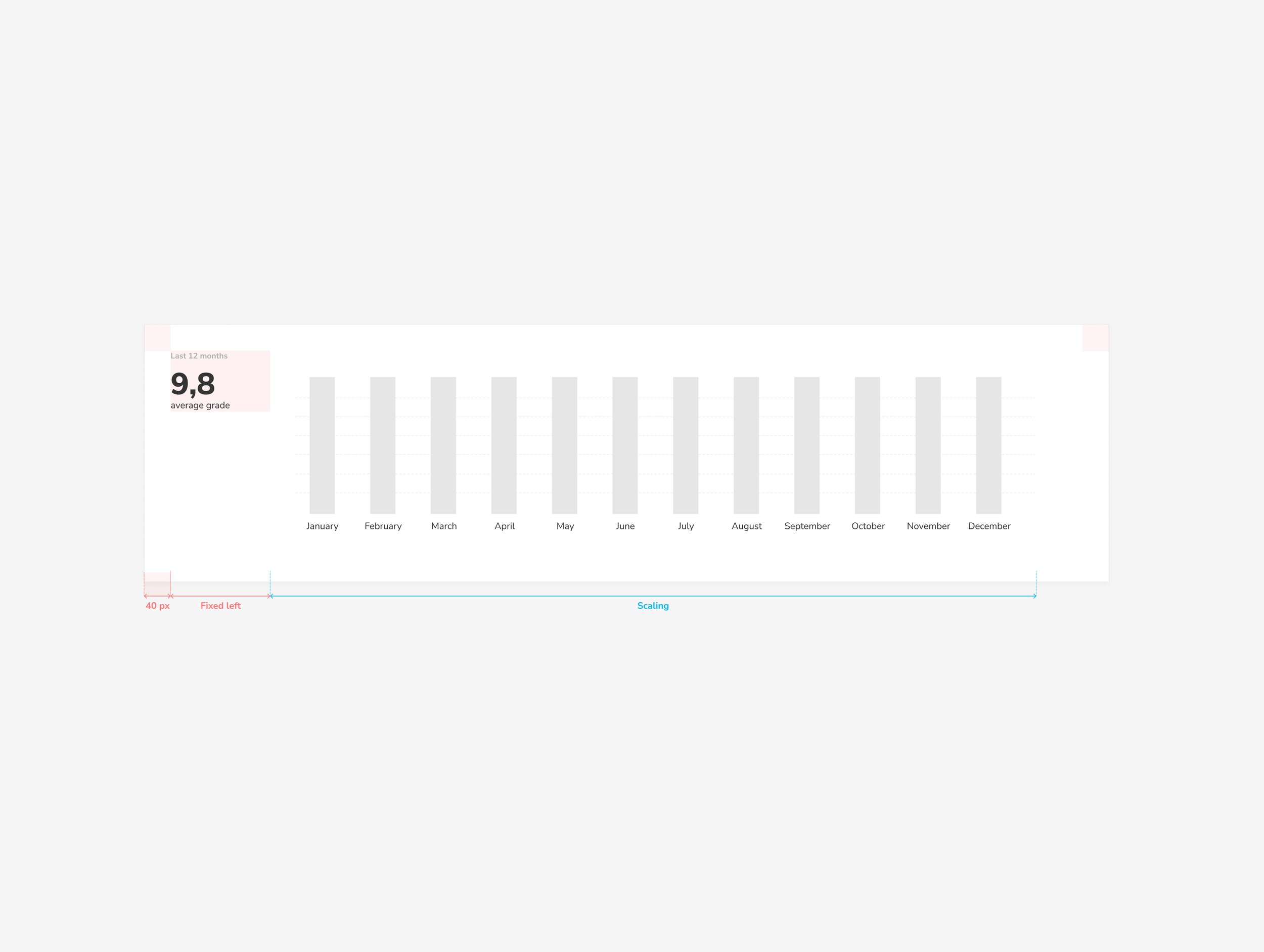
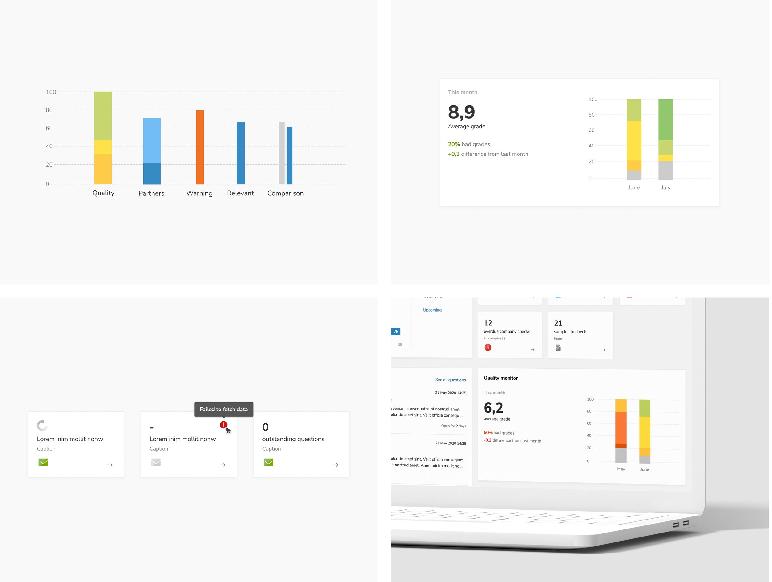
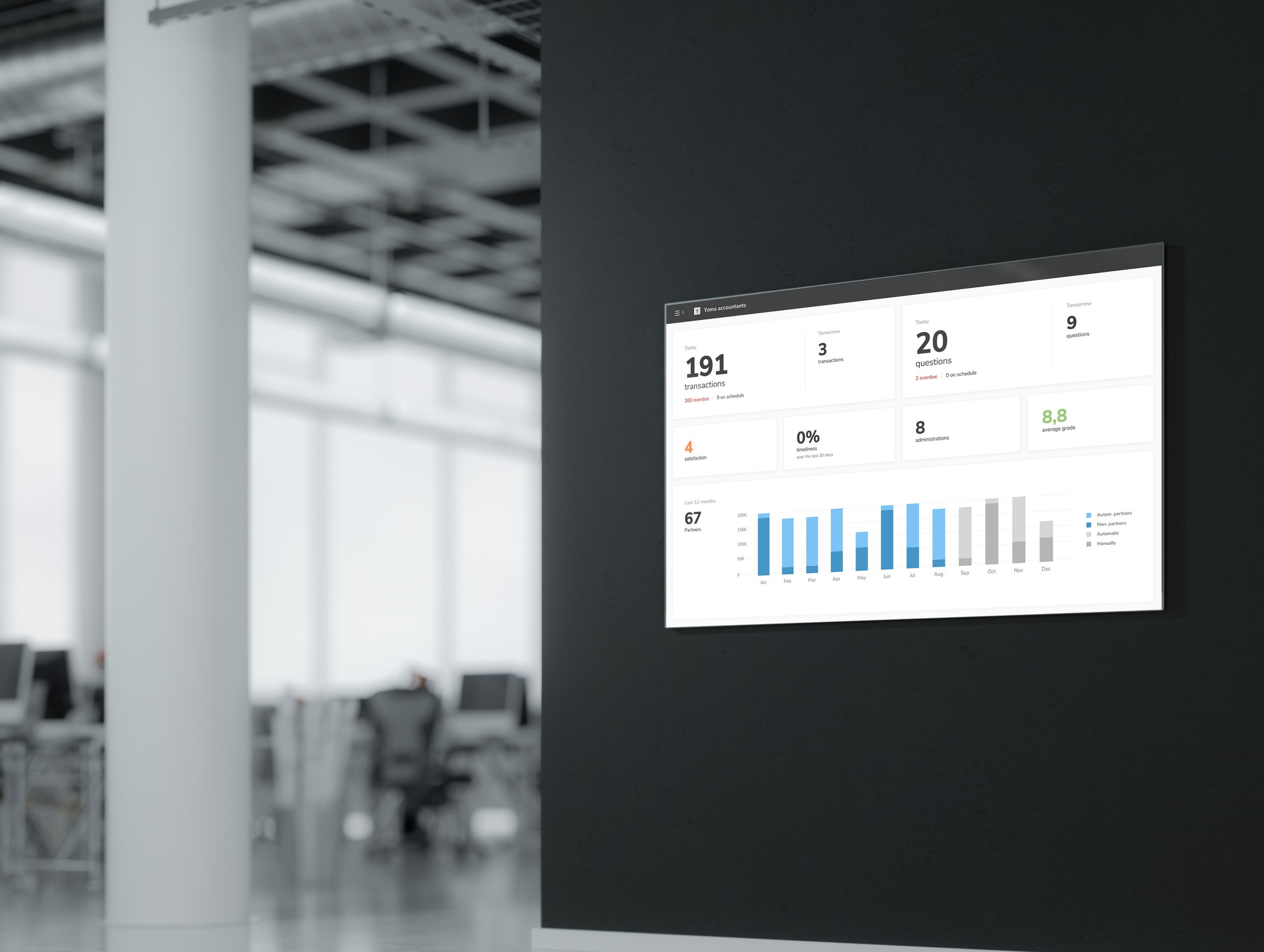
Another focus was rethinking financial graphs to ensure they were clear and informative across desktop and mobile. Simplifying data visualizations while retaining accuracy required multiple iterations and user feedback, resulting in graphs that are easy to understand at a glance.
Finally, this project reinforced the value of a solid design system, which ensured consistency and streamlined collaboration across teams. It also taught me the importance of balancing brand identity with functionality and the need for clear communication when managing diverse priorities.
Results
The redesigned Yuki platform now offers a smart, reliable, and enjoyable experience, embodying our Moodgoals by making the platform convenient, effective, and enjoyable. Through the thoughtful integration of a design system, modern UI, and user-centered UX, we’ve made complex tasks easier to navigate, reducing effort while keeping users in control. For example, the clean and intuitive interface simplifies user flows, while personalized features present only relevant data, making the experience more tailored and efficient. By leveraging modern technology, we’ve created a platform that is not only innovative but also trustworthy, providing users with accurate data they can rely on. This success was the result of close collaboration with my manager, whose belief in me and guidance helped turn bold ideas into a platform that truly reflects Yuki’s vibrant spirit and its core values.
