work /
Quin Health
Designing for Impact: Building the Corpus Design System for Consistency, Collaboration, and Innovation in Healthcare
Quin MD
Quin develops digital solutions for GP practices and specialized care. The goal is to provide smarter contact options between healthcare professionals and patients and streamline workflows and care pathways. The mission: make care accessible for everyone.
Business challenge
Dutch healthcare, despite being among the best globally, is facing critical issues: primary and secondary care providers struggling to meet increasing demand. General practices are particularly burdened, operating at the limits of their capacity. Quin set out to tackle these challenges by creating digital tools that simplified care pathways, improved communication between professionals and patients, and streamlined care delivery. However, inconsistencies, inefficiencies, and poor collaboration in the design process threatened the scalability and impact of these solutions. Indeed, Quin realized that effective solutions required more than isolated tools—consistent design and proper collaboration were key. By focusing on a unified design system, we ensured scalability and sustainability, creating tools that could evolve with healthcare needs.
The goal was ambitious yet clear: to create a self-sustaining system that empowers teams to design, develop, and maintain a consistent user experience across products and platforms—efficiently and at scale.
My role
When I joined Quin, the Design System was in its infancy. At this stage, our team focused on defining its scope, vision, and overall strategy. I joined as a product designer in several product teams designing solutions, refining existing features as well as driving the designs of new ones. Alongside this, I was driving the work with the design system to align teams around clear standards and principles, anchored by user needs, and the business problem that we were trying to solve.
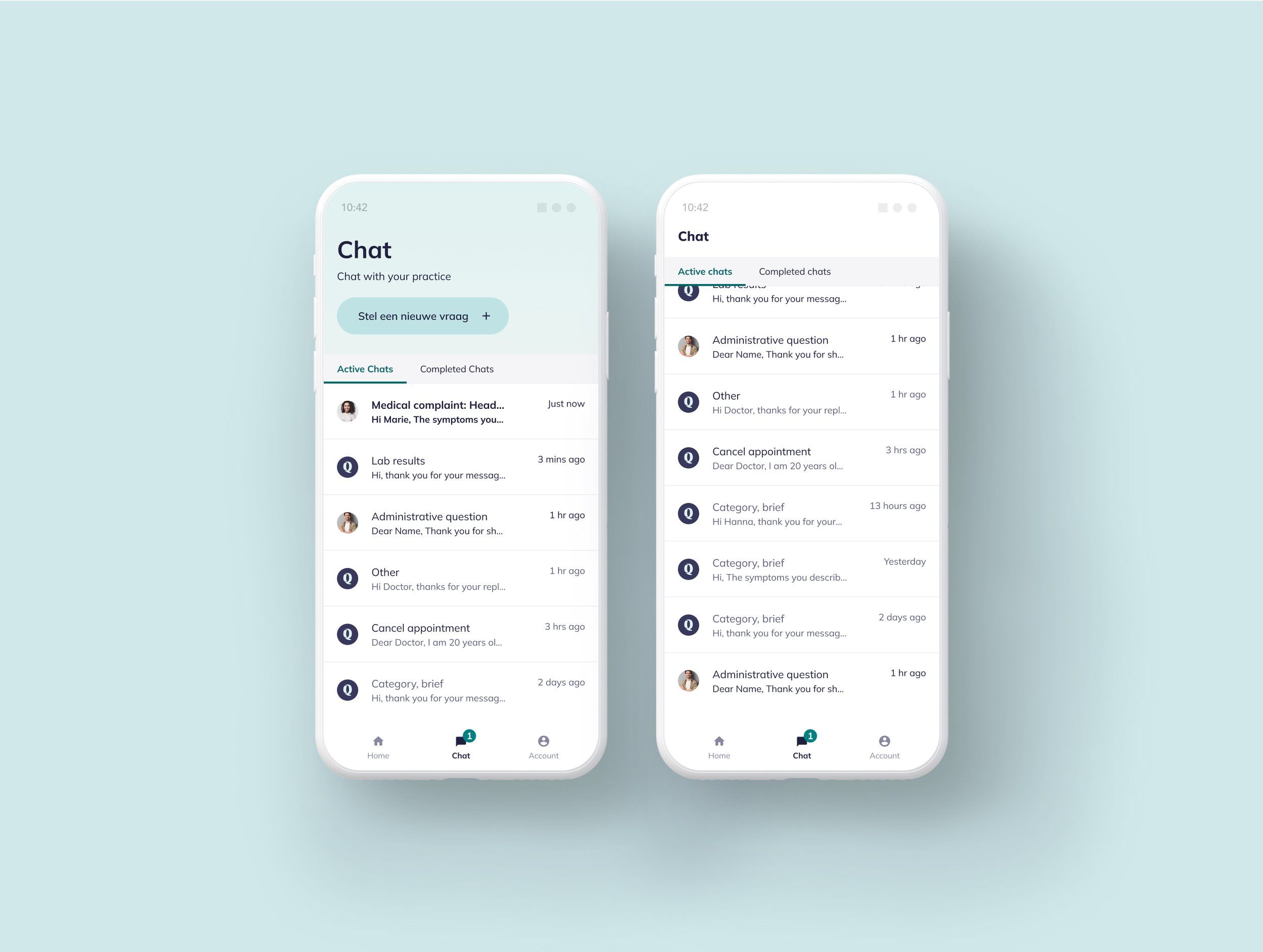
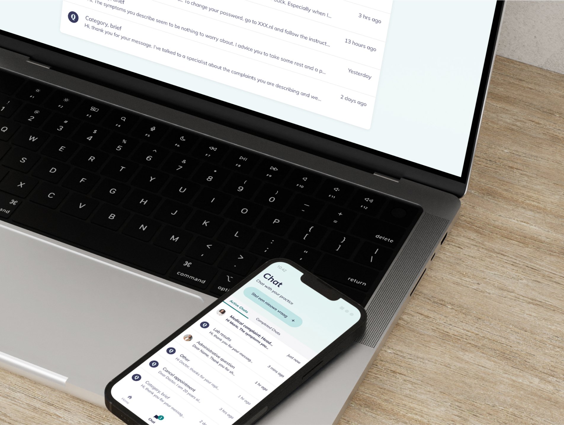
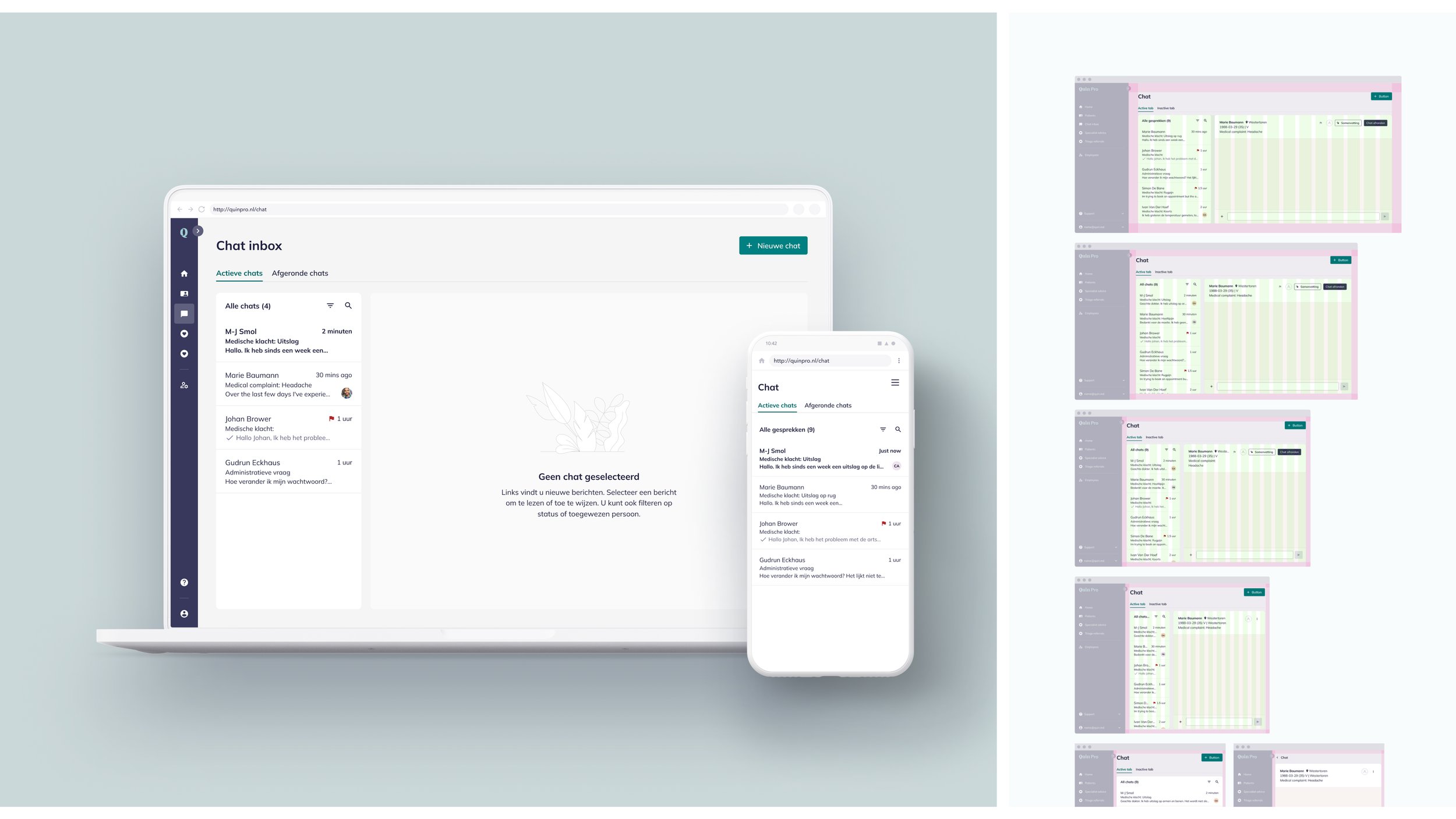
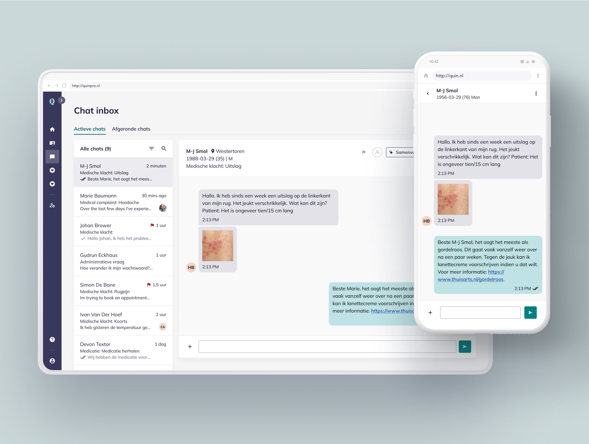
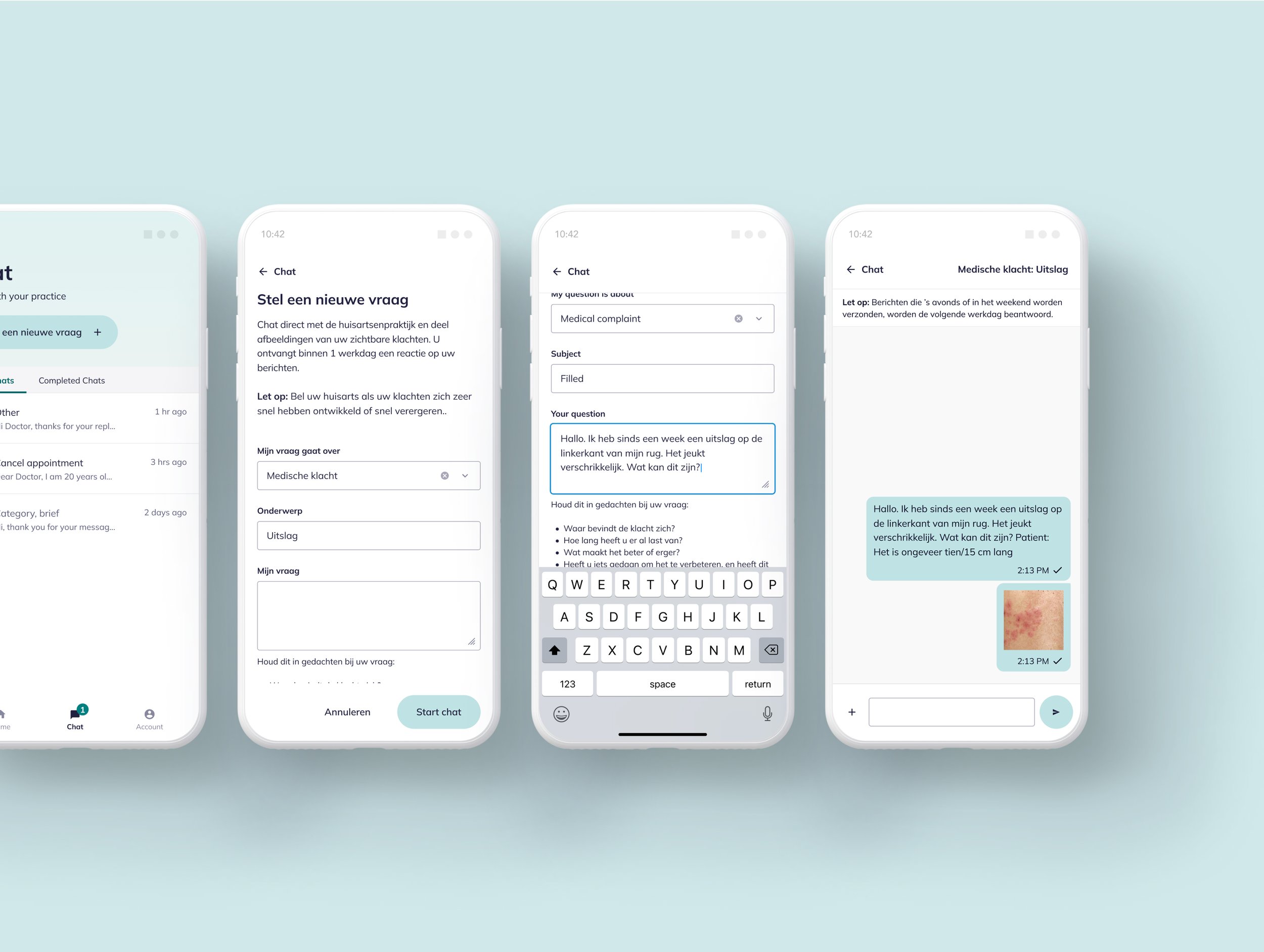
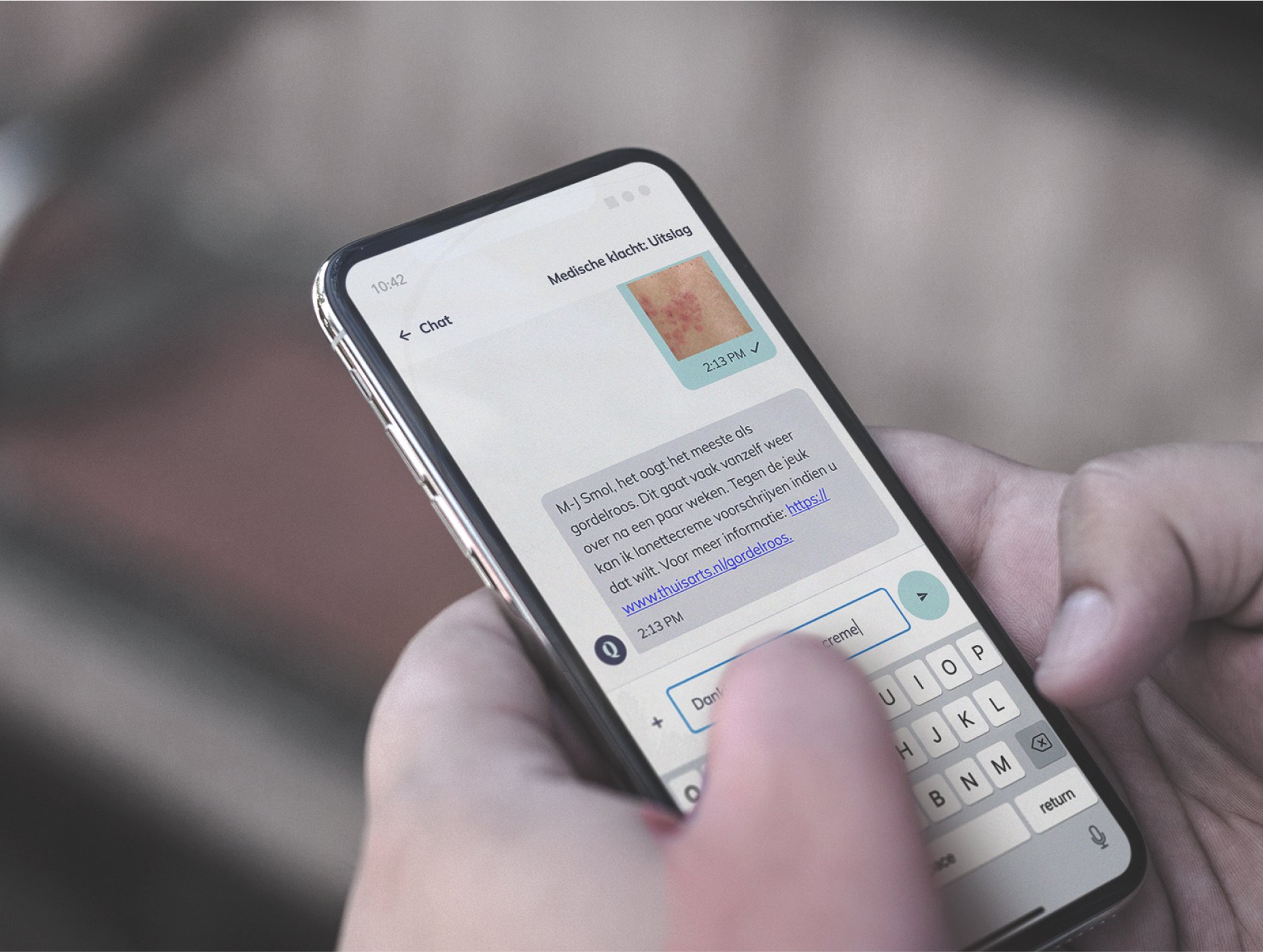
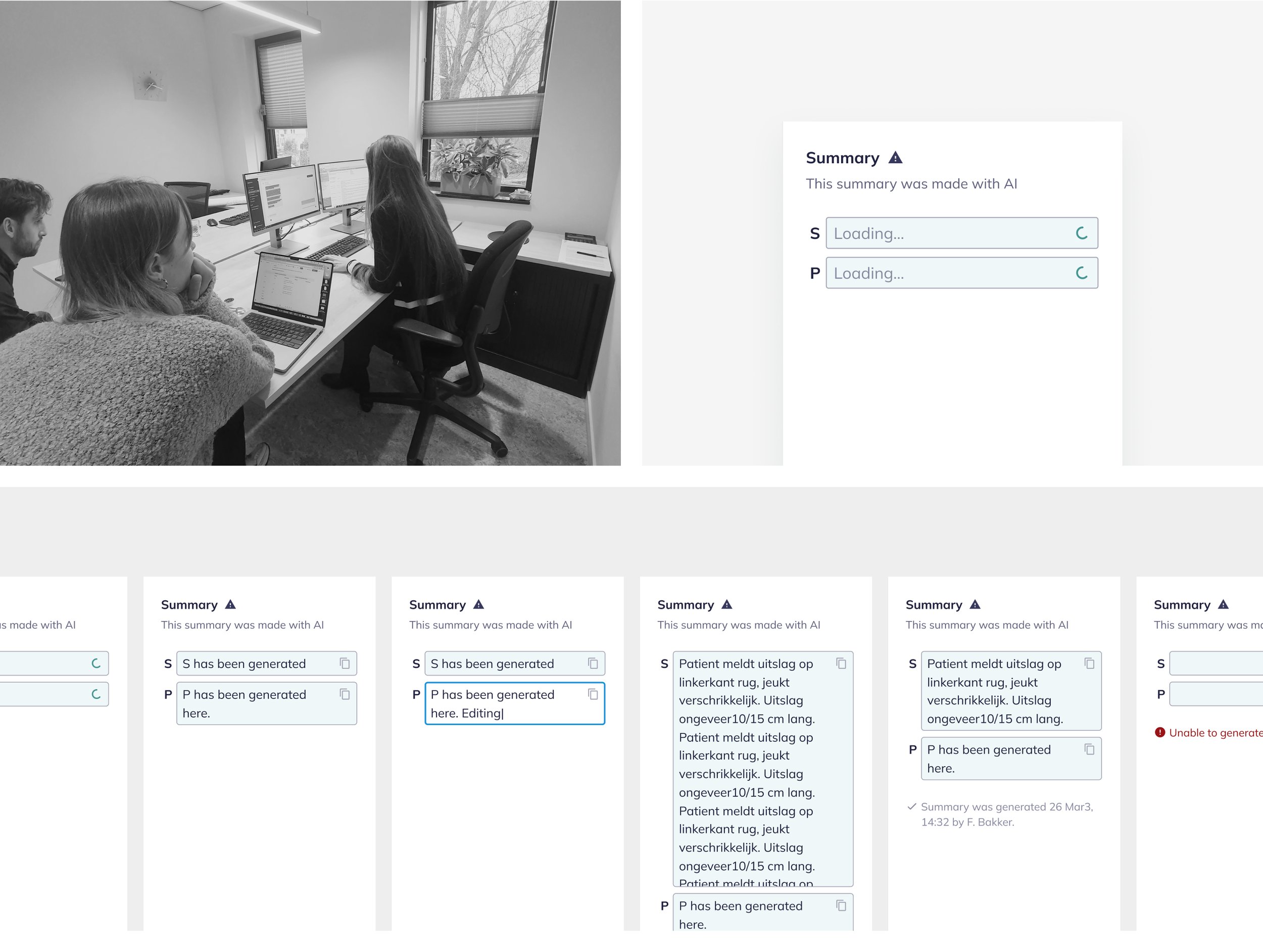
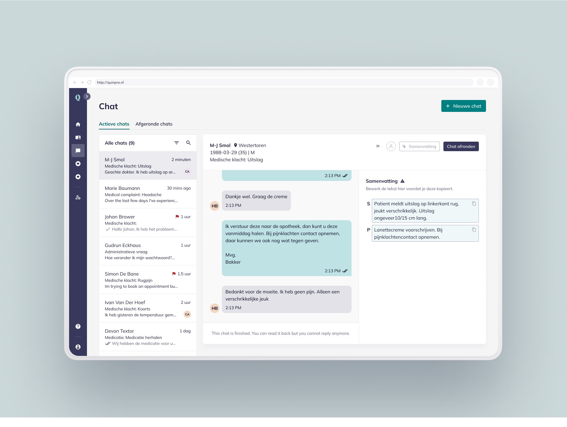
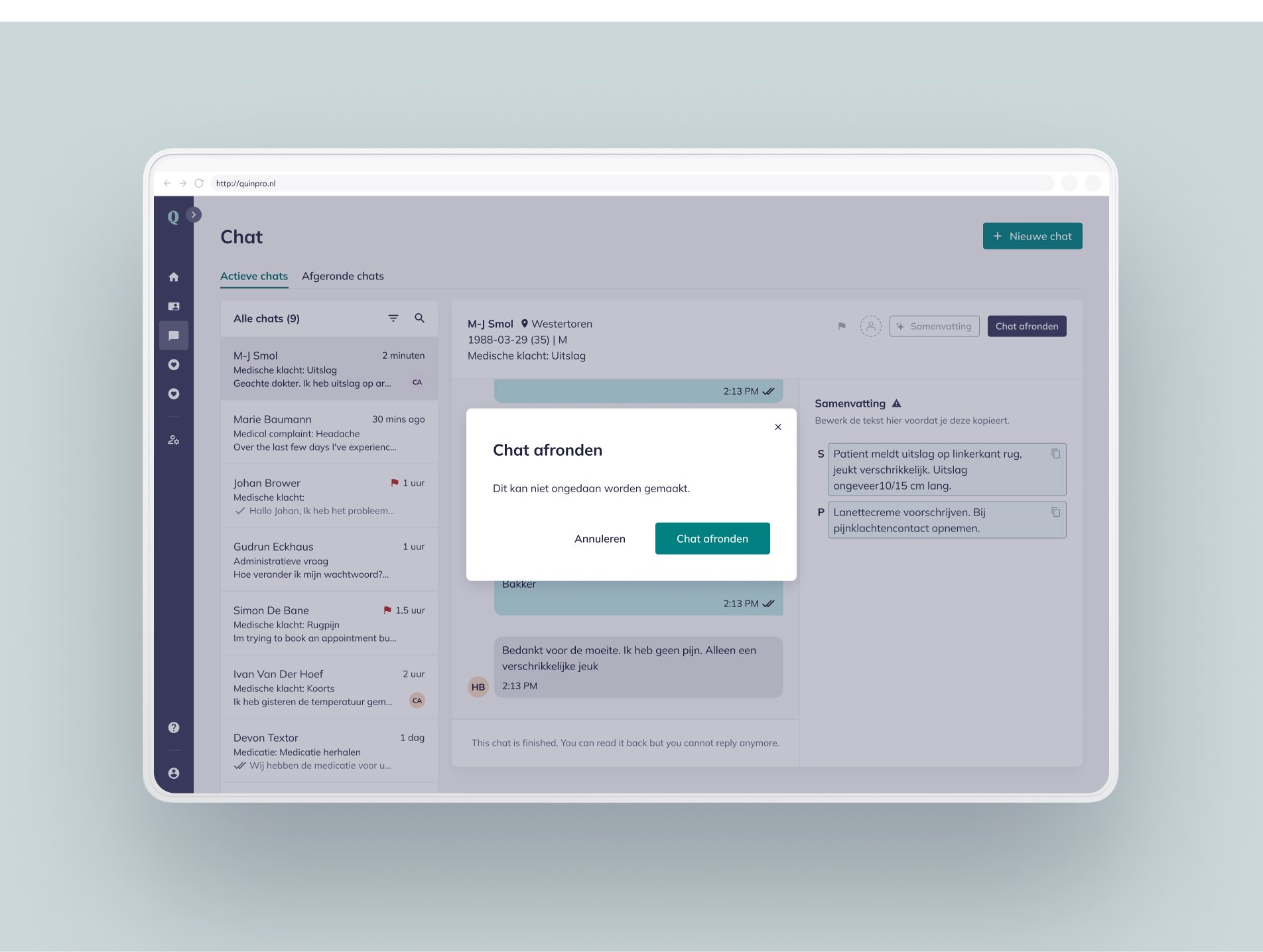
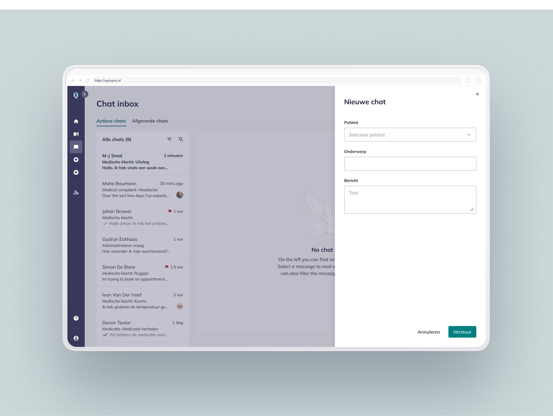
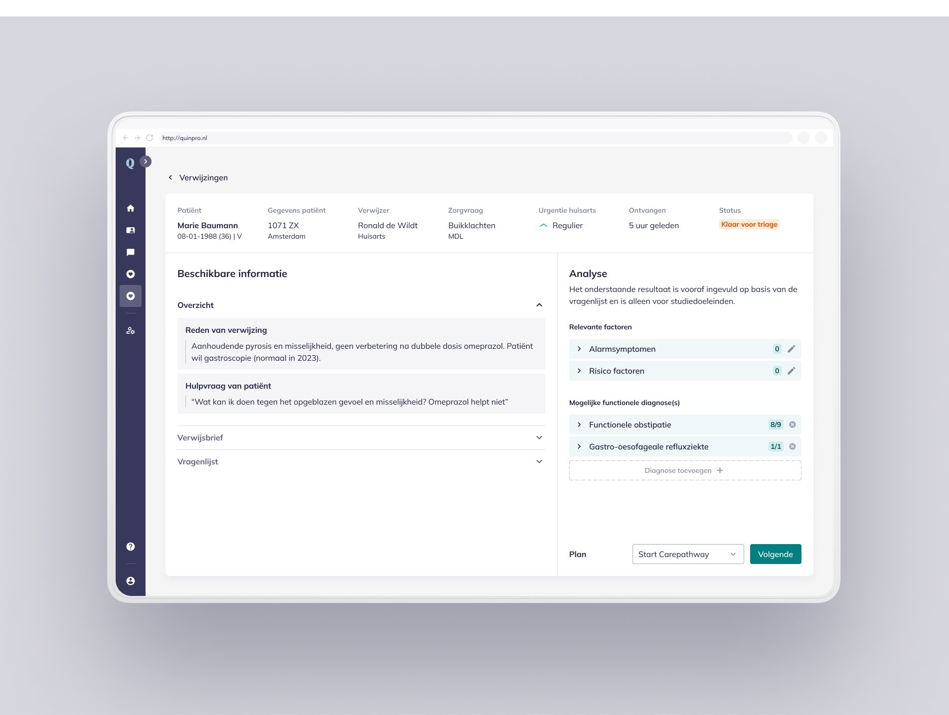
This showcase highlights the design system and its role in building the product, while also covering some of Quin’s key product solutions where I was directly involved: The chat, and the AI triage tool.
In-house at: Quin, Amsterdam
My role: Product Designer
Deliverables: Design System (Vision, goal, principles, styleguide, component & pattern library), UX and UI flows for various features across the platform.
In collaboration with: Fellow design- and developer colleagues at Quin.
Problem and approach
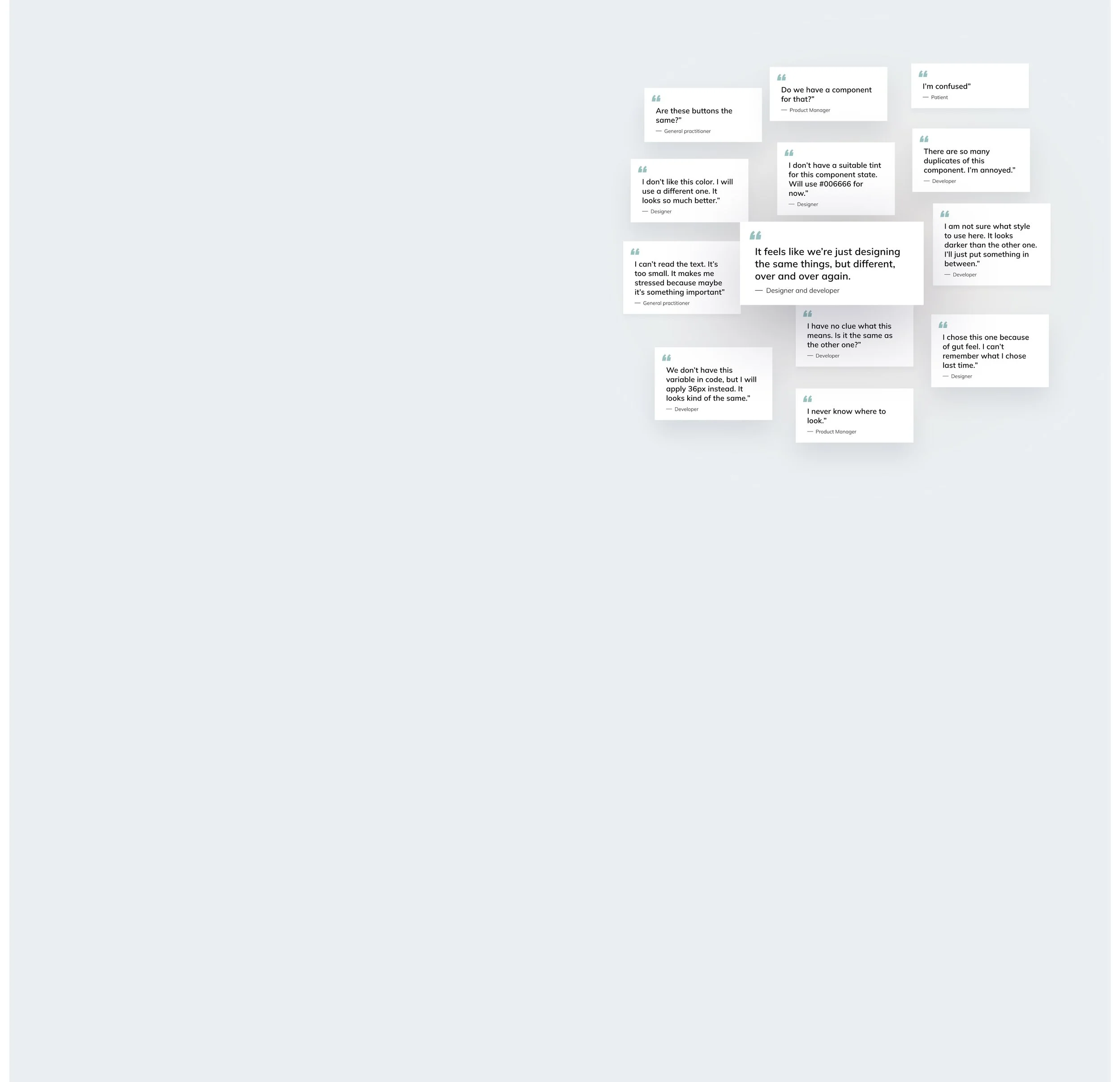
Quin faced inefficiencies from fragmented systems, inconsistent practices, and collaboration gaps, leading to wasted time and unpredictable user experiences. To address this, we audited workflows, gathered feedback, and collaborated across teams, identifying key priorities: unified guidelines, reusable components, and a scalable, collaborative design strategy.
-
The design teams at Quin encountered significant obstacles that hindered their ability to deliver consistent and user-centric experiences:
Fragmentation Across Platforms: Separate design systems and UI libraries led to redundancy, confusion, and difficulty maintaining consistency across platforms.
Inconsistent Design Practices: The absence of standardized guidelines resulted in arbitrary choices, misaligned designs, and scalability issues.
Tooling and Process Gaps: Limited reusable properties in Figma caused repetitive adjustments, while hardcoded values in the codebase restricted flexibility.
Collaboration and Quality Challenges: The lack of a shared framework created miscommunication between designers and developers, and the absence of semantic design tokens impacted accessibility.
-
The inefficiencies in Quin’s design workflow led to significant cognitive and resource costs:
Cognitive Overload: Teams spent excessive time on repetitive tasks instead of focusing on innovative solutions.
Decreased Productivity: Fragmented processes and misaligned workflows caused delays and increased effort. Inconsistent design practices led to unpredictable and confusing user experiences for both patients and healthcare professionals, frustrating users and creators alike.
-
To understand the scope of the challenges, we conducted a thorough audit of existing workflows, analyzed user feedback, and collaborated closely across teams. Key insights included:
Unified guidelines and reusable components were essential for scalability.
Collaboration gaps between design and development required immediate attention.
A semantic design token system was necessary to improve adaptability and accessibility.
Re-build of components needed to make the platform scalable and maintainable, and then:
Re-design of styles needed to bring the UI up a notch, so as to increase the trust of the platform.
Solution
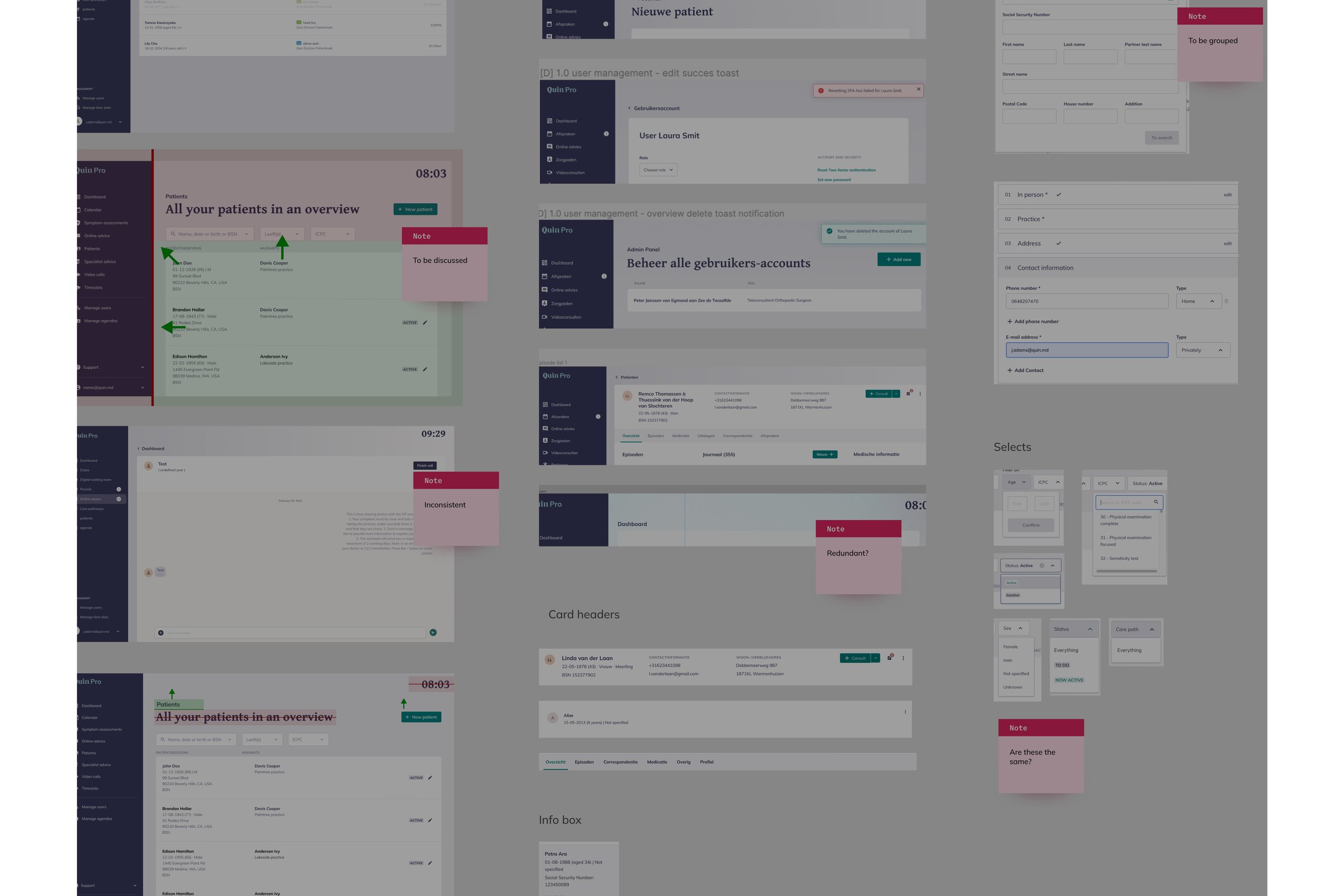
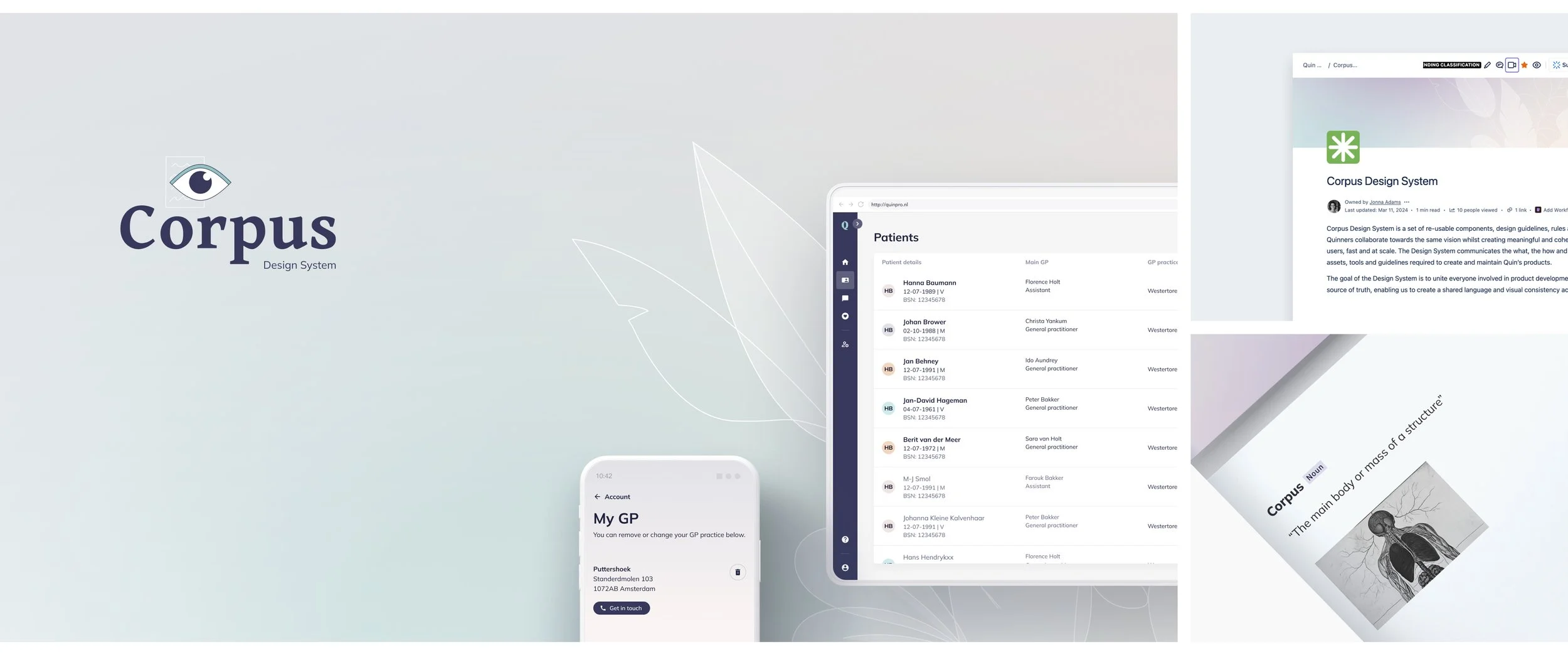
The solution focused on creating the Corpus Design System, a unified framework to enhance quality and consistency and ensure efficiency. It includes reusable components, design guidelines, and design tokens connecting brand assets with UI elements. The process involved auditing existing systems, defining goals and structure, and developing a core design tokens library. From there, we replaced outdated styles, created a generic reusable UI component library with improved ways of working to make hand-over and usability testing fast and easy.
-
The solution centered on developing the Corpus Design System:
A unified framework of reusable components, design guidelines, and standards.
Scalable design tokens to bridge brand assets with UI components.
A system that fosters collaboration and consistency across all products.
-
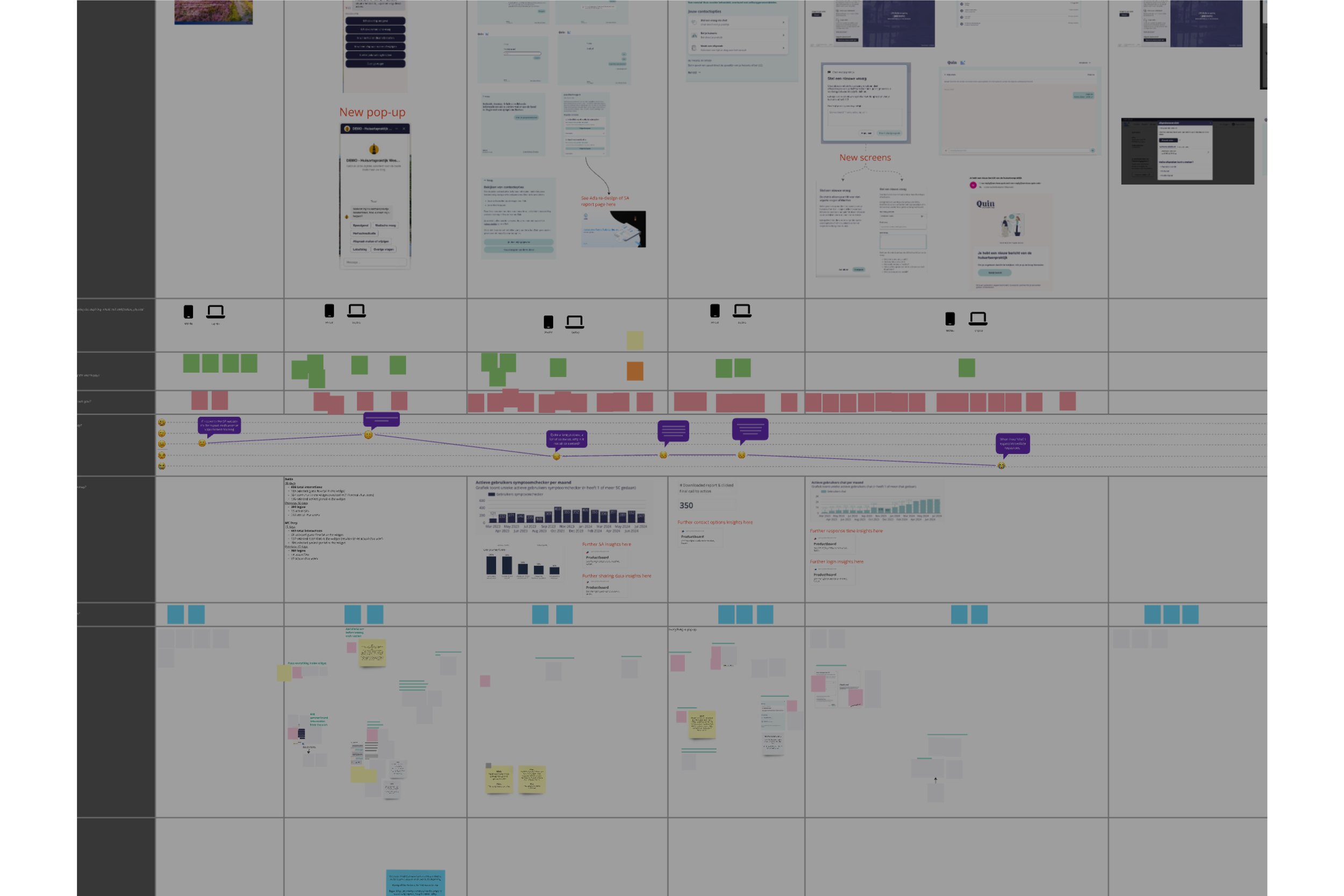
We took a strategic approach to improve efficiency and consistency across platforms by evaluating existing systems, defining core structures, and creating reusable components. Key steps included:Audit: We evaluated existing platforms to identify inconsistencies and redundancies, while mapping workflows to pinpoint inefficiencies.
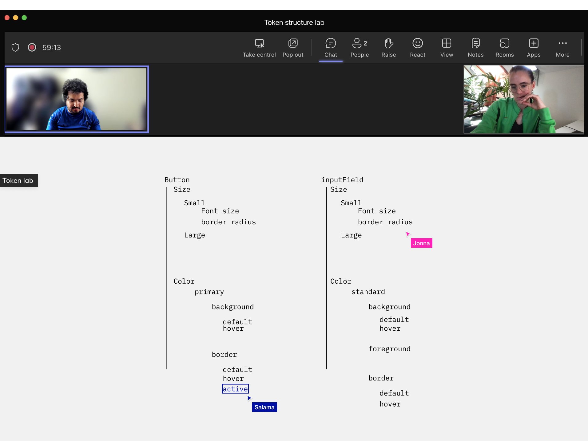
Definitions: We defined “Corpus,” its goals, vision, and purpose, and established its anatomy and structure. Additionally, we aligned on ways of working and naming conventions.
Overview and structure: Developed a clear Figma file structure, ensuring alignment with code files and consistent naming conventions.
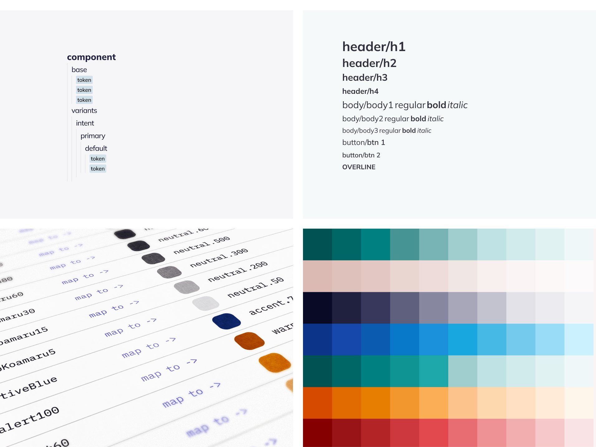
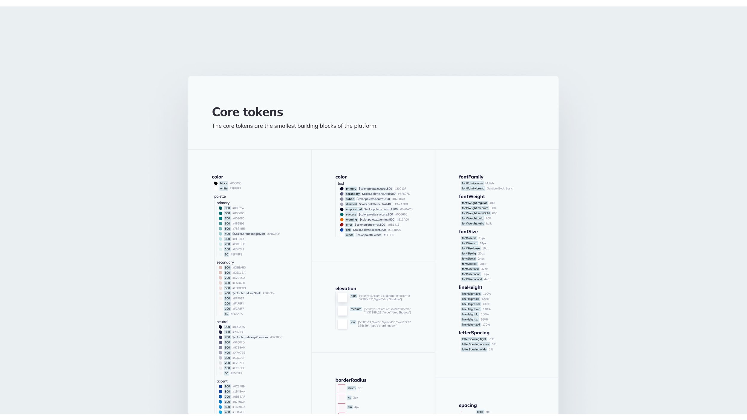
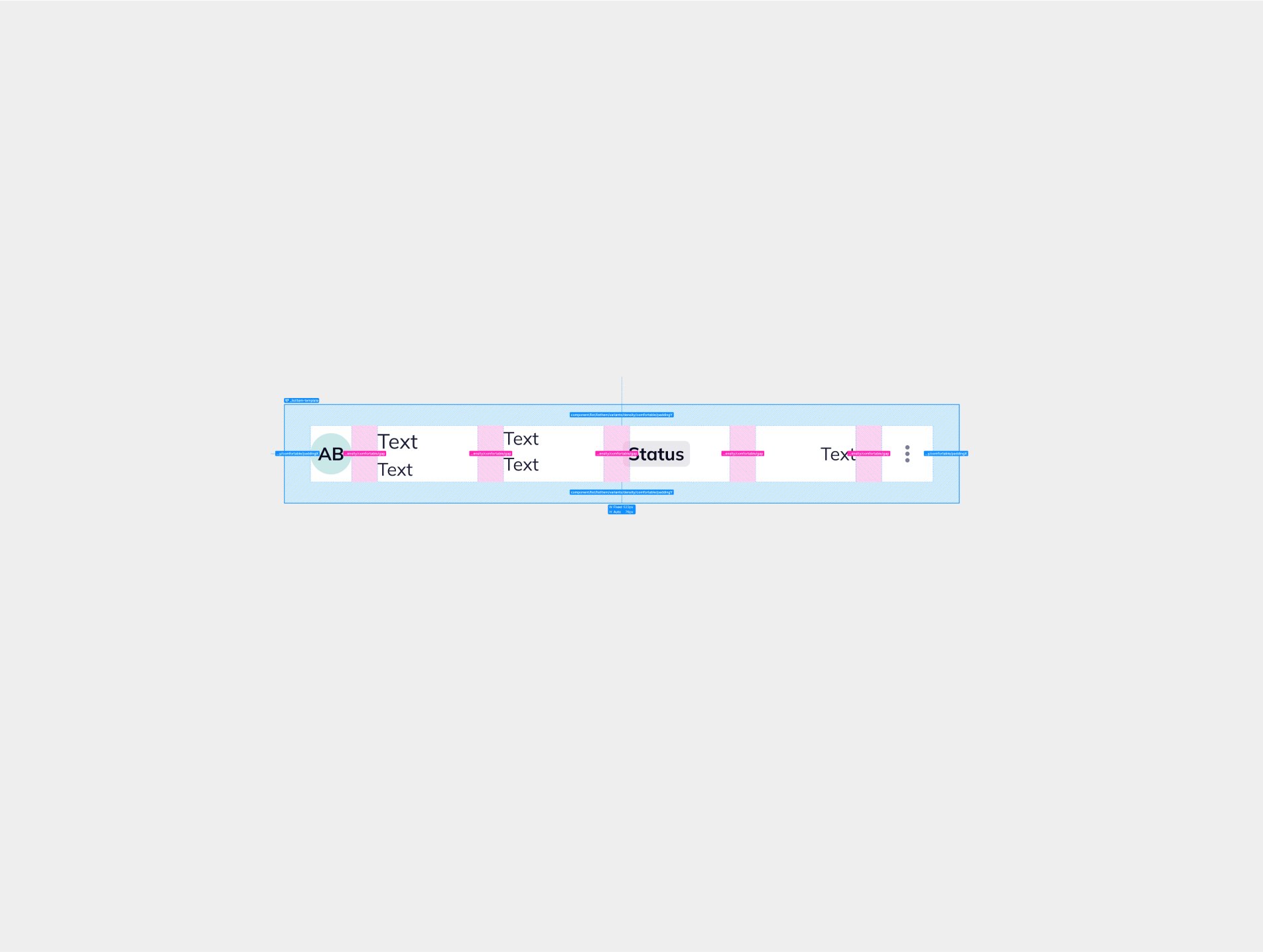
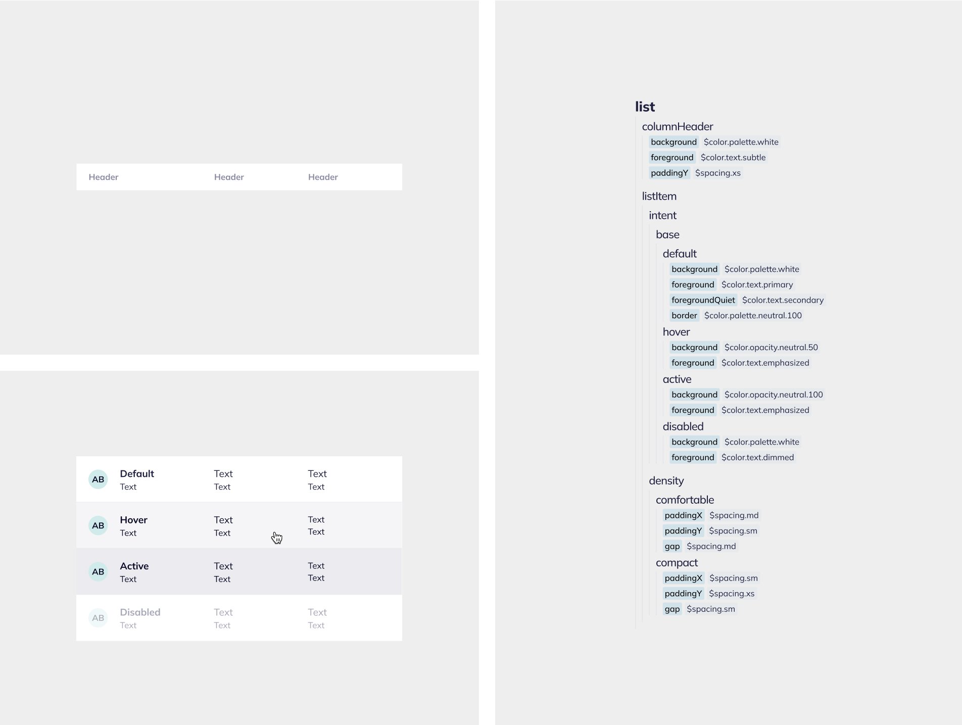
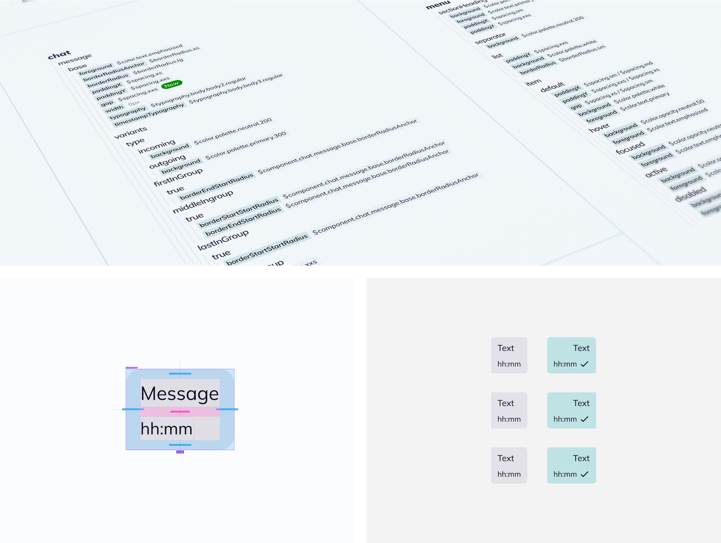
Design tokens: Created a core token library with semantic building elements, aligned with the Quin brand. On top of this, we developed a themed component-token library as building blocks for generic components across our two platforms, serving both patients and healthcare professionals.
Mapping and migration: Replaced old styles and hard-coded values with tokens from the library, and deprecated redundant styles.
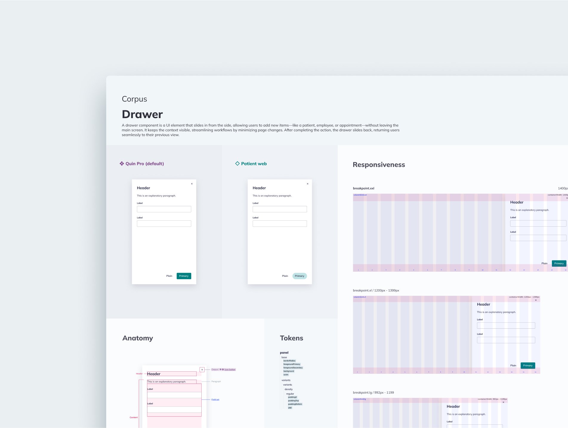
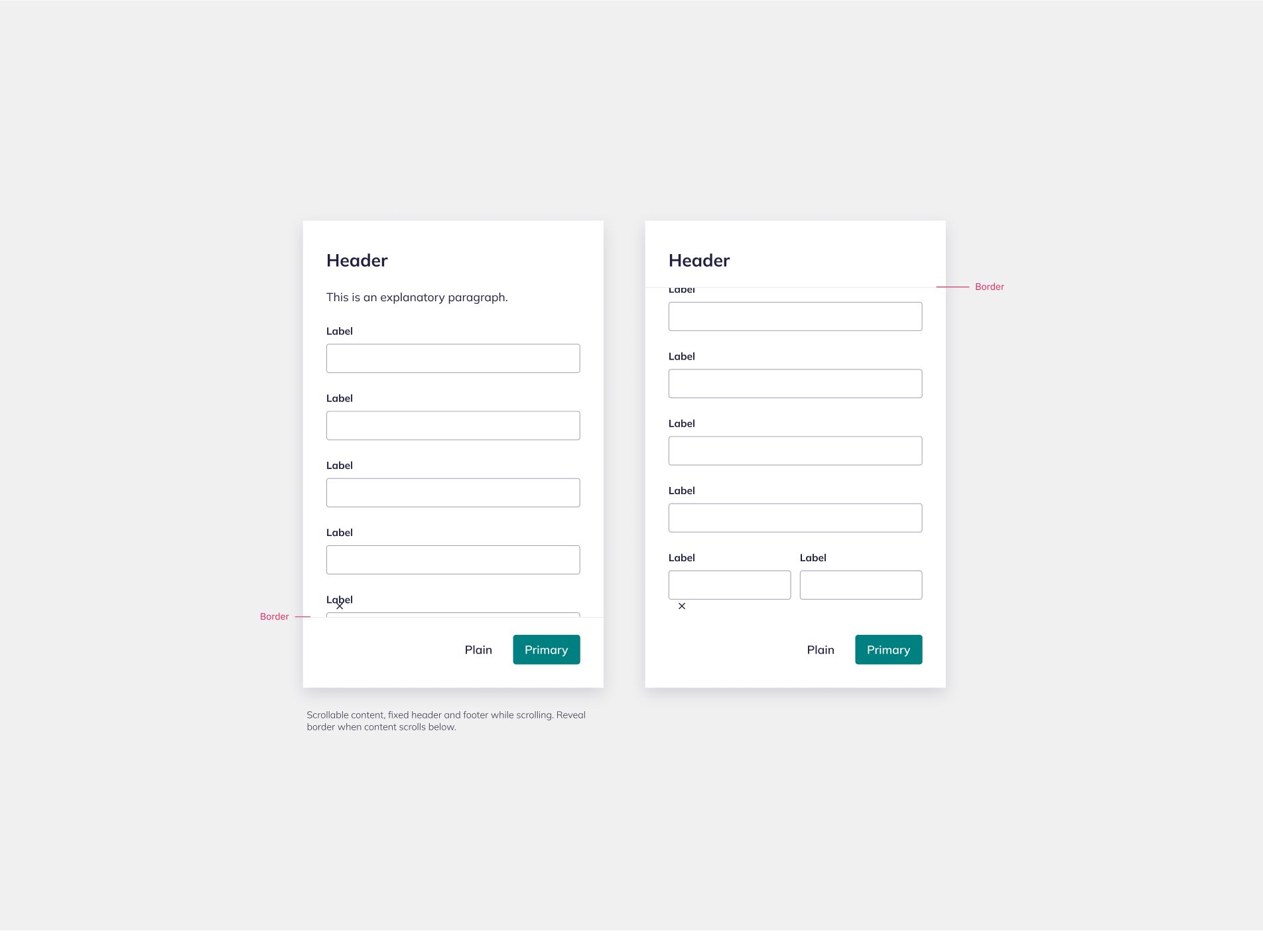
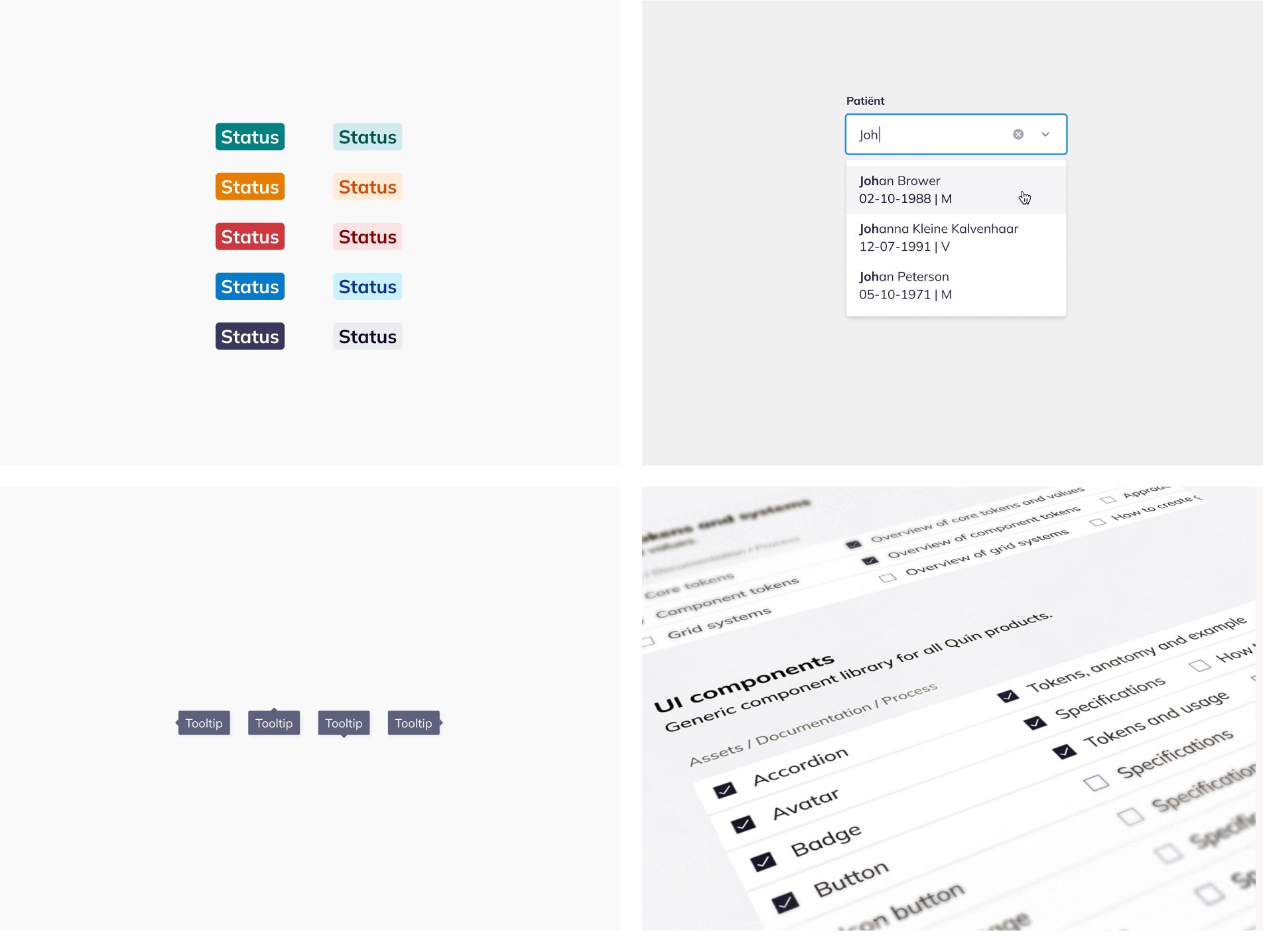
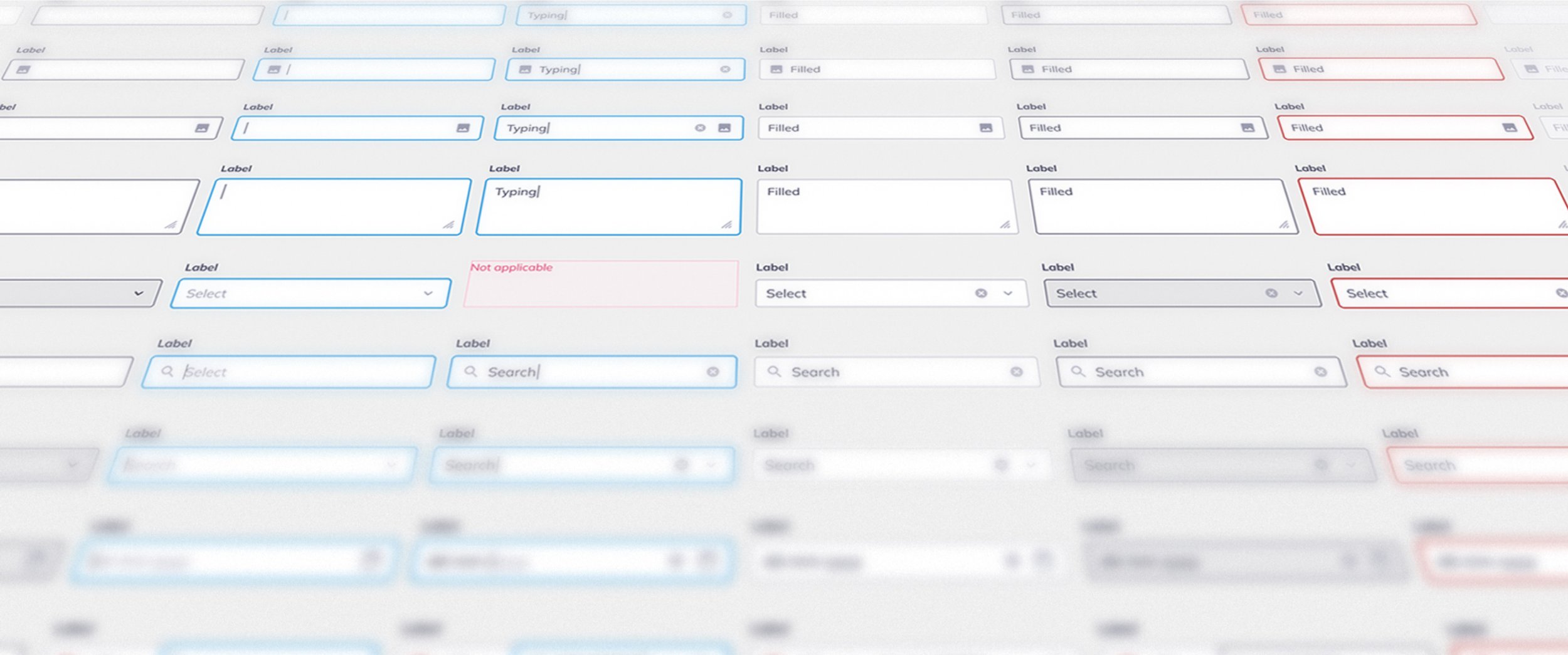
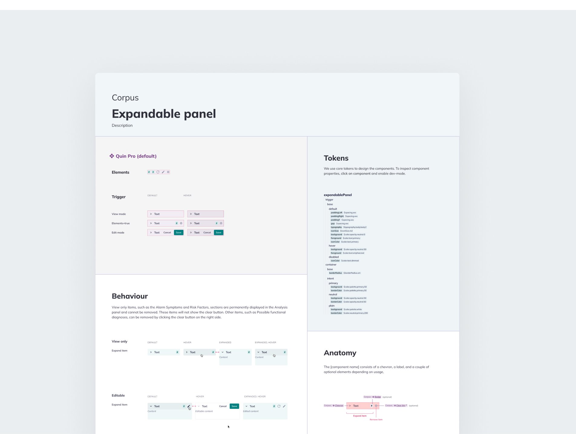
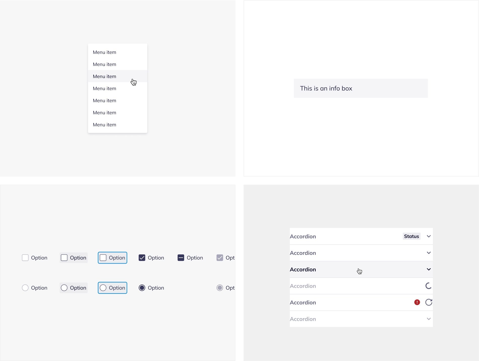
UI component library: Delivered high-fidelity, consistent and reusable components styled with design tokens.
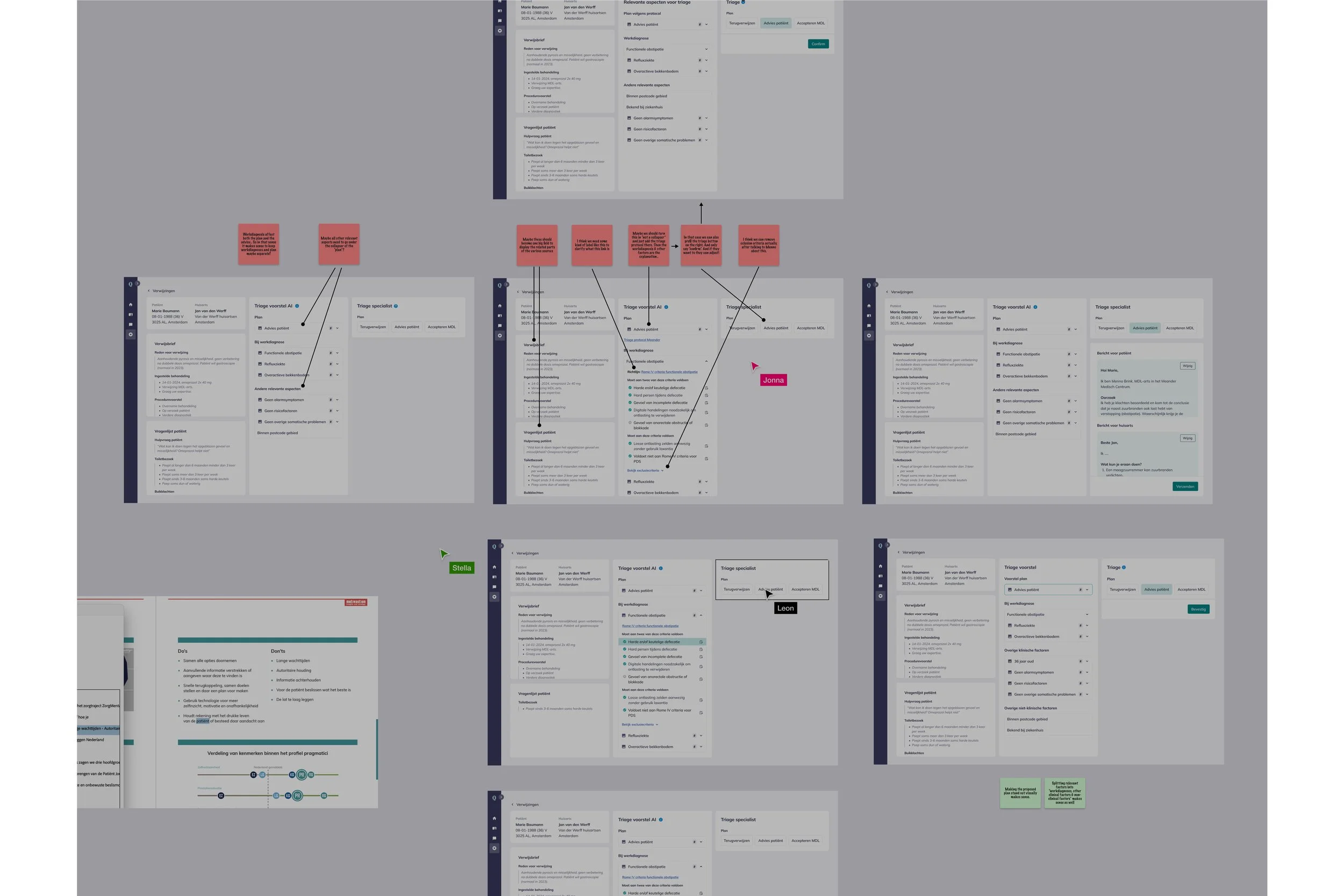
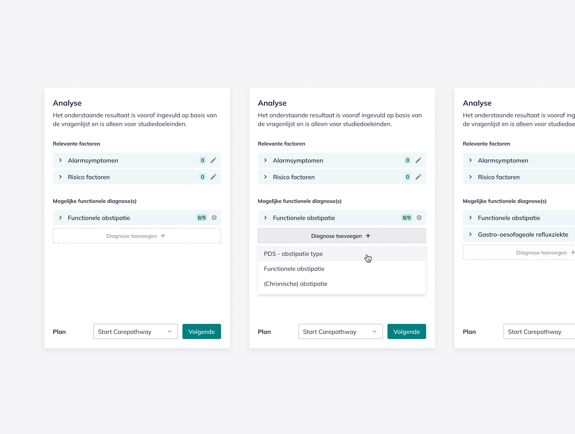
Pattern Library: Developed scalable design patterns through sketches and prototypes.

Design output & results
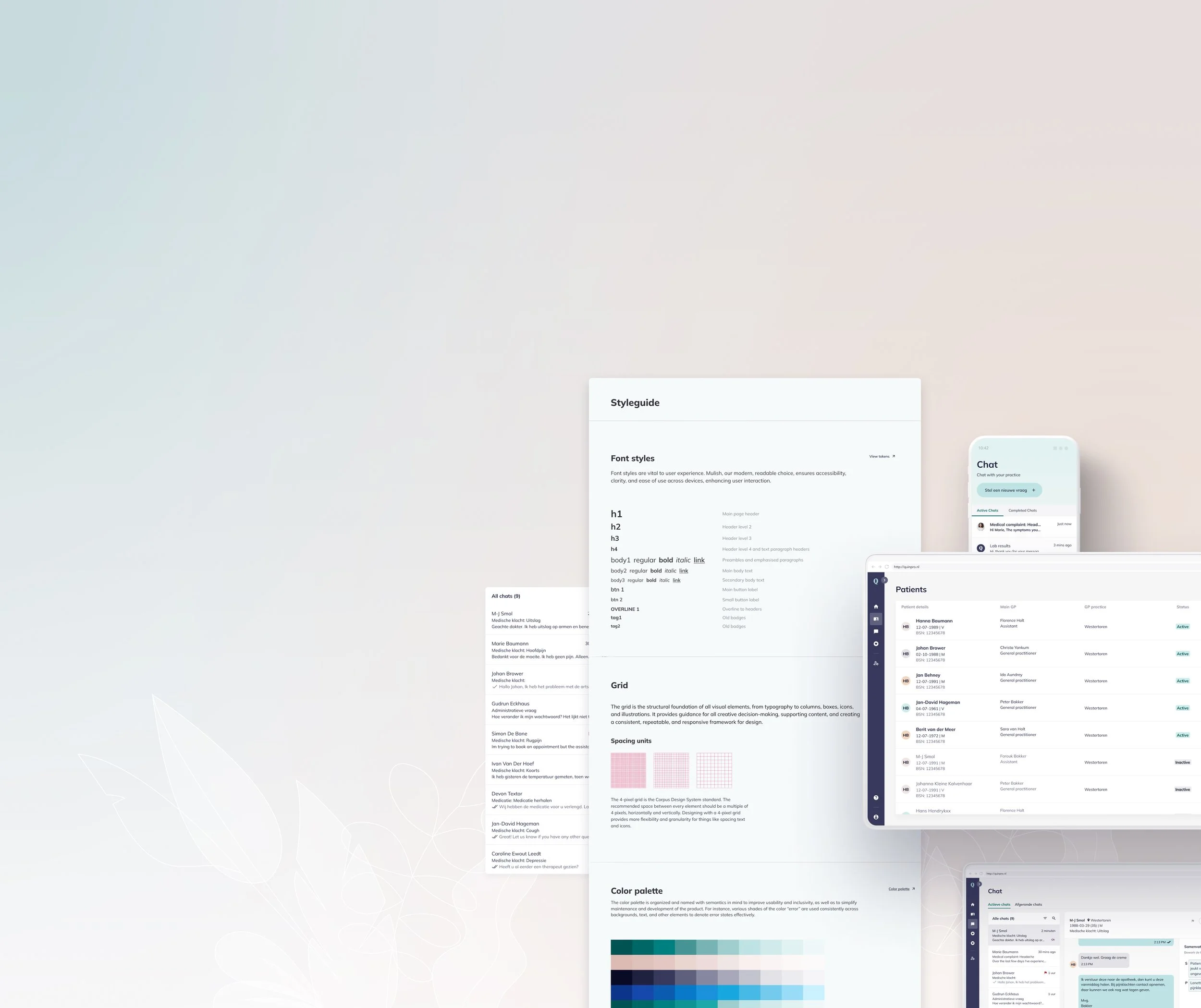
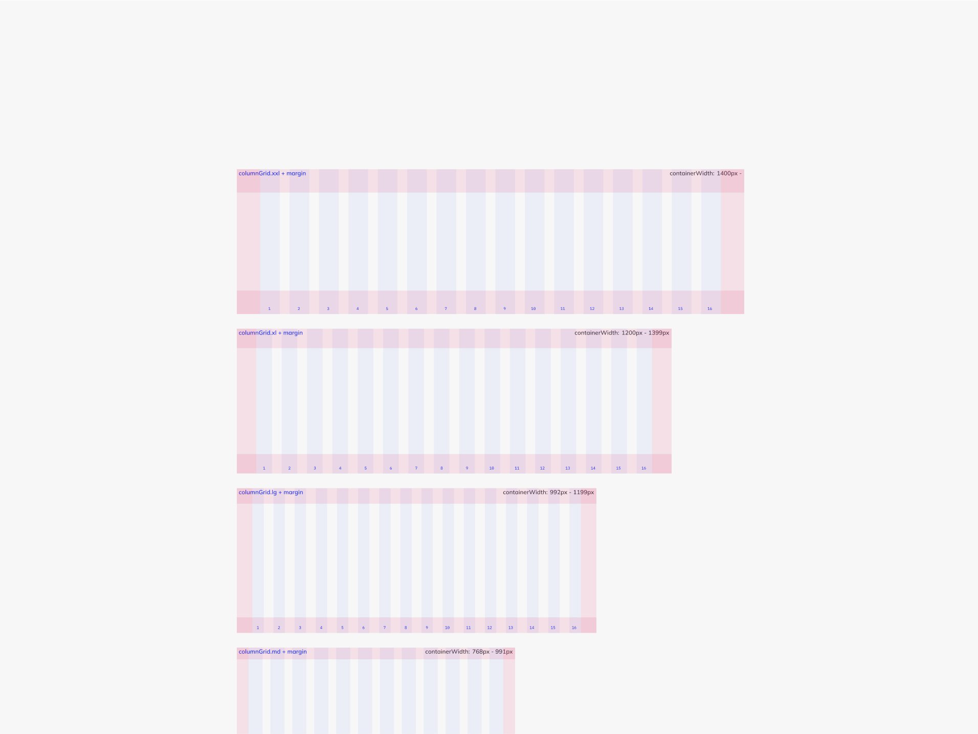
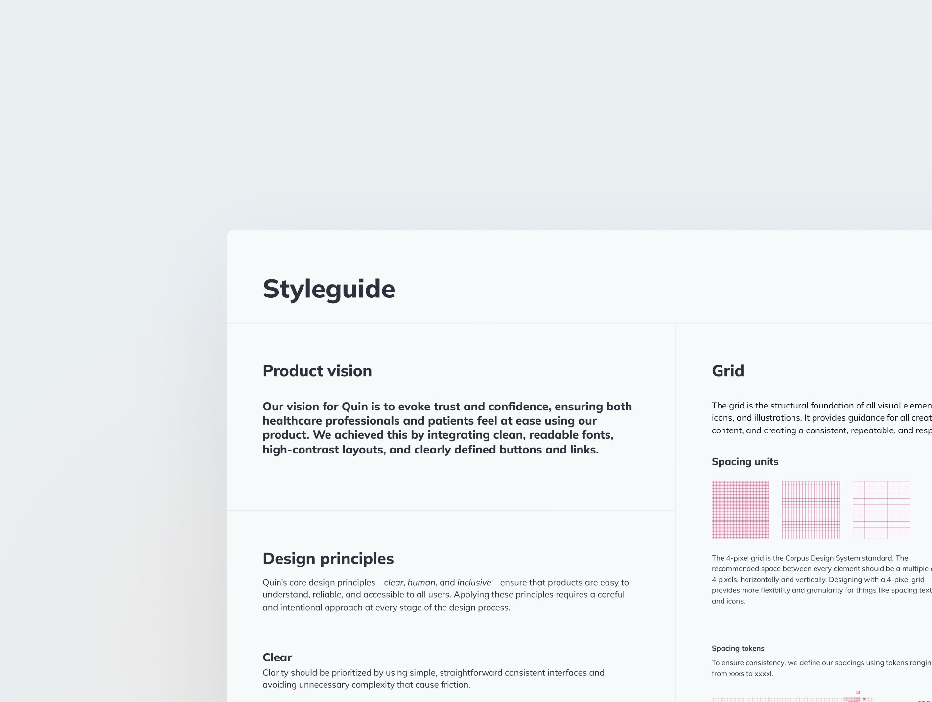
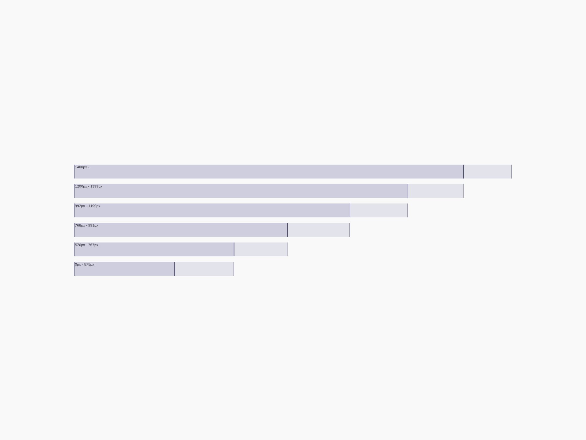
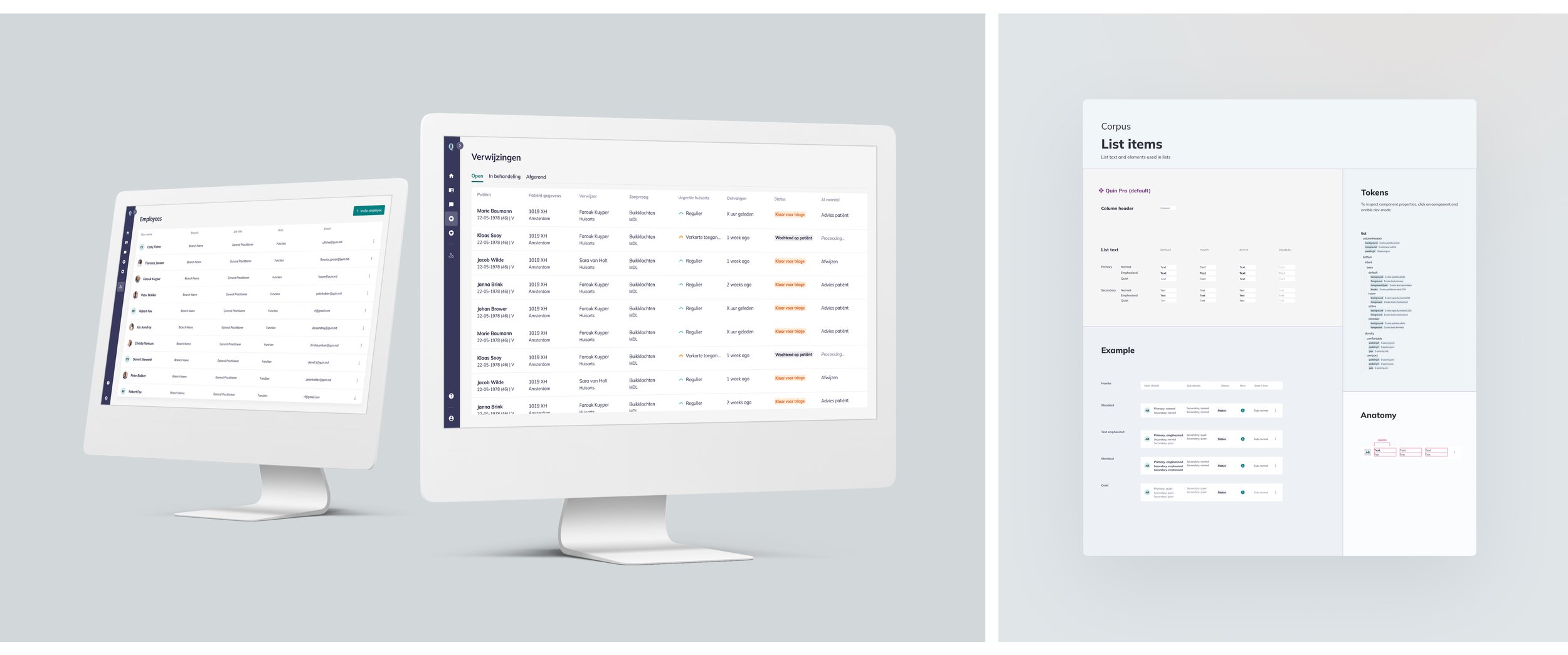
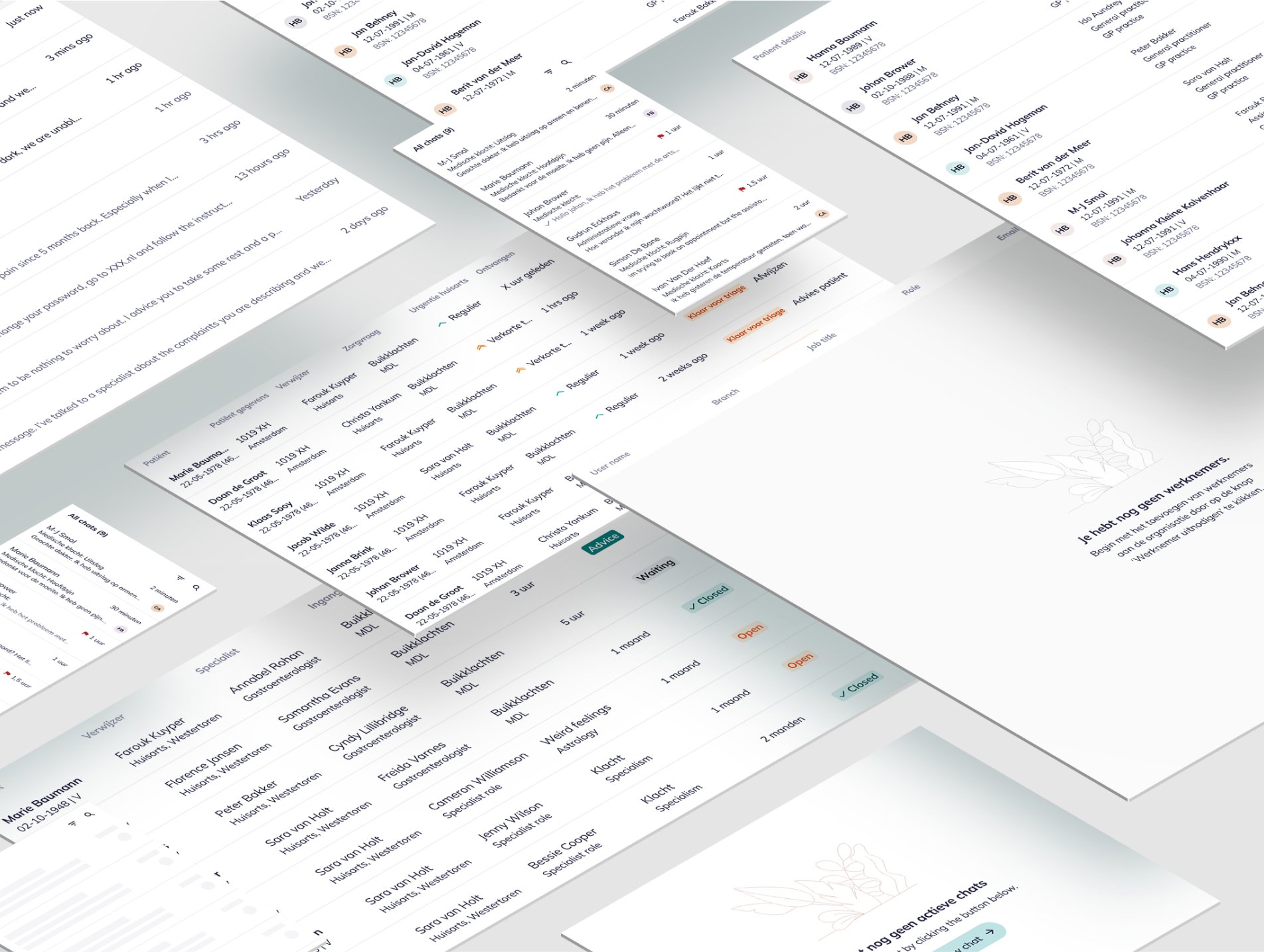
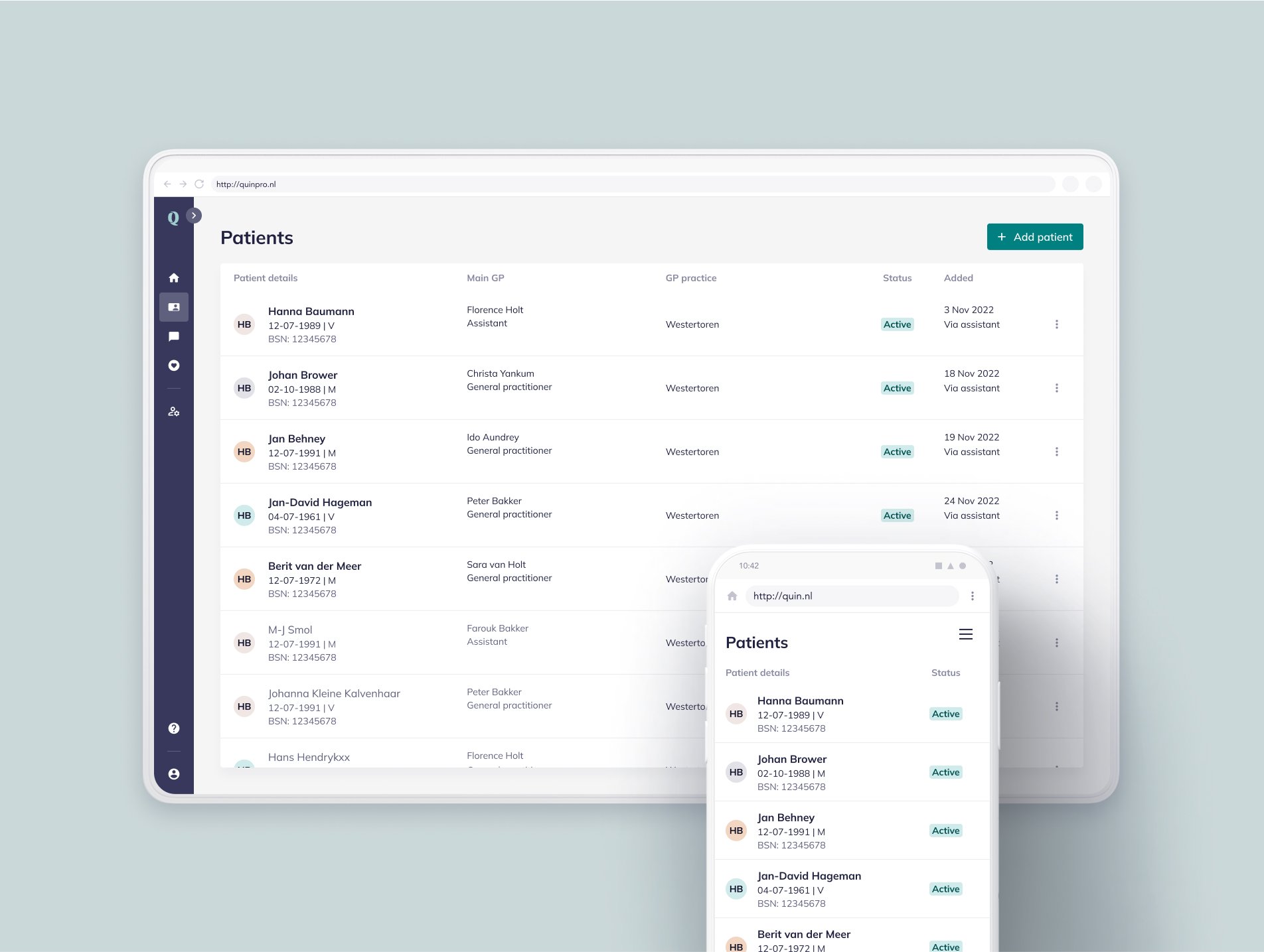
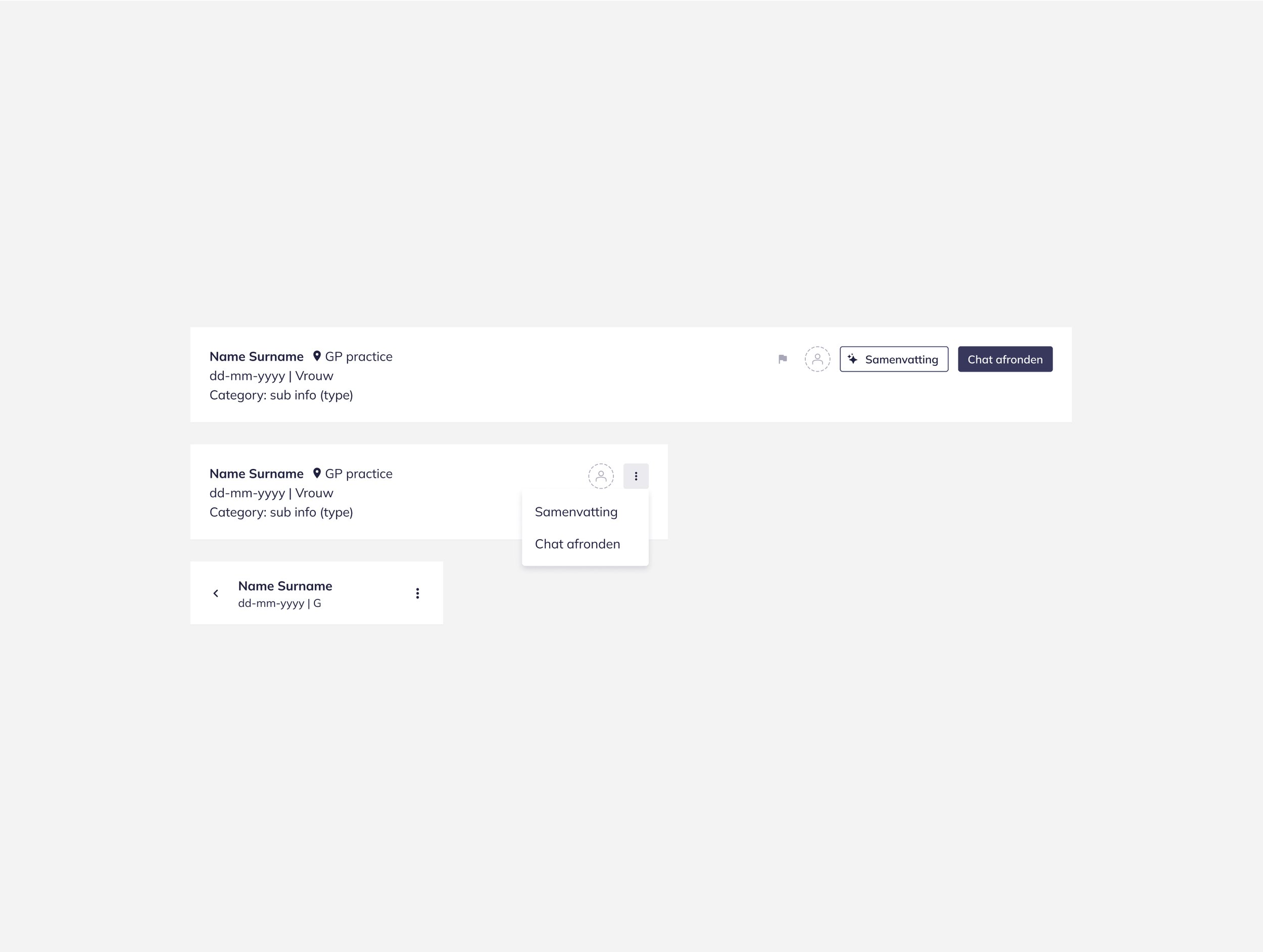
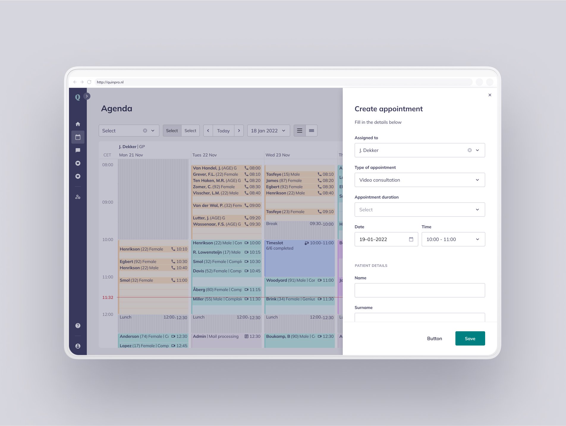
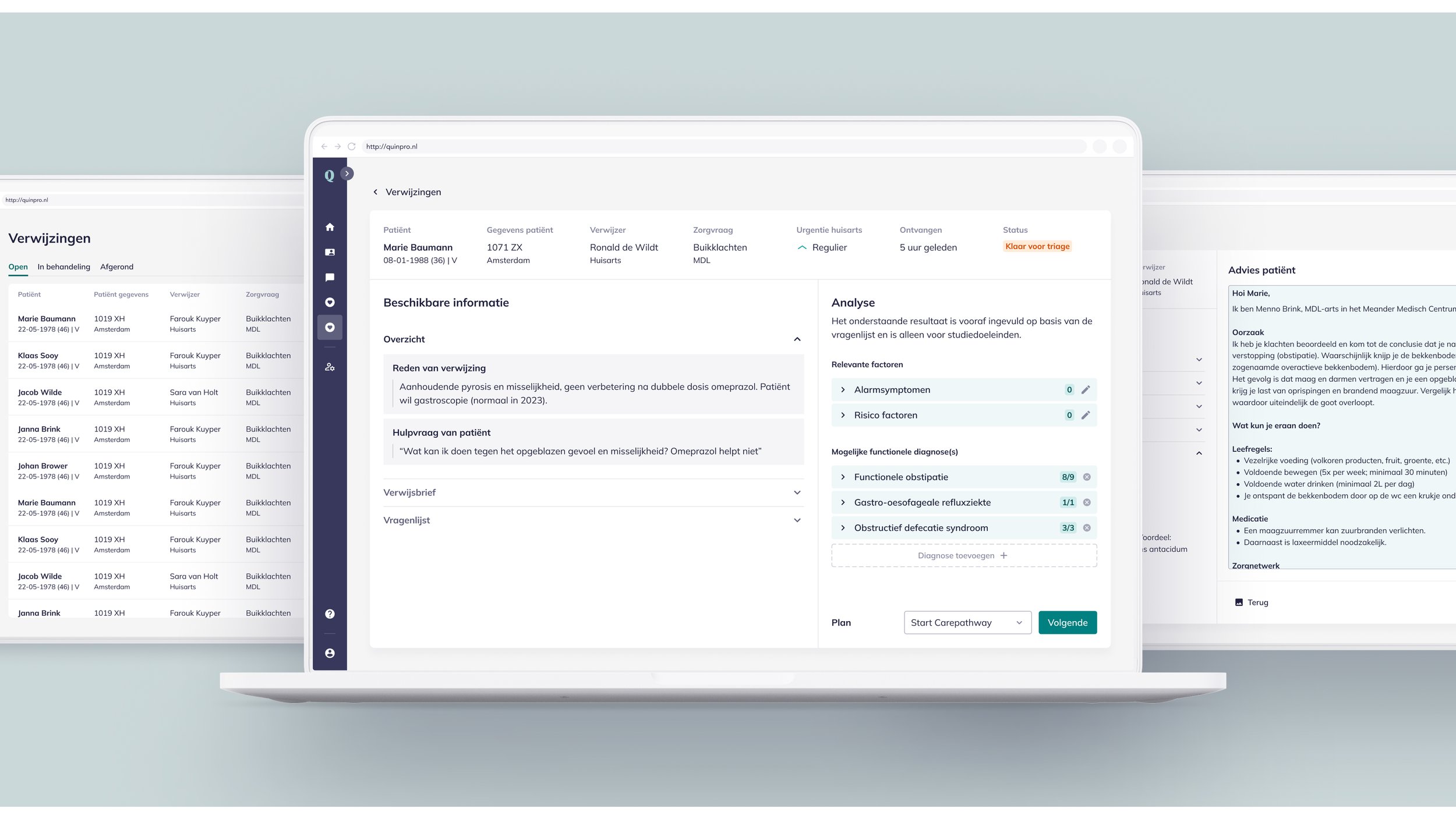
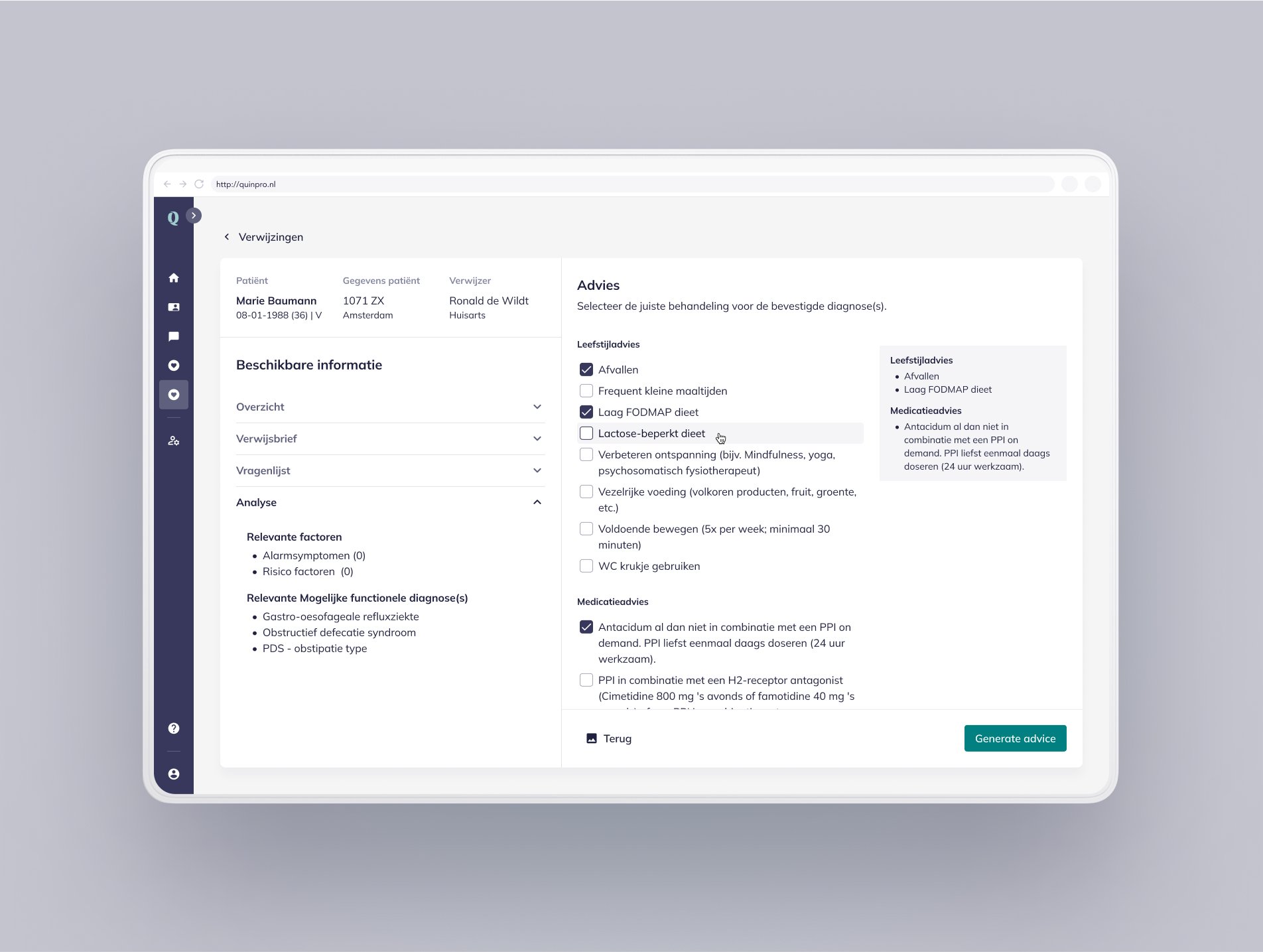
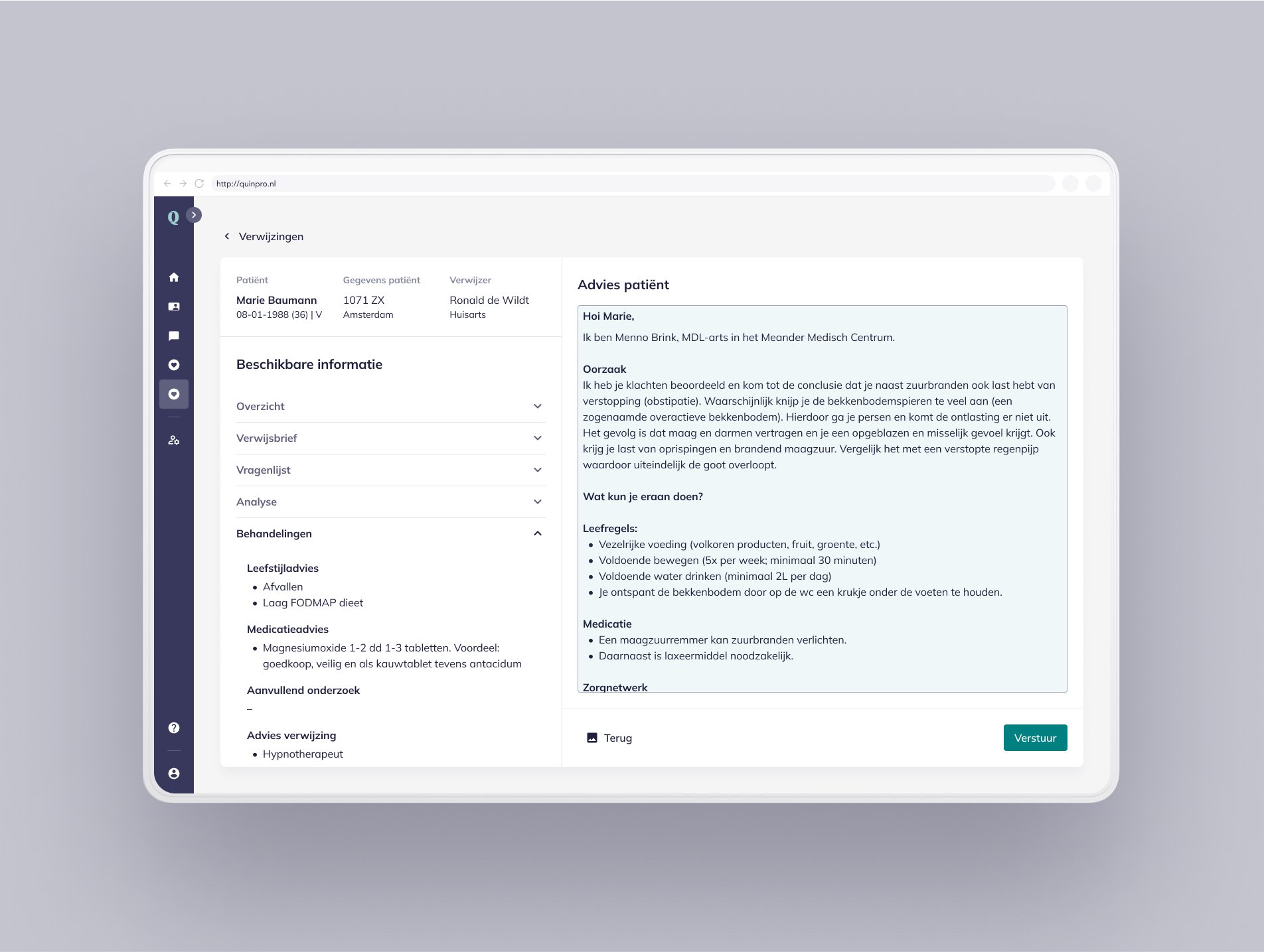
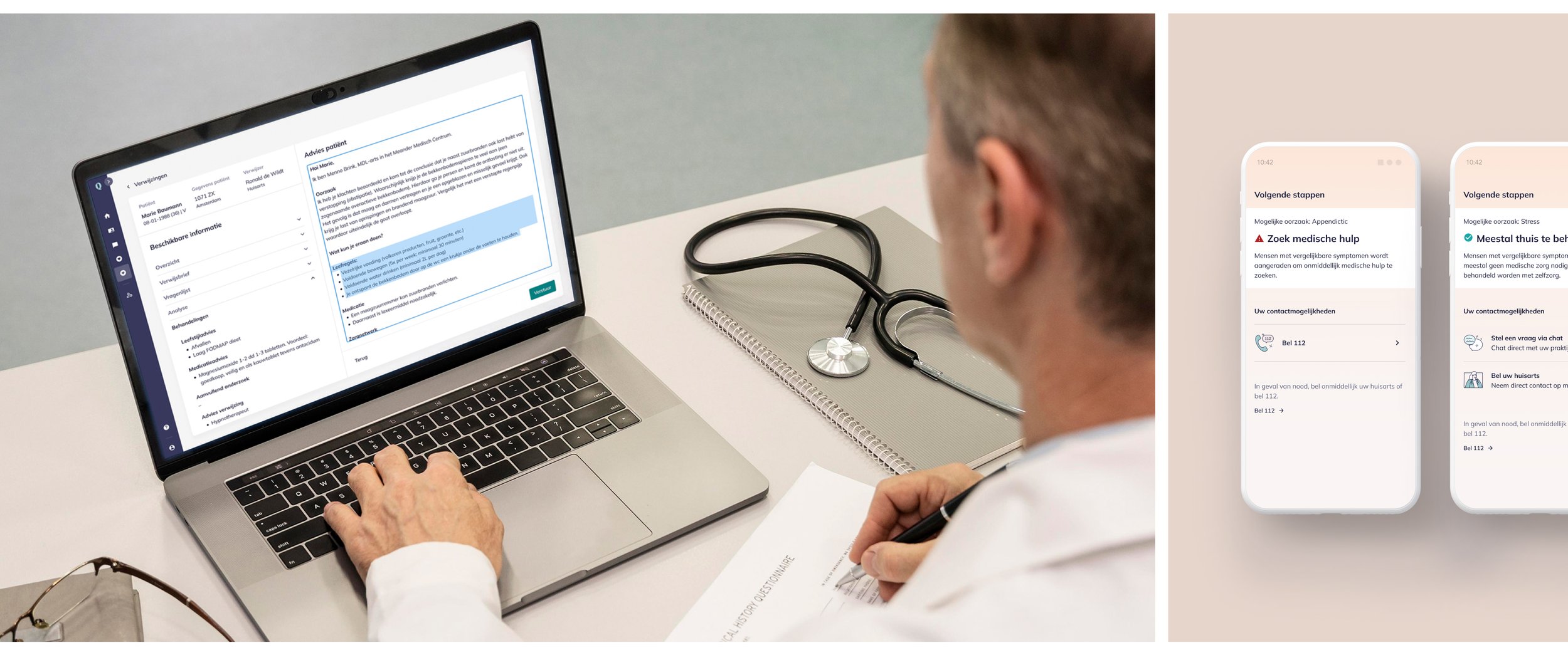
The Corpus Design System consists of a set of tools and guidelines created to improve design consistency and in-house workflows across Quin’s products. Key deliverables include guidelines, core design token library, high-fi UI component library, and UX patterns, developed to support some of Quin’s most value-driven features for both patient and healthcare professional interfaces. The system integrates brand assets with UI elements, fostering a unified design approach – informed by strong design principles, user needs, and the business problem that we were trying to solve.


Reflection
Creating the Corpus Design System was a pivotal moment for Quin, tackling key challenges and aligning with its mission of affordable, patient-centered care. It wasn’t easy—aligning teams and gaining stakeholder buy-in was a struggle, but the persistence paid off.
One of the most rewarding parts was improving collaboration between design and development. Previously, miscommunication slowed us down, but working closely together to build a shared system fostered trust and streamlined workflows. I learned how crucial open communication and early alignment are, both for joy in the workday, and for the success of the product.
Ultimately, the system enabled Quin to scale while maintaining quality, transforming healthcare accessibility, and that was the goal. It was a great reminder of how alignment, collaboration, and buy-in from the right people can drive meaningful change. Finally, I made lasting meaningful connections, and learned so much. Forever grateful for this experience.
-
Quin’s design system way-of-working addressed key pain points and changed how we work for the better, enabling more consistent, user-focused solutions, by:Addressing Fragmentation: A unified design library removed redundancies, ensuring consistency and streamlining workflows.
Standardizing Practices: Reusable tokens and guidelines aligned designs and improved scalability across products.
Closing Process Gaps: Reusable Figma components and semantic tokens reduced repetitive tasks, speeding up design and improving accessibility.
Improving Collaboration: A shared framework improved communication between teams, reducing errors and ensuring a smooth user experience.
Delivering Scalable Solutions: By solving fragmentation and consistency issues, Quin created intuitive, reliable interfaces for both patients and healthcare professionals.
